Gifting for the Humble Abode

Gift Guide 2017 - Home

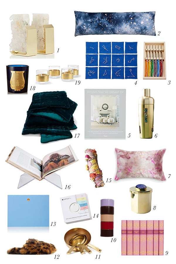
1//2//3//4//5//6//7//8//9//10//11//12//13//14//15//16//17//18//19

This year, home for the holidays has a special meaning for me because it’s the first time Tom and I will celebrate Christmas in our very own home. One of the first things I did in preparation for the Holidays was to go out and buy the largest tree that would fit in front of our windows. I’ve always loved a tree in front of a window because not only do you get to enjoy it, but those on the outside do, too.

When it came to thinking about gifts for the home, I gravitated towards really unique items that would really make a house a home. Those things that show others a bit more of your personality and make coming home feel special.

I really love the idea of pairing this acrylic book stand with a gorgeous coffee table book. I have lots and lots of coffee table books that I absolutely love and while they look good sitting on a shelf or the table, I’ve hardly ever seen a guest look at one. I like the idea that you could open your favorite book to your favorite page and encourage guests to thumb through it. Continuing with the book theme, I’m feeling like my bookcases could use a little kick. I love the idea of pairing these beautiful bookends with your most tattered and beloved books to create a beautiful contrast on your cases.

I also looked for items that I thought would make a space cozy and bright. I’m completely obsessed with these pillowcases by Elizabeth Few. I saw them first at Roxie Daisy here in Charlottesville and have been completely in love ever since. I also love the idea of using this coverlet during the holiday months. How amazing would an emerald green velvet coverlet look this time of year.

And last, but not least, those emoji notecards. Last year, I got some emoji cocktail napkins that I just love, and I wanted to continue the theme. My husband has been really into writing handwritten letters this year, and I love the fact that these pair the best of technology with a good, old fashioned note.

I hope you find something in here that will bring a special touch to the homes of those you love this year.

Merry Merry!

The Thanksgiving Table of My Dreams

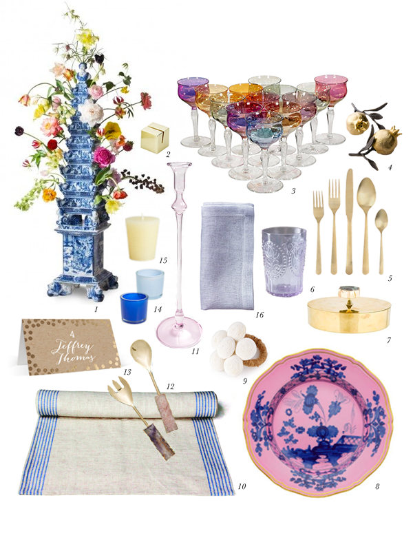
Thanksgiving Table Setting1//2//3//4//5//6//7//8//9//10//11//12//13//14//15//16

For the last couple of years, we’ve celebrated Thanksgiving by taking a trip with family. It’s a surprisingly wonderful time to travel as you don’t encounter many long lines while exploring a city since the bulk of humanity is sitting on their grandmother’s couch watching football. While I absolutely love this new tradition we’ve started, the one thing I miss about Thanksgiving is having the opportunity to design a beautiful Thanksgiving table.

Since I won’t be able to put together a real Thanksgiving table this year, I decided to share with you the Thanksgiving table I’m currently dreaming of. When I started to brainstorm what my ideal Thanksgiving table would look like, two things immediately came to mind dutch tulip vases and Richard Ginori’s Oriente Italiano dinnerware collection. I first fell in love with delftware tulip vases when Tom and I saw the dutch flower pyramid or “Bloempiramide” at the Rijksmuseum in Amsterdam. On a recent trip back, Tom brought me home a kit to build my own flower pyramid. Mine is made of plastic, but it’s still super cool. Ever since, I’ve wanted to design a table with a Bloempiramide as the centerpiece. Now on to those pink plates. I first saw one of Richard Ginori’s Oriente Italiano plates at Forty Five Ten in Dallas. I awkwardly took a picture of the back of the plate in the store because I knew I would want to remember who made it. I think what I love about these plates is that the simultaneously seem traditional and modern at the same time, but in all reality, it was probably just the millennial pink that caught my eye. I built the resulting tablescape around these two pieces and hope it inspires you to make a beautiful Thanksgiving tablescape of your own. Happy Thanksgiving, ya’ll!

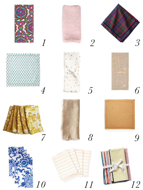
The 12 Dinner Napkins We’re Craving for Thanksgiving

12ThanksgivingDinnerNapkins

1//2//3//4//5//6//7//8//9//10//11//12

I can’t believe the holiday season is upon us. We didn’t really have our traditional Fall weather here, so the fact that it’s almost Thanksgiving is really surprising. Maybe it’s the fact that this year feels a little “off”, but when I was thinking about how to set the table for Thanksgiving this year, I was drawn to things that didn’t look too “Thanksgiving.” While having a theme can be nice, sometimes I feel like it ends up looking too kitschy.

This year, I’m really craving adding some color to my table. I have beautiful white dinner plates and napkins, which I use for practically everything and it would be nice to have an alternative. I also really like the idea of buying something that can be repurposed for other dinner parties throughout the year so that whatever I buy will get used more than once.

I think when it comes to holiday decorating often times we feel like there’s a right way to decorate. For Thanksgiving, your need warm colors – reds, oranges, and yellows and lots of gourds. But I don’t think you need to be overly formulaic. When it comes to Thanksgiving, it’s all about getting your favorite people around the table and enjoying a delightful meal. It’s also one of the two times per year that you will probably actually set the table and use real napkins and fancy china. The objective for setting the table is really to make the people you have invited to your home feel special. By just by being thoughtful about how you set the table, you will set the tone for the day. Whether you use a pumpkin or a gourd or some metallic napkins, is totally up to you.

It’s All In The Mix

abstract art dresser interiors

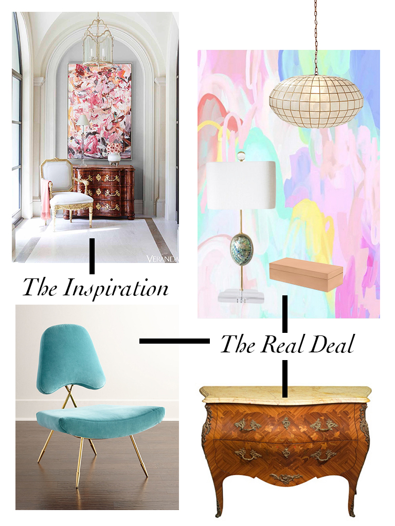
I’ve always loved this image from Veranda – I love the choice of art, the colors, the textures, and especially the mix of styles. I think there are two reasons why mixing styles works so well in this image. The first is that pairing the antique dresser with a bright, colorful piece of contemporary art breathes life into the dresser, which could have a tendency to be overly stodgy or too precious. The second is that there is a tension created by placing two contrasting items next to each other that is much more interesting than if you didn’t.

I have a somewhat similar antique dresser that I absolutely love, and I’m dying to get a great abstract painting to go above it. If I did, this is how I would style it.

The gorgeous painting is by Michael Manning on Artsy, which is a great source of contemporary art, and I paired it with a wonderful occasional chair from Jonathan Adler, a unique lamp, and a simple box.

I also found several other options, below, that offer a similar take on the idea:

Inside Fallingwater

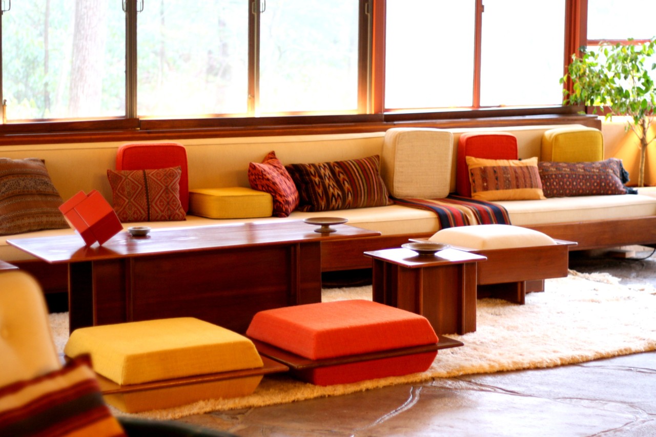
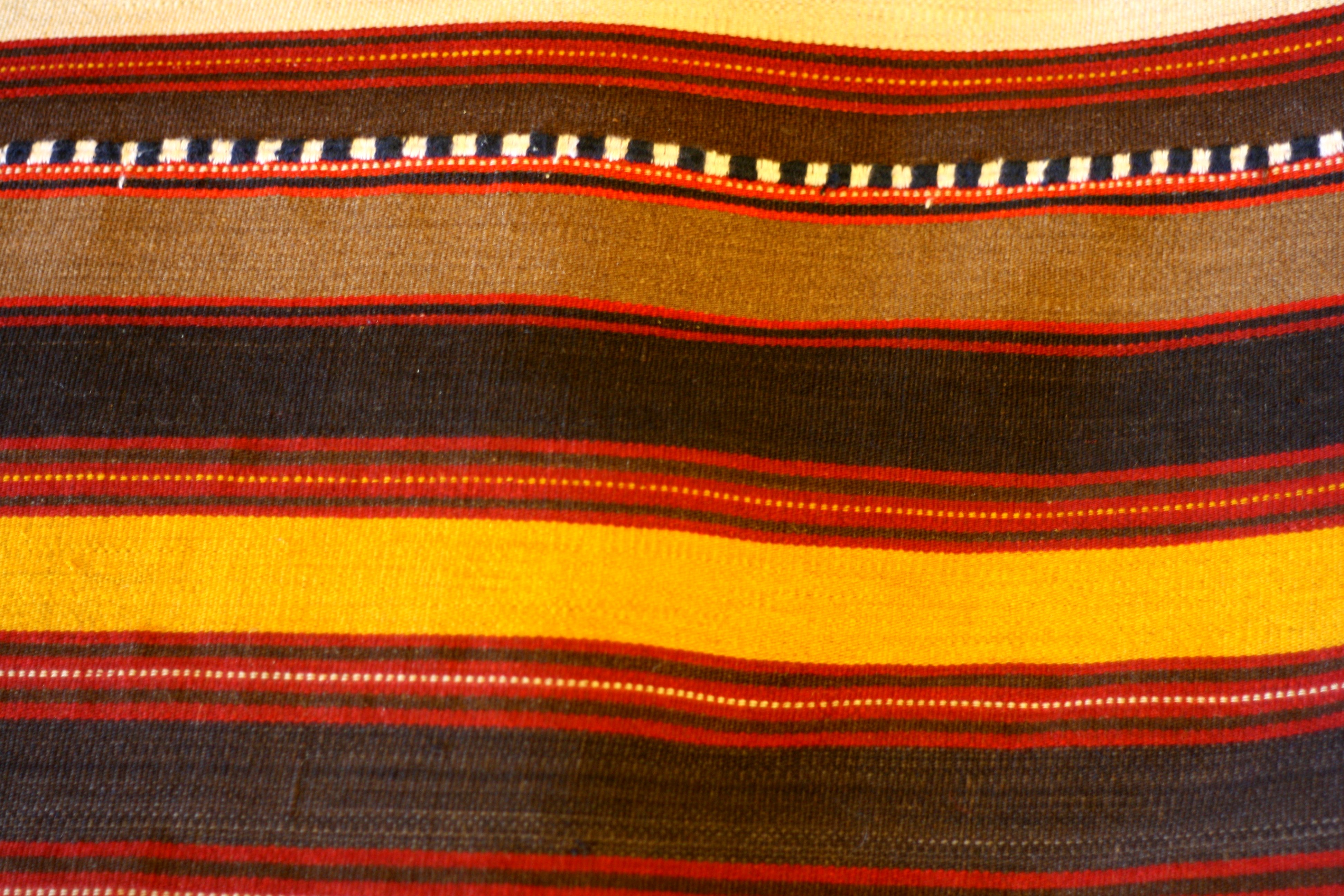
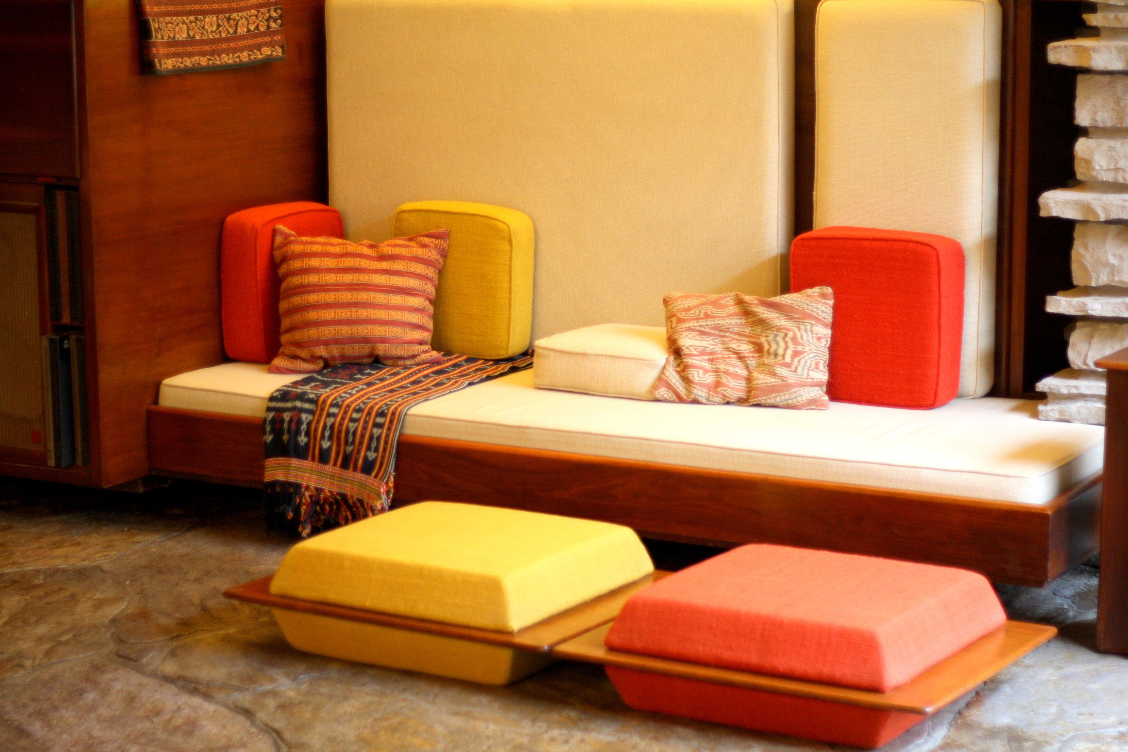
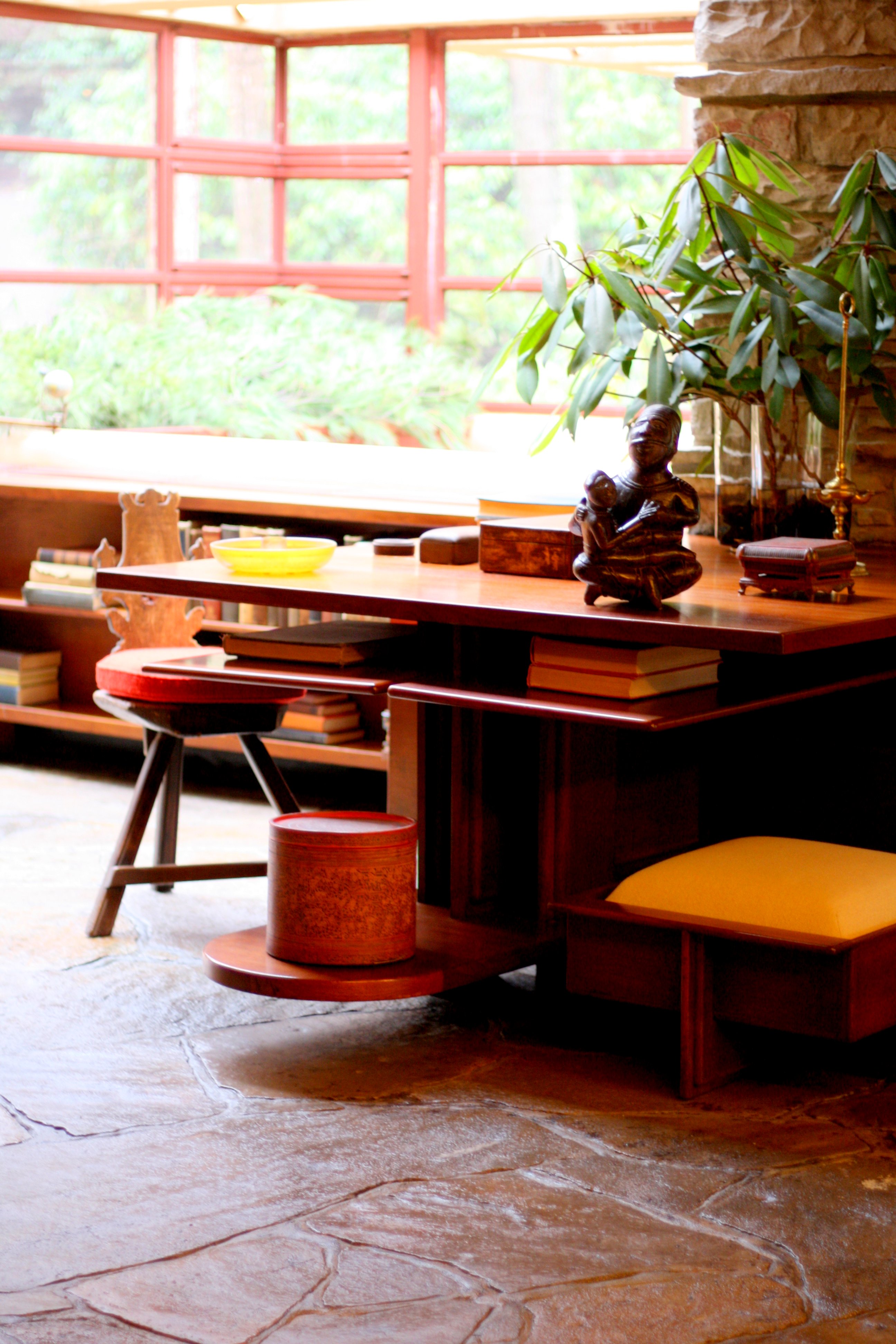
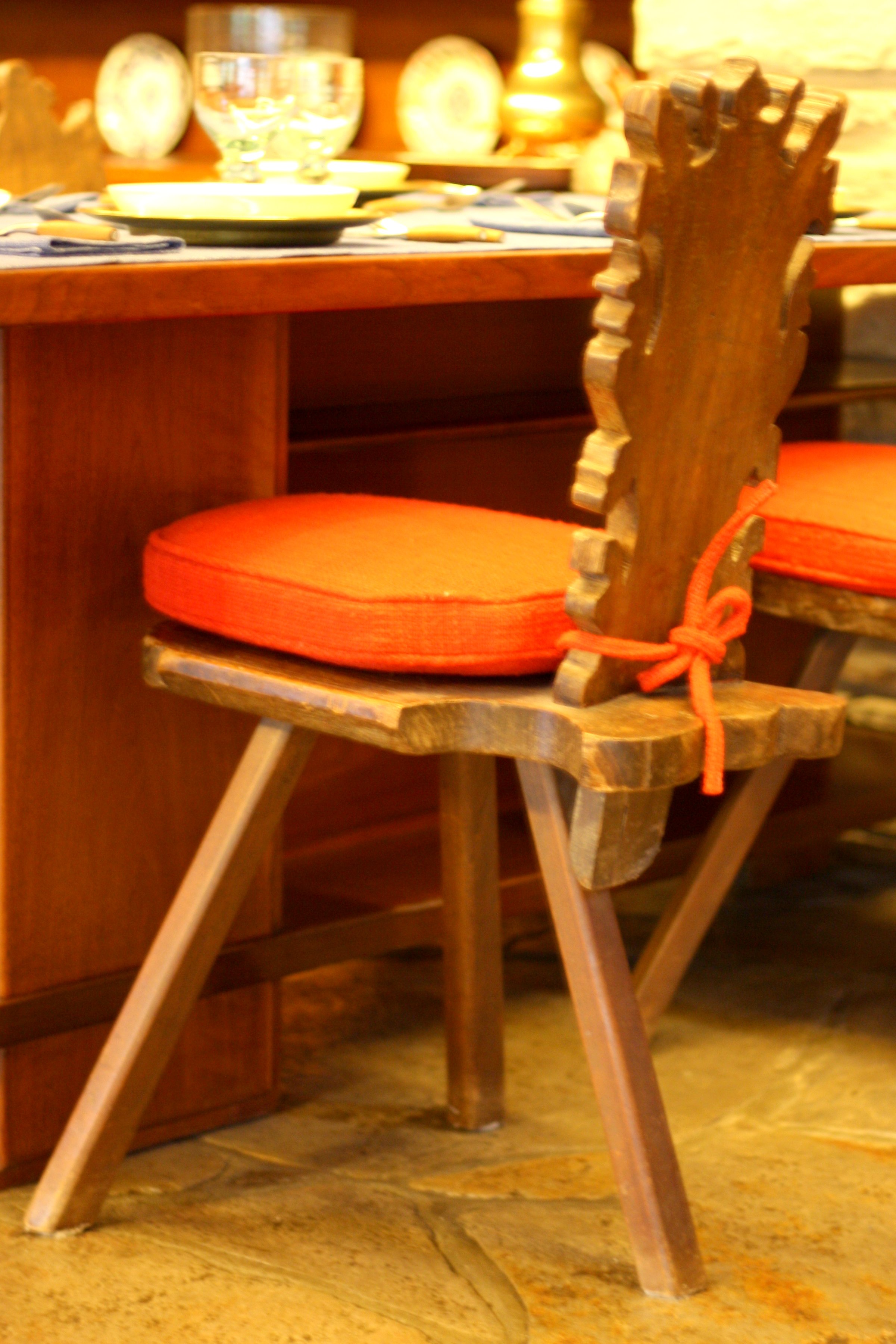
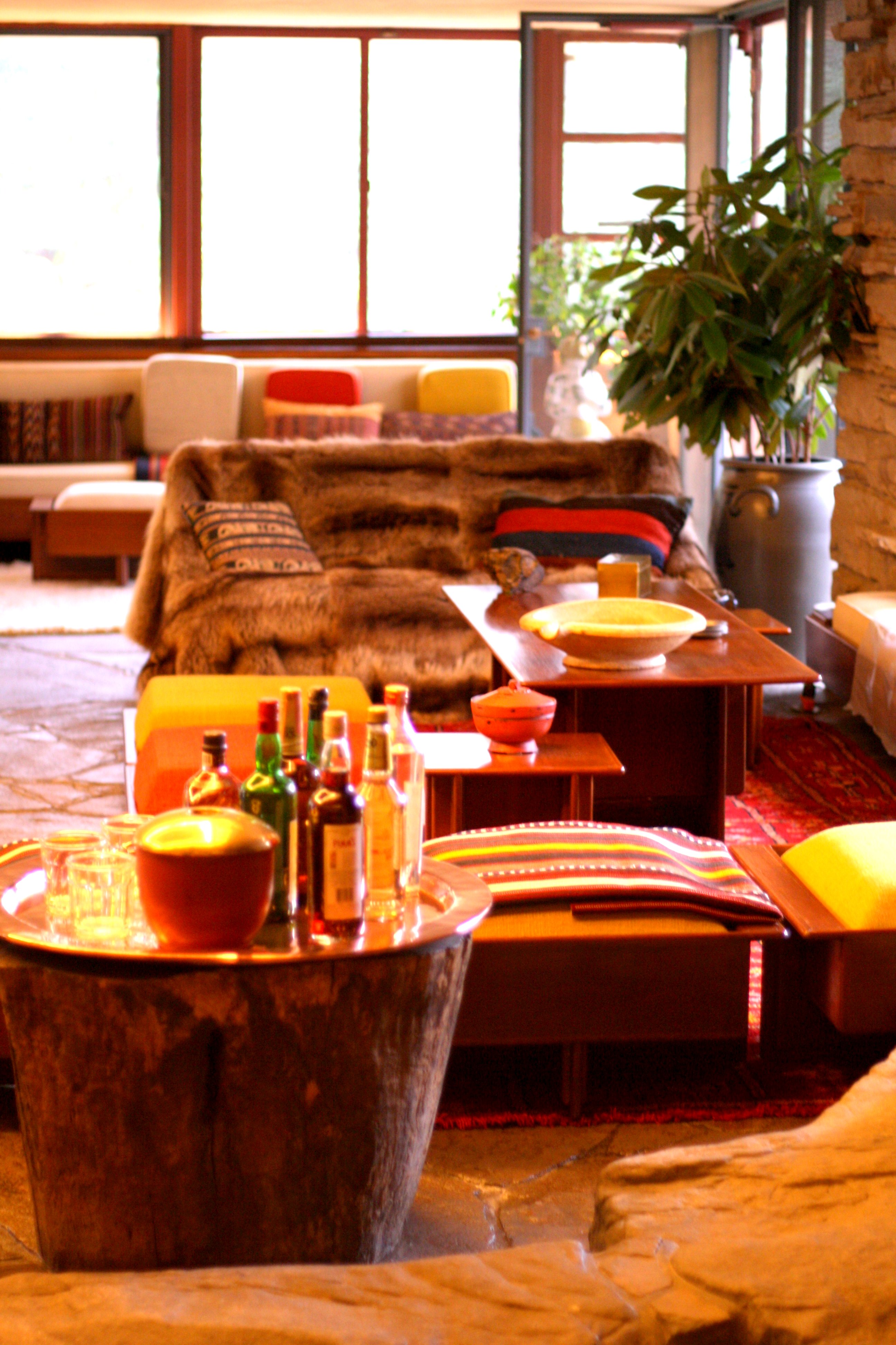
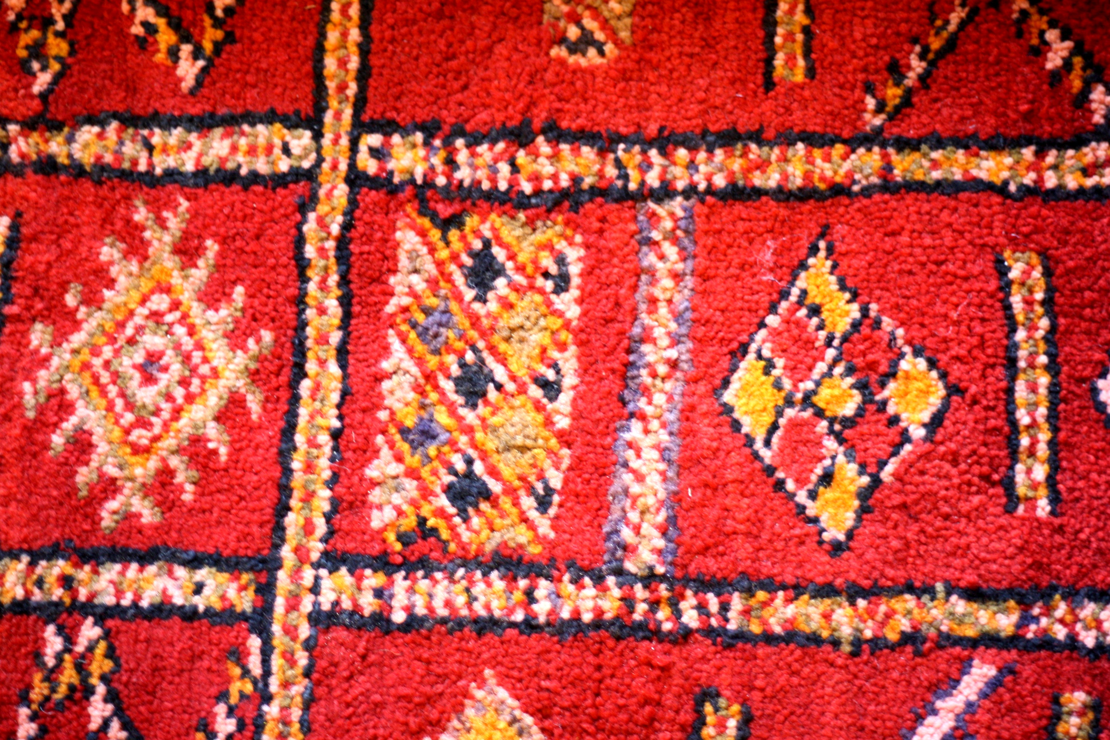
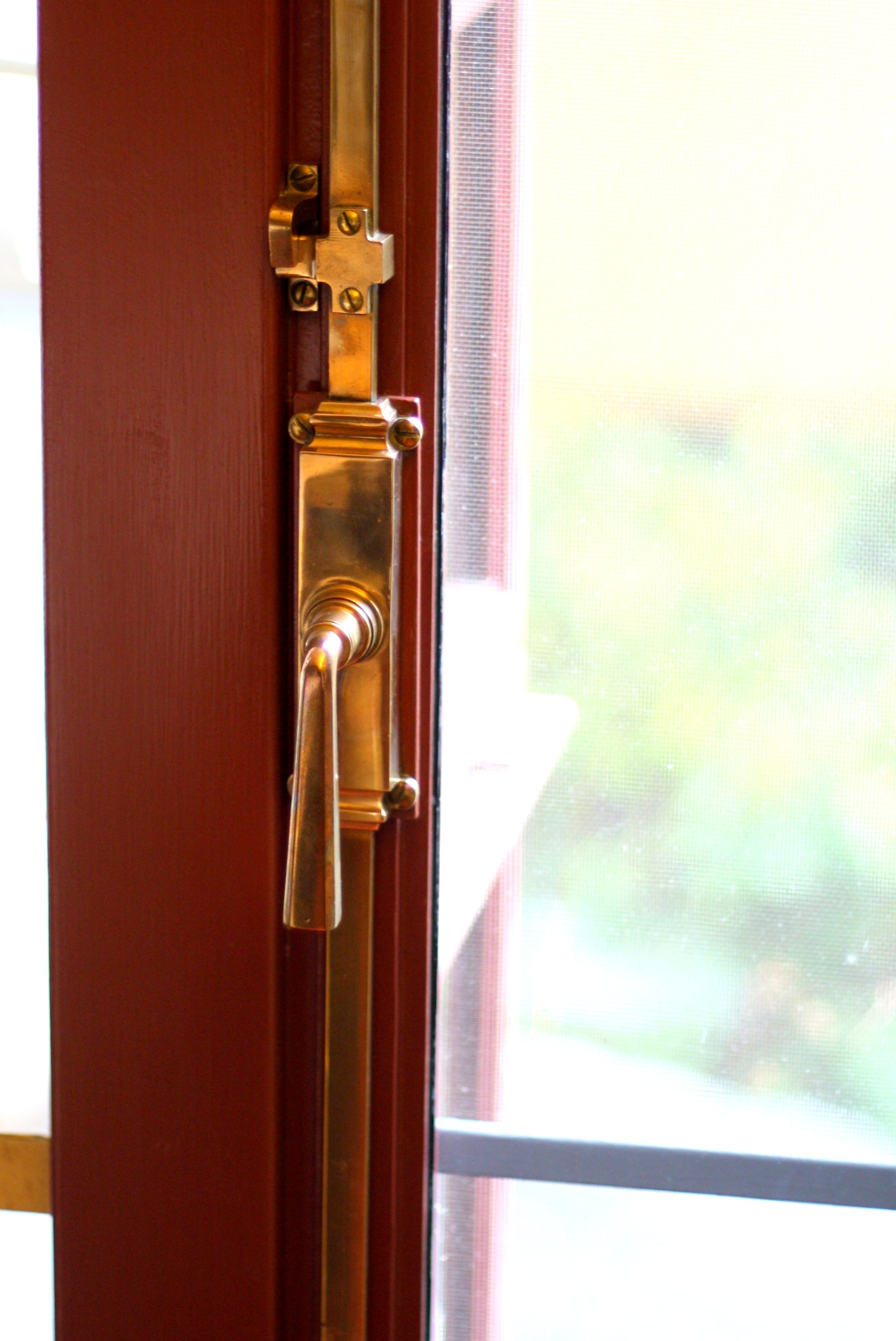
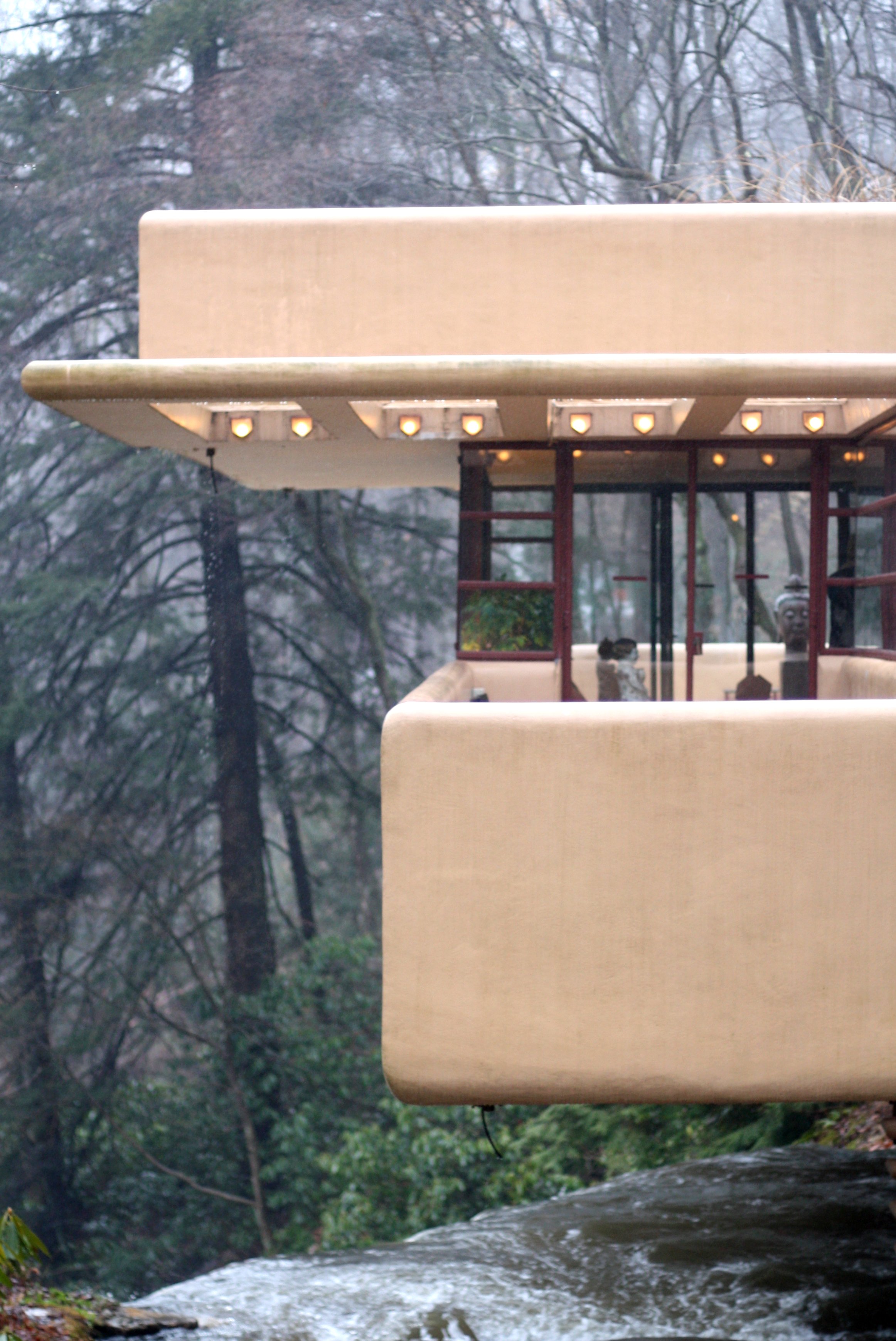
When I walked inside the main living space at Fallingwater, I immediately felt at ease. I felt sometimes like I do in a wonderfully designed hotel room. Where you can tell someone has thought about exactly what you need to feel comfortable. You felt like you had everything you needed, and nothing you didn’t. There were plenty of areas to lounge and read a book or come together with others and socialize. While it functioned perfectly, it was also quite stylish. Yet not over the top where you felt uncomfortable, just enough to feel special without feeling precious. It was what we can only hope to achieve in an interior space.

02-IMG_1461 03-IMG_1467 04-IMG_1452 05-IMG_1460 06-IMG_1456 07-IMG_1514 08-IMG_1459 09-IMG_1468 10-IMG_1484 11-IMG_1478 12-IMG_1444 13-IMG_1490 14-IMG_1431

Miami Art Deco District

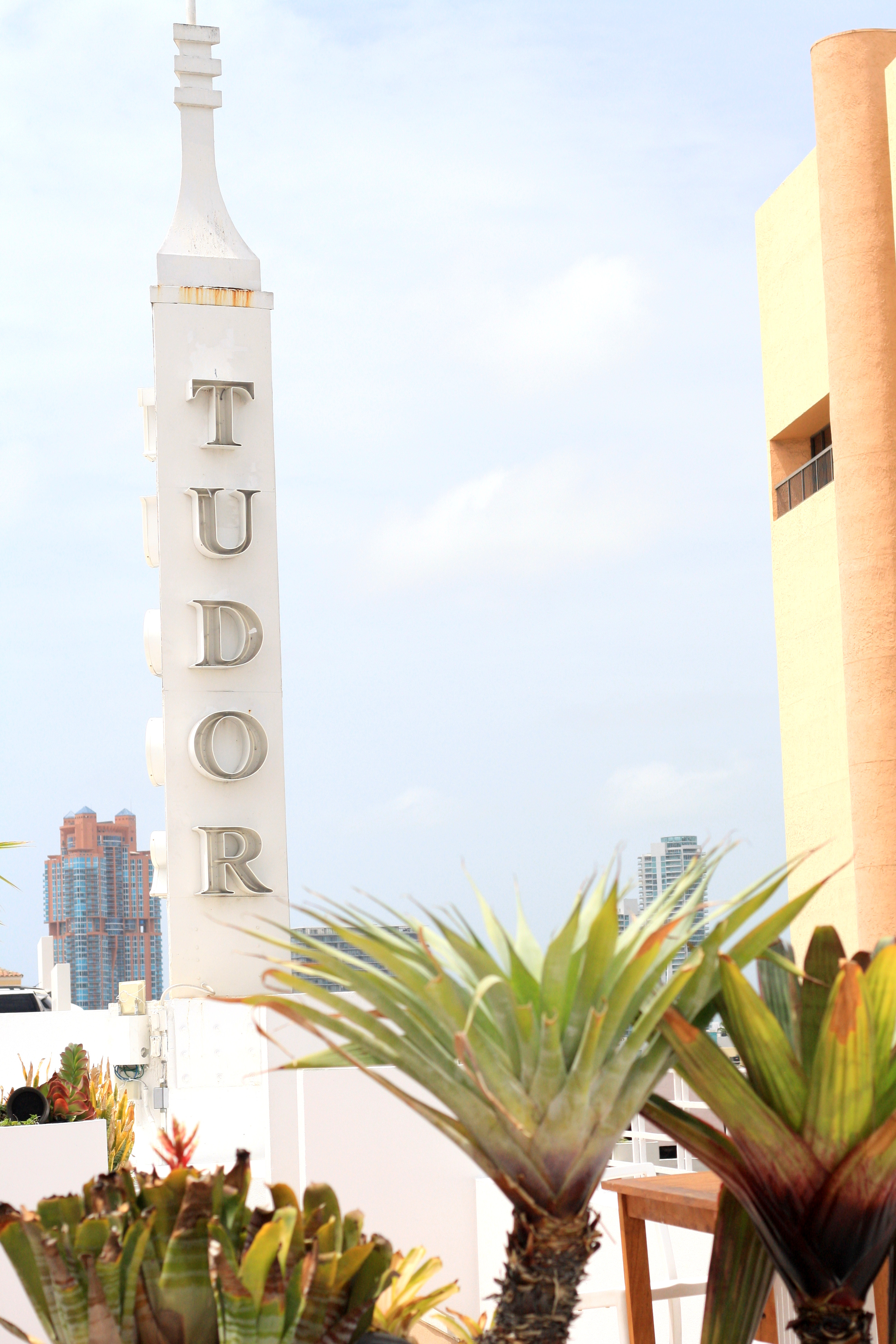
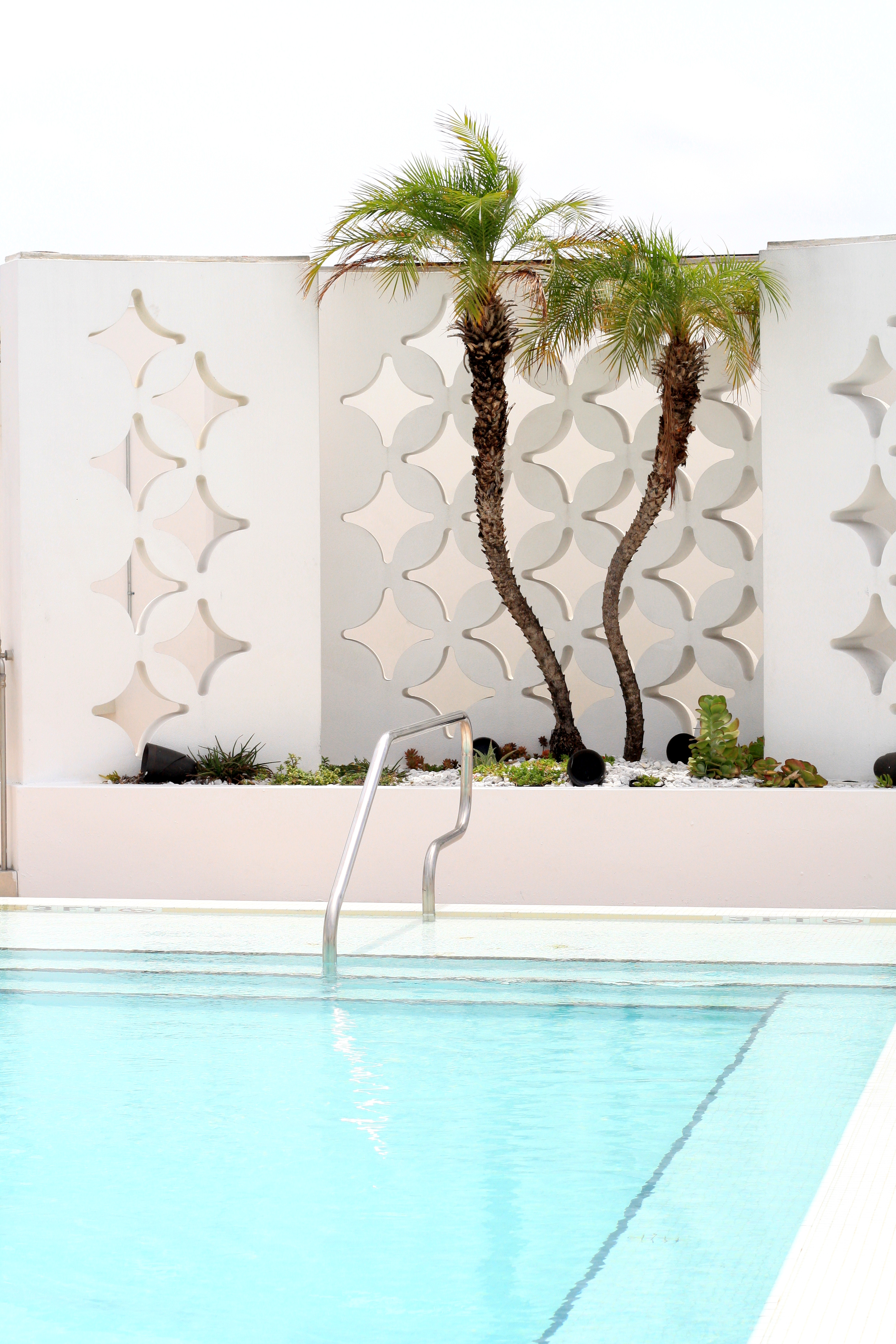
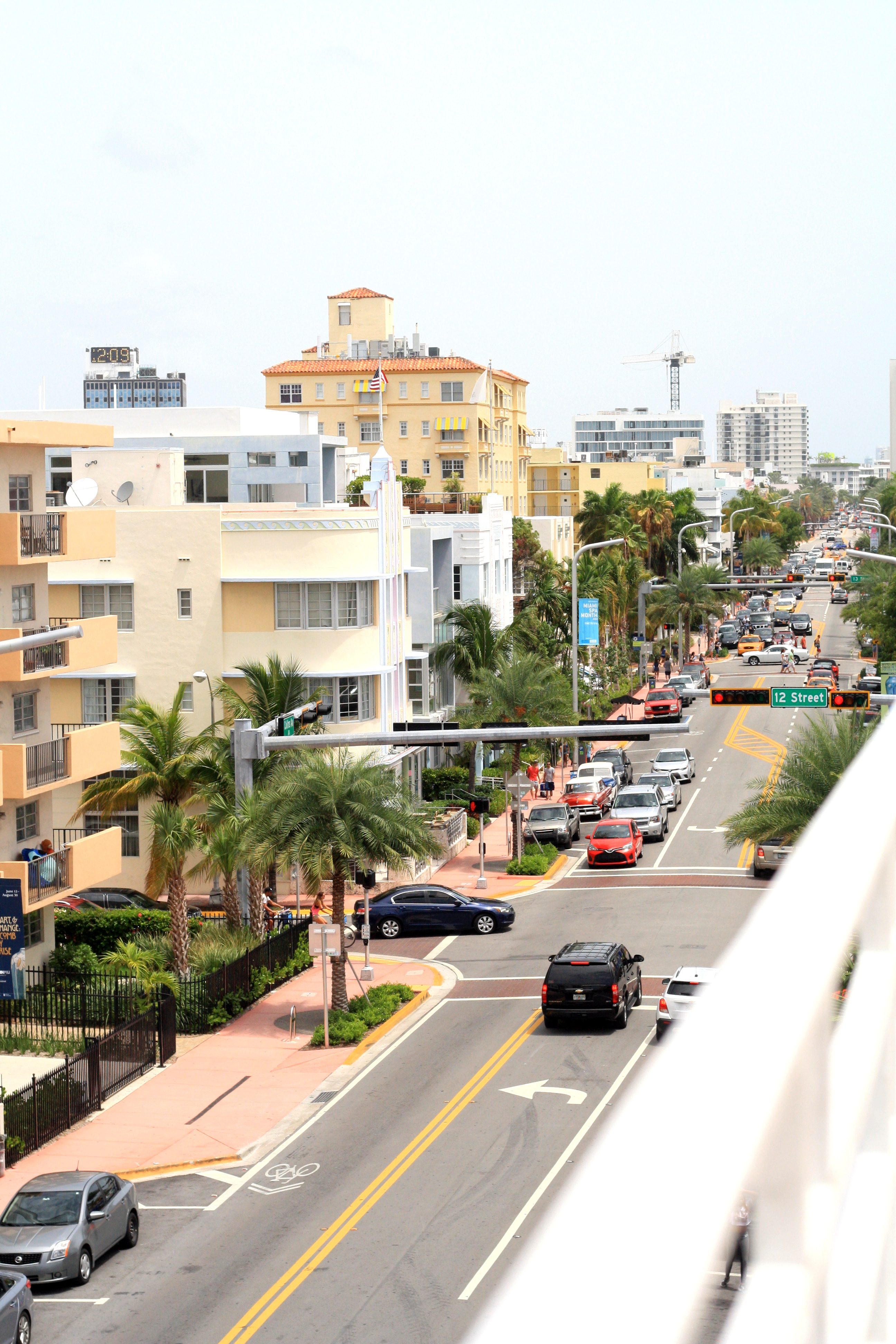
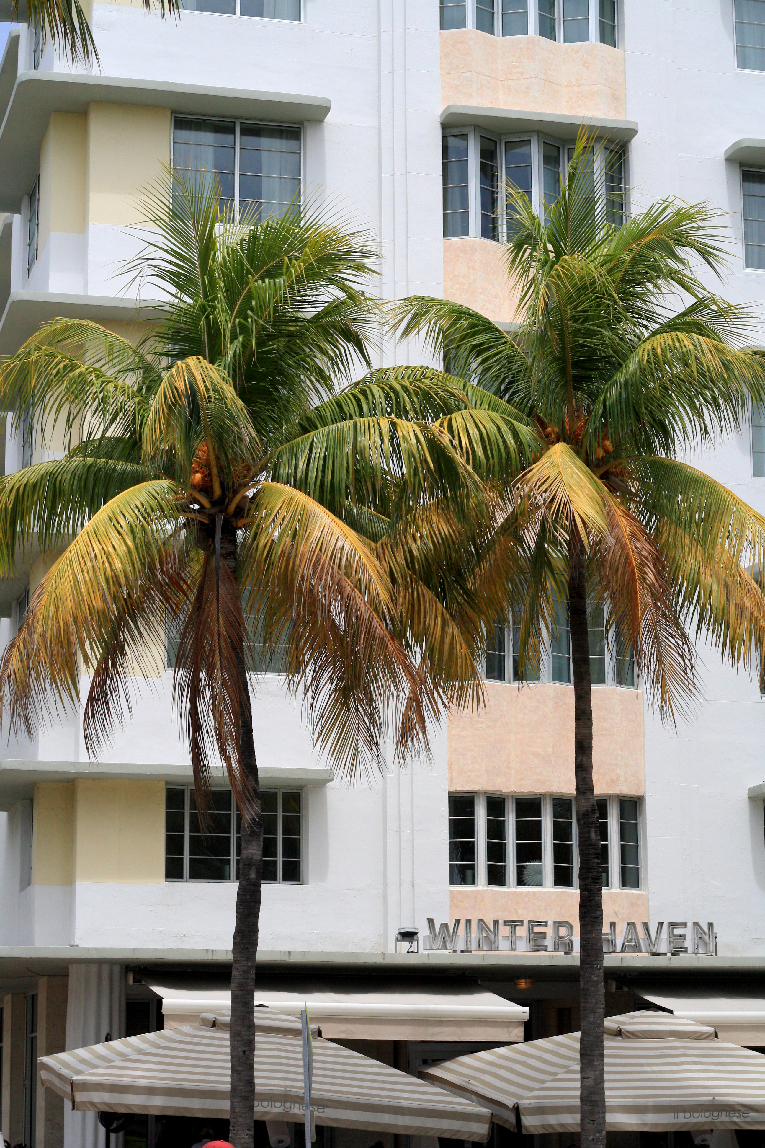
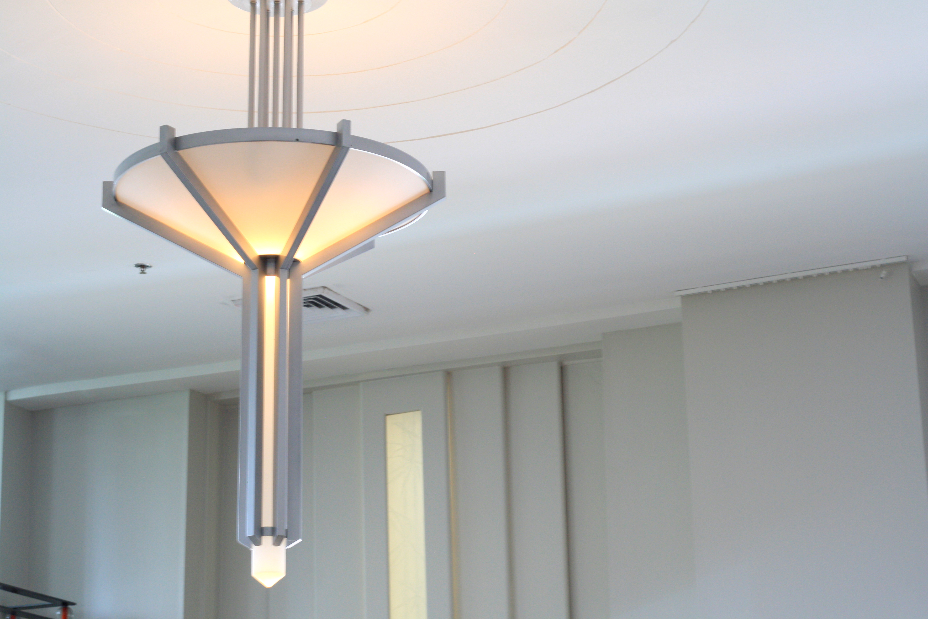
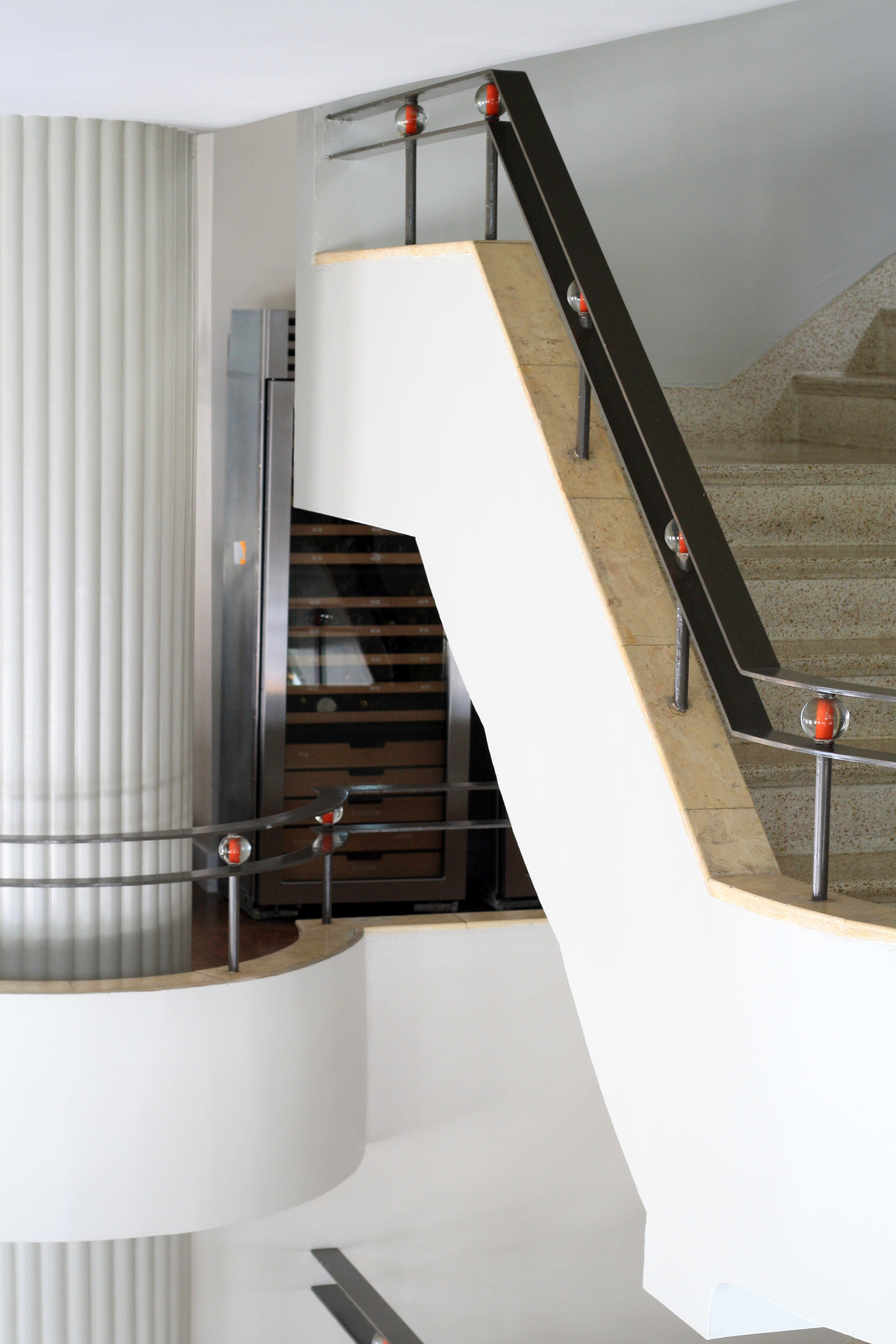
I went to Miami Beach recently for the first time in fifteen years, and one of the highlights of the trip was the Art Deco Walking Tour. One of the most interesting things that we learned is that there are only two places in the world with a high concentration of Art Deco architecture. One is Miami Beach and the other is Napier, New Zealand. Both were devastated by natural disasters around the same time causing them to have to rebuild in the 1930s when the Art Deco style was prominent. Art Deco became popular around the world after the 1925 Exposition Internationale des Arts Decoratifs et Industriels Modernes in Paris. Miami Beach’s Art Deco District was the first 20th century neighborhood to be recognized by the National Register of Historic Places and is the largest collection of Art Deco architecture in the world. Much of the preservation is the work of one woman, Barbara Baer Capitman, who had the realization in the late ’70s that these buildings were worth saving and devoted her life to the cause.

A few details to note on the buildings themselves. The buildings that are completely white are actually more historically correct. When the architects designed these structures they were after a streamlined aesthetic and loved the use of white. They were particularly interested in the play of light on the buildings and the shadows created by the “eyebrows” or overhangs over windows and other sculptural elements such as the ziggurat or stepped rooflines and decorative sculptural panels seen on many of the buildings. Other common themes include symmetry, repeated elements in groups of three, curved edges and corners, and the use of neon lighting.


3-IMG_32312-IMG_3253 4-IMG_3245 5-IMG_3159 6-IMG_3170 7-IMG_3199 8-IMG_3207 9-IMG_3098

Meet Me at Congress Hall

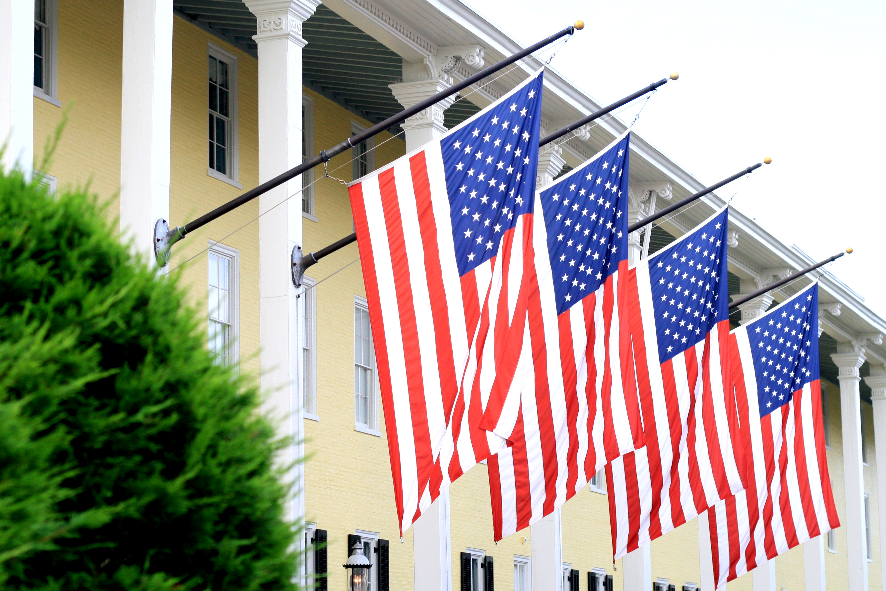
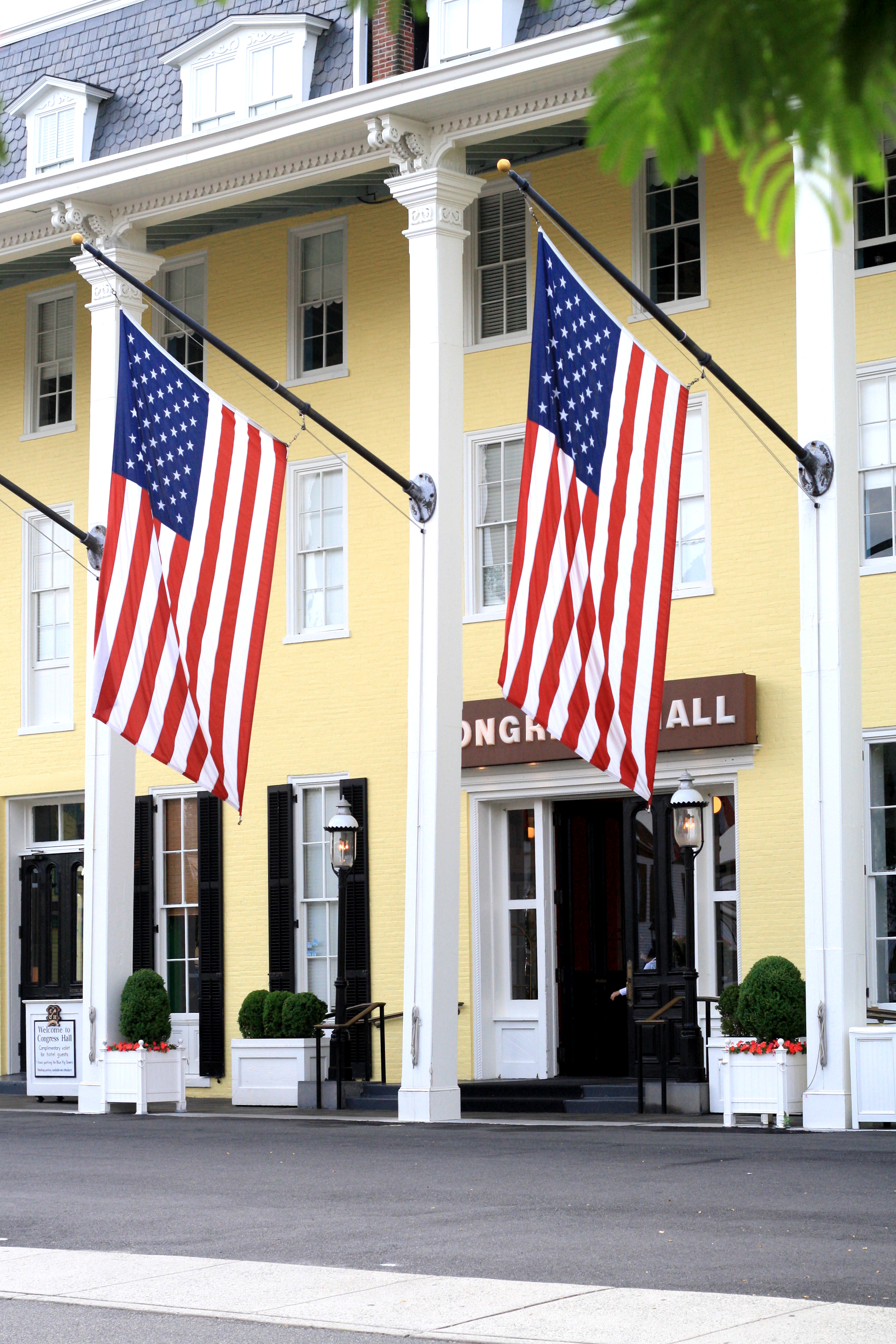
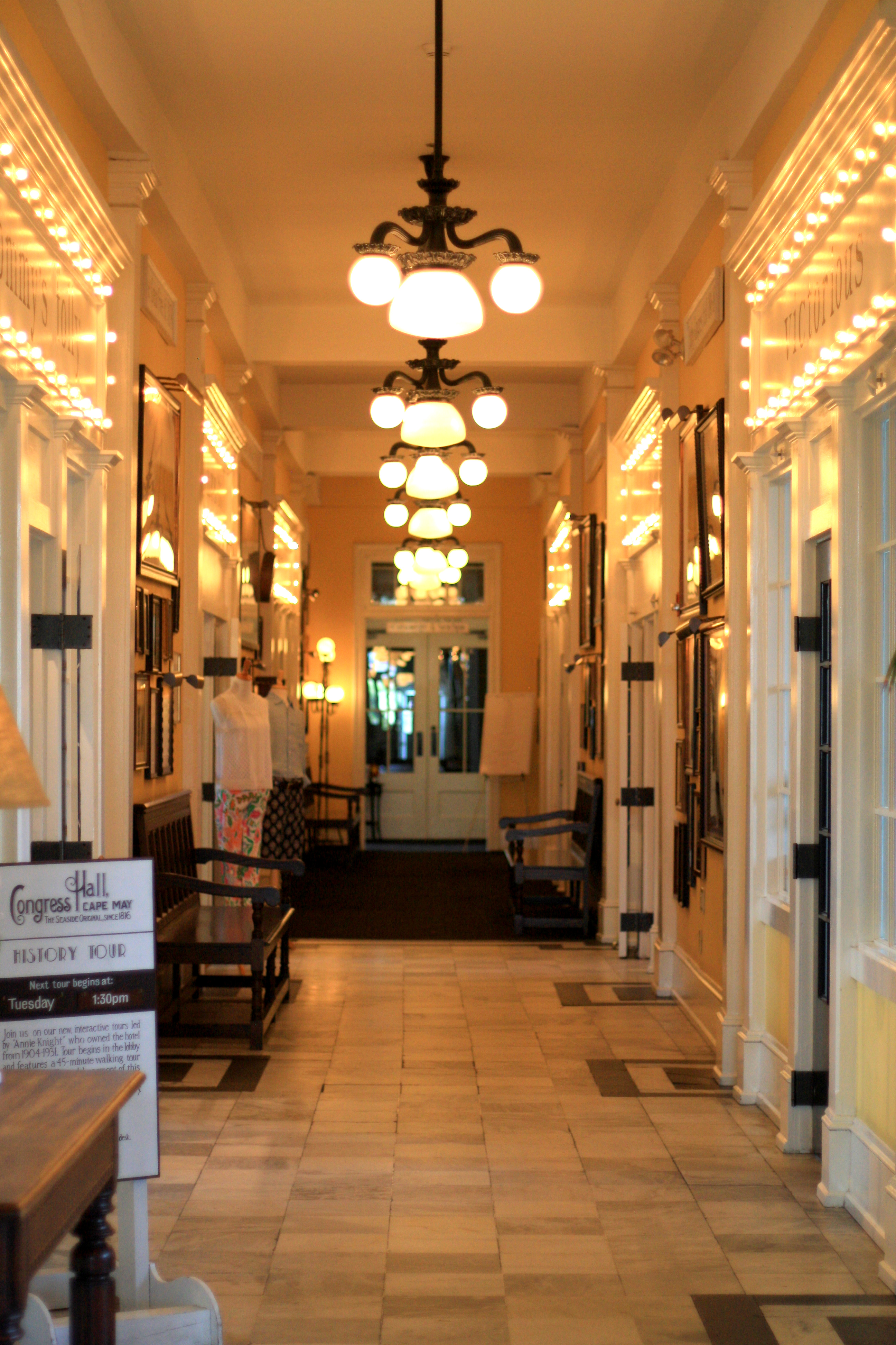
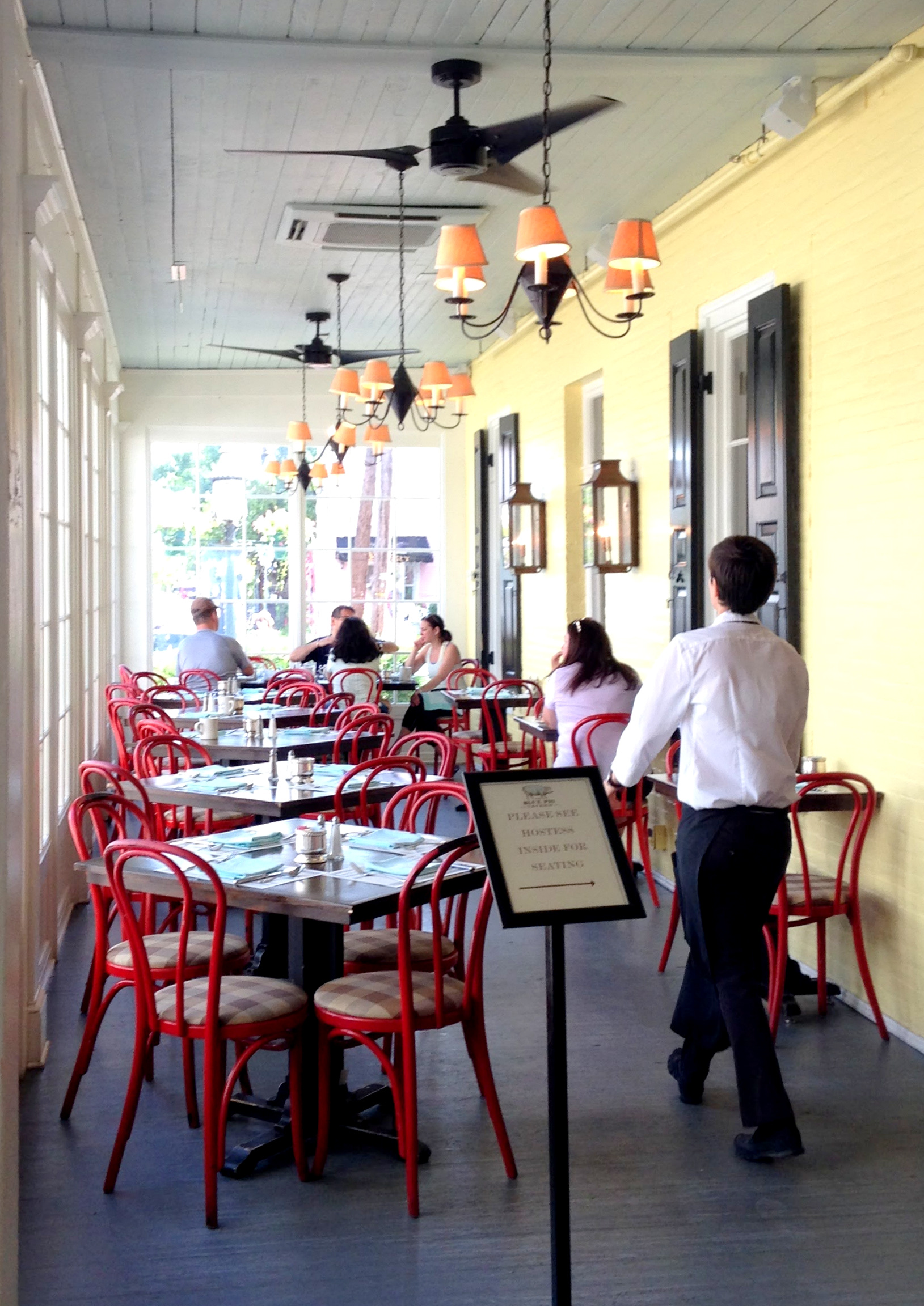
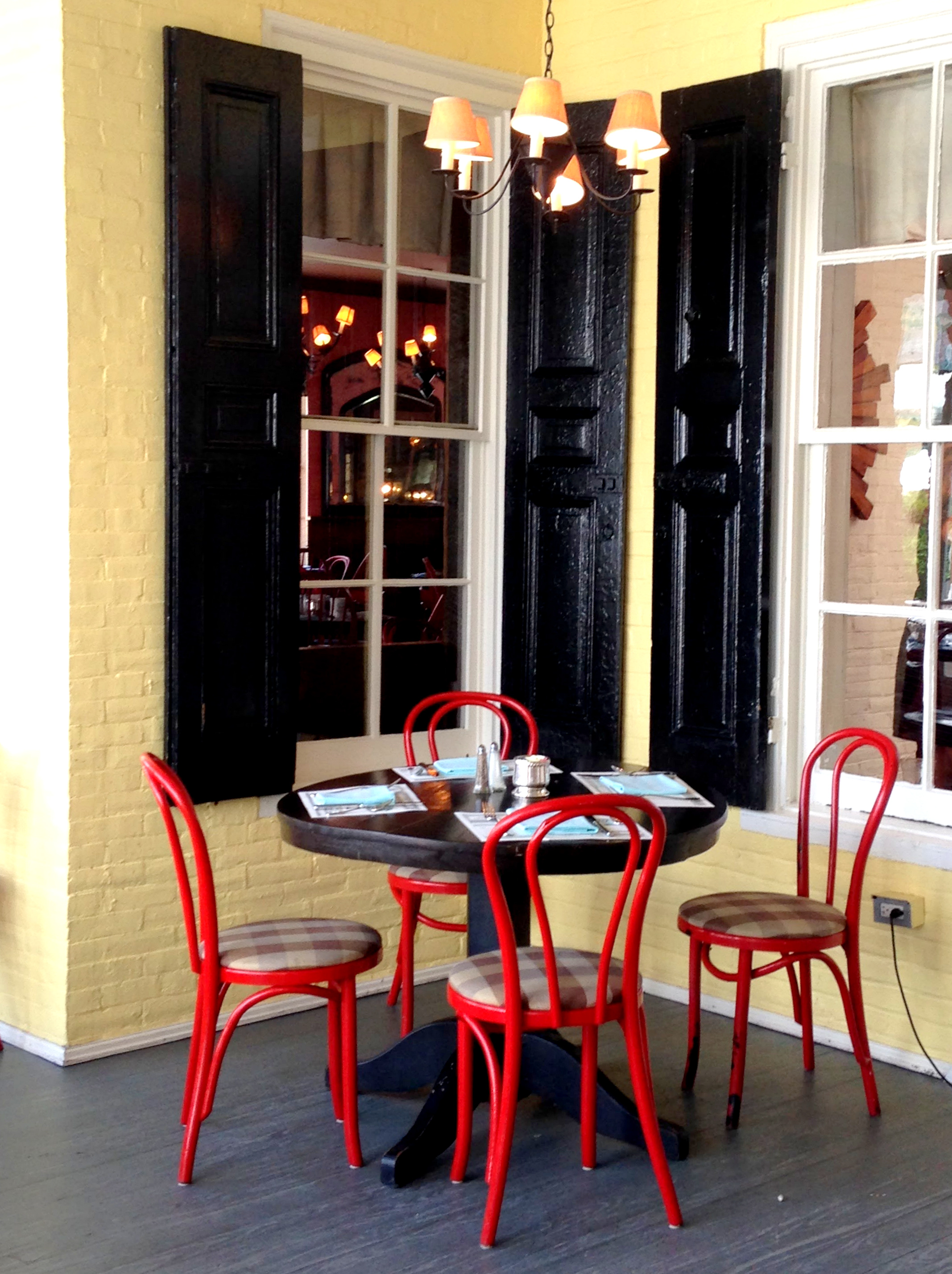
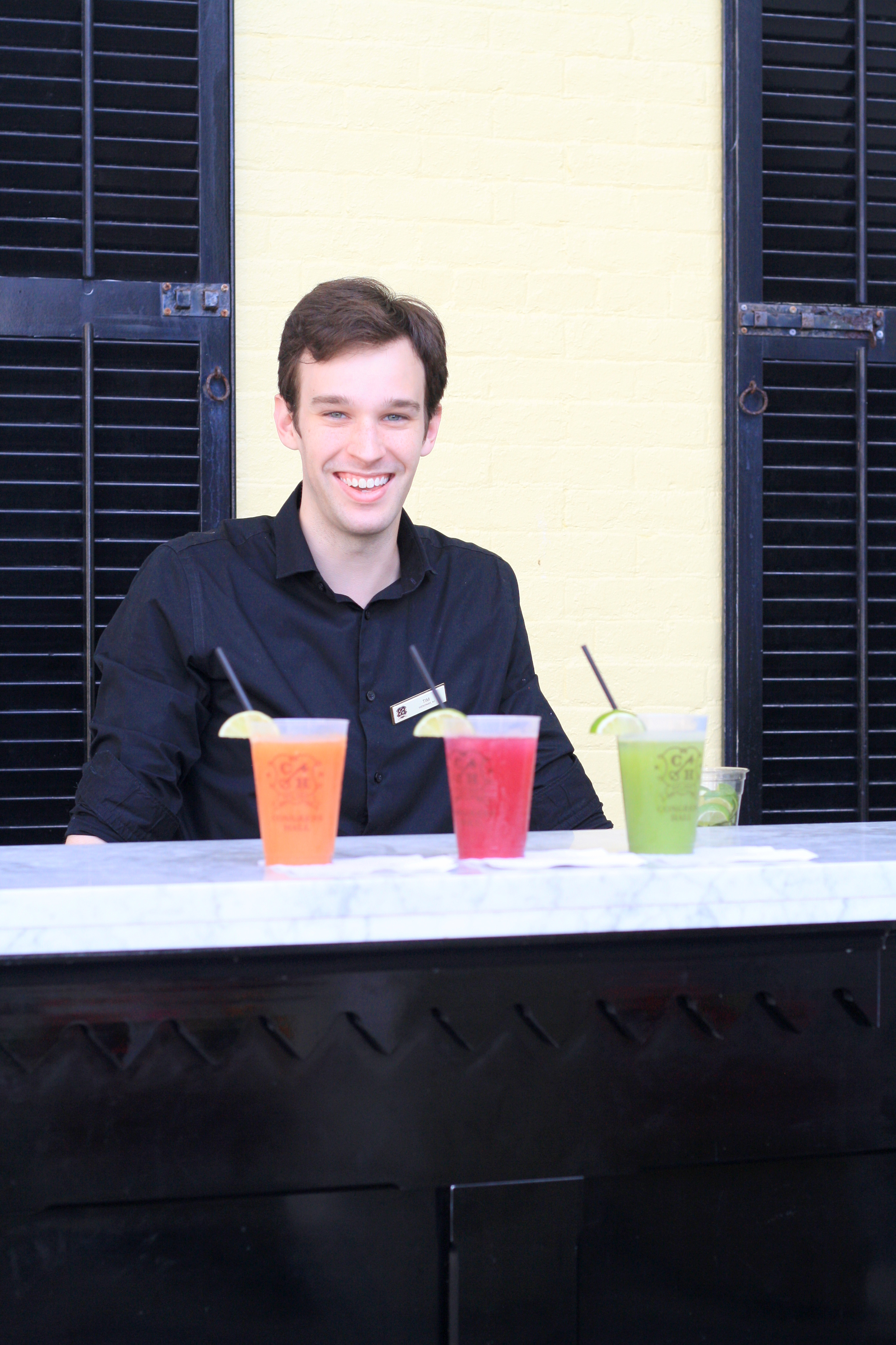
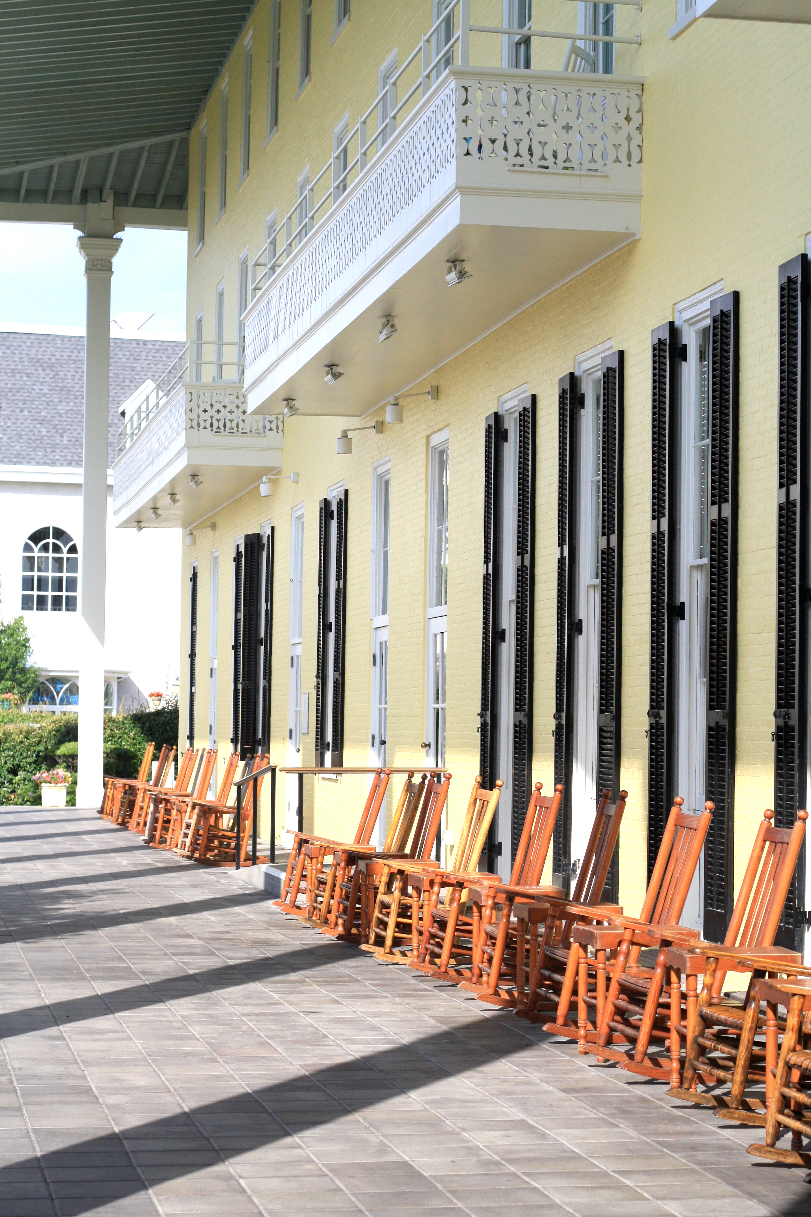
I had the unexpected opportunity to go to Cape May last weekend. If you had asked me two weeks ago about Cape May, I could have told you absolutely nothing. However it is absolutely charming and historic to boot. Cape May is one of the country’s oldest vacation resort destinations. The whole town is a a National Historic Landmark because of the concentration of Victorian buildings.

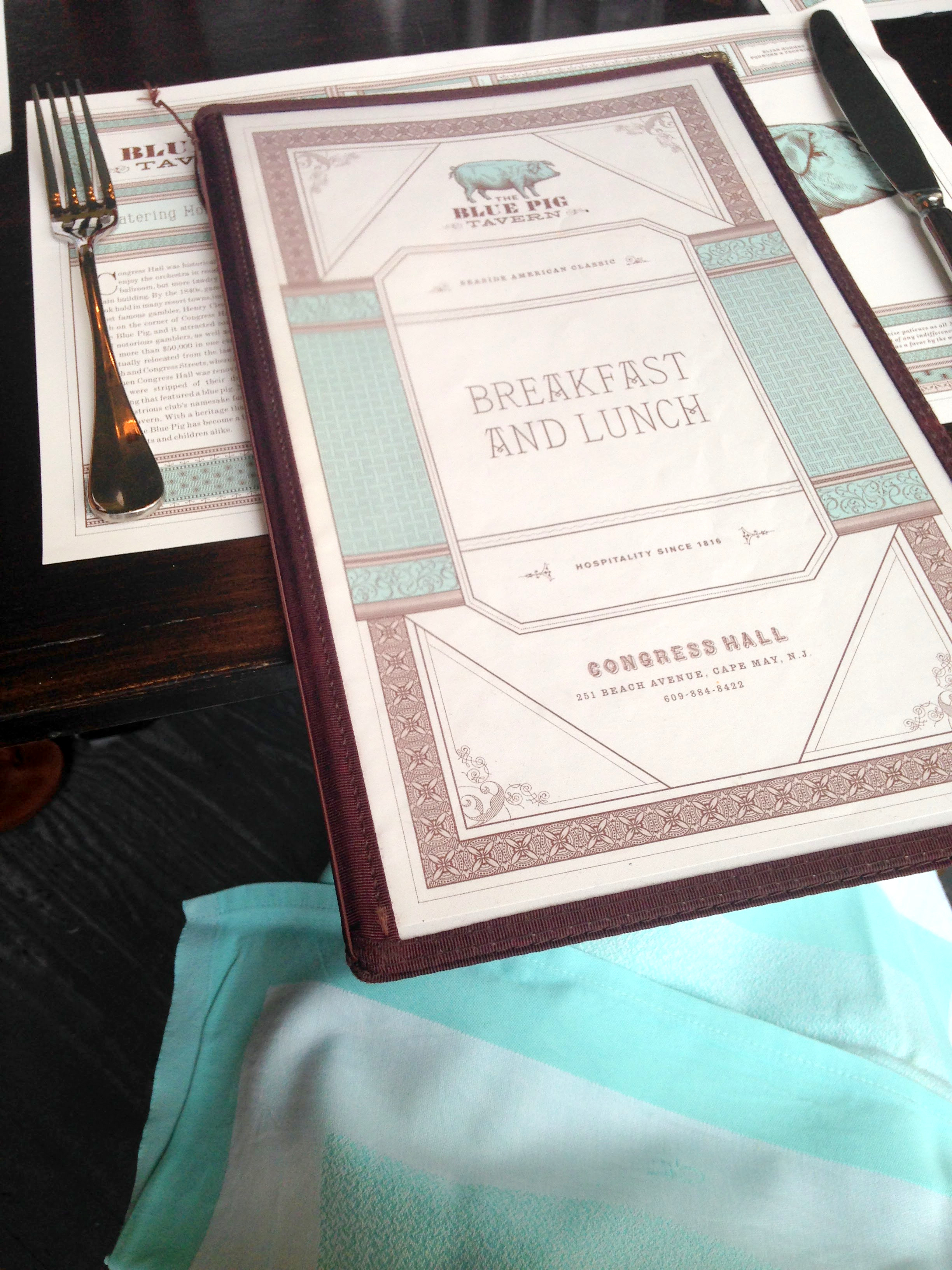
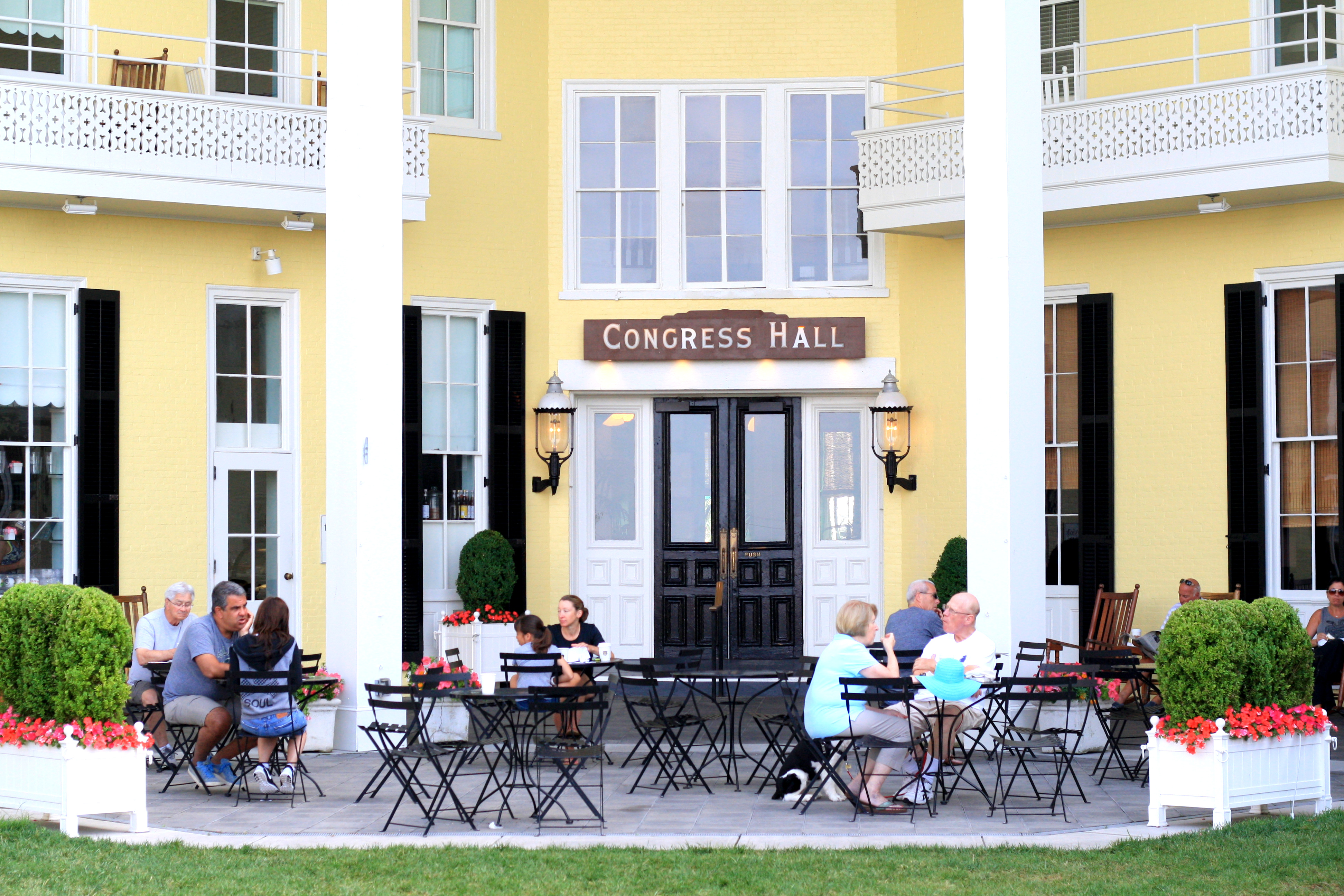
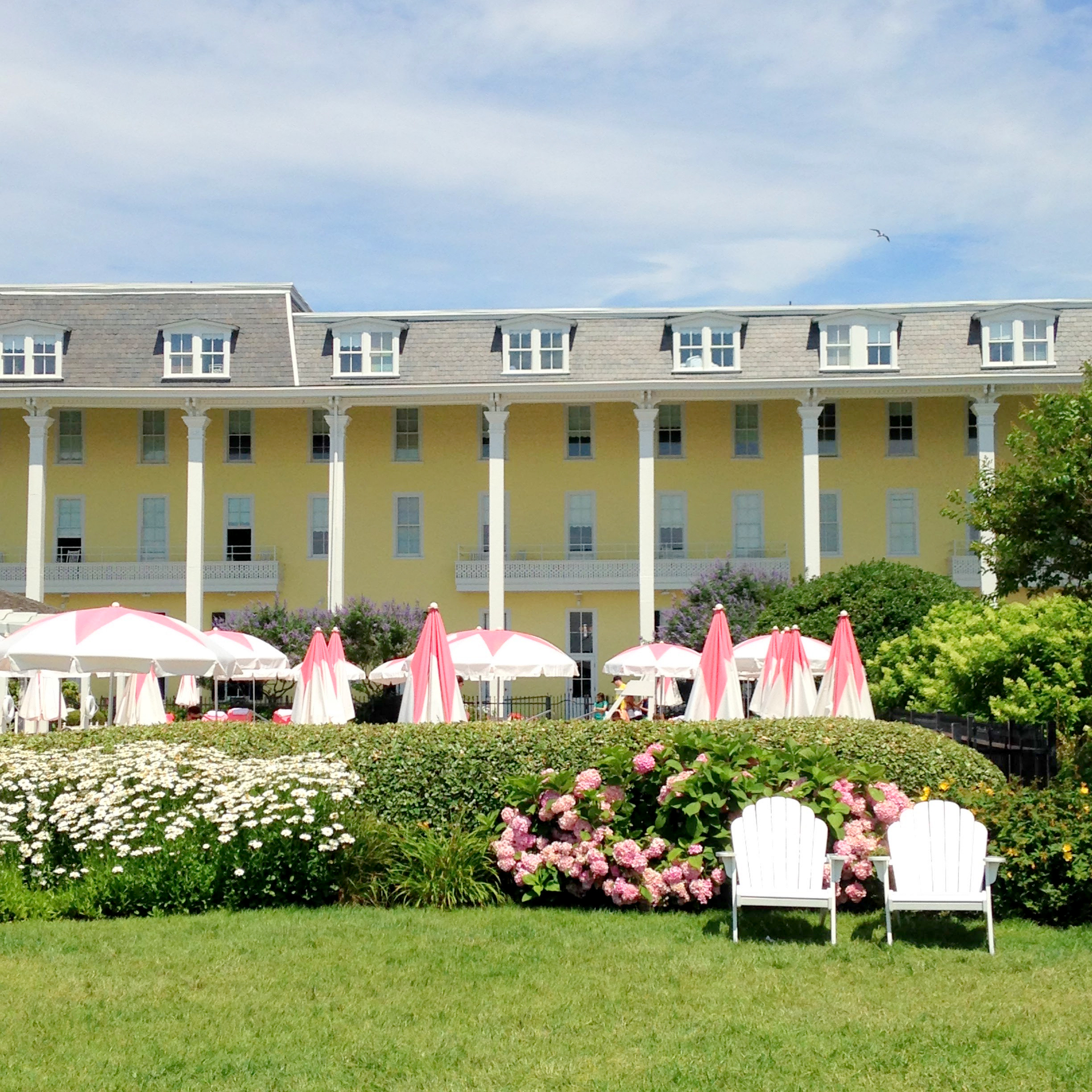
While we stayed in the historic Bradford Cottage on Franklin Street, I spent a day at Congress Hall. Congress Hall is America’s Oldest Seaside Resort. Four different presidents have vacationed there and it was the official Summer White House for President Benjamin Harrison.

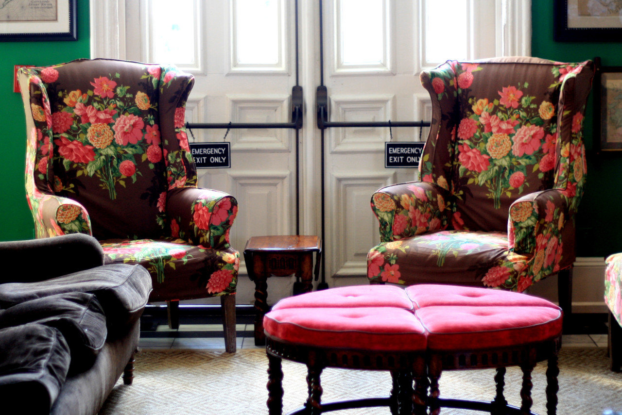
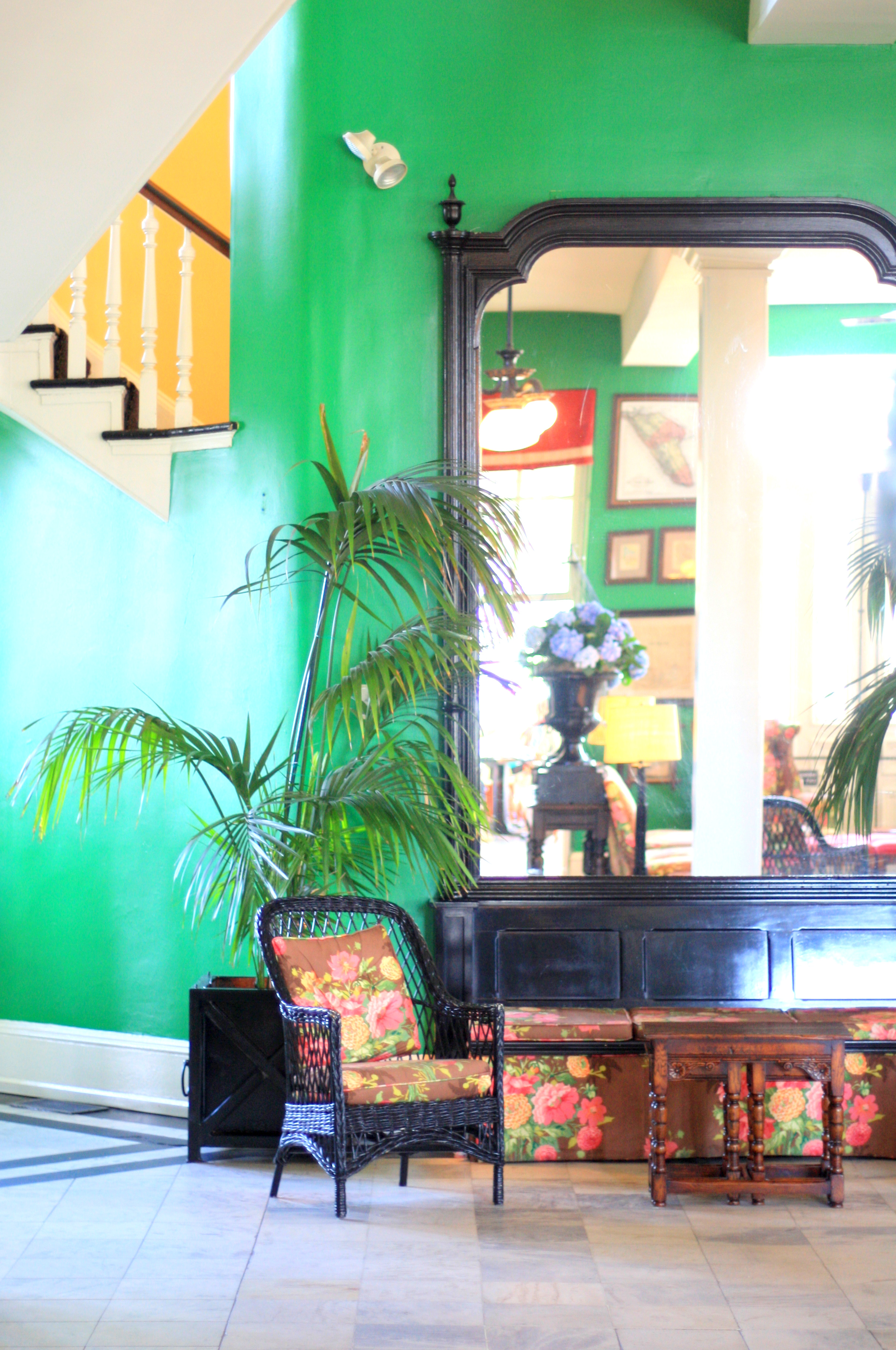
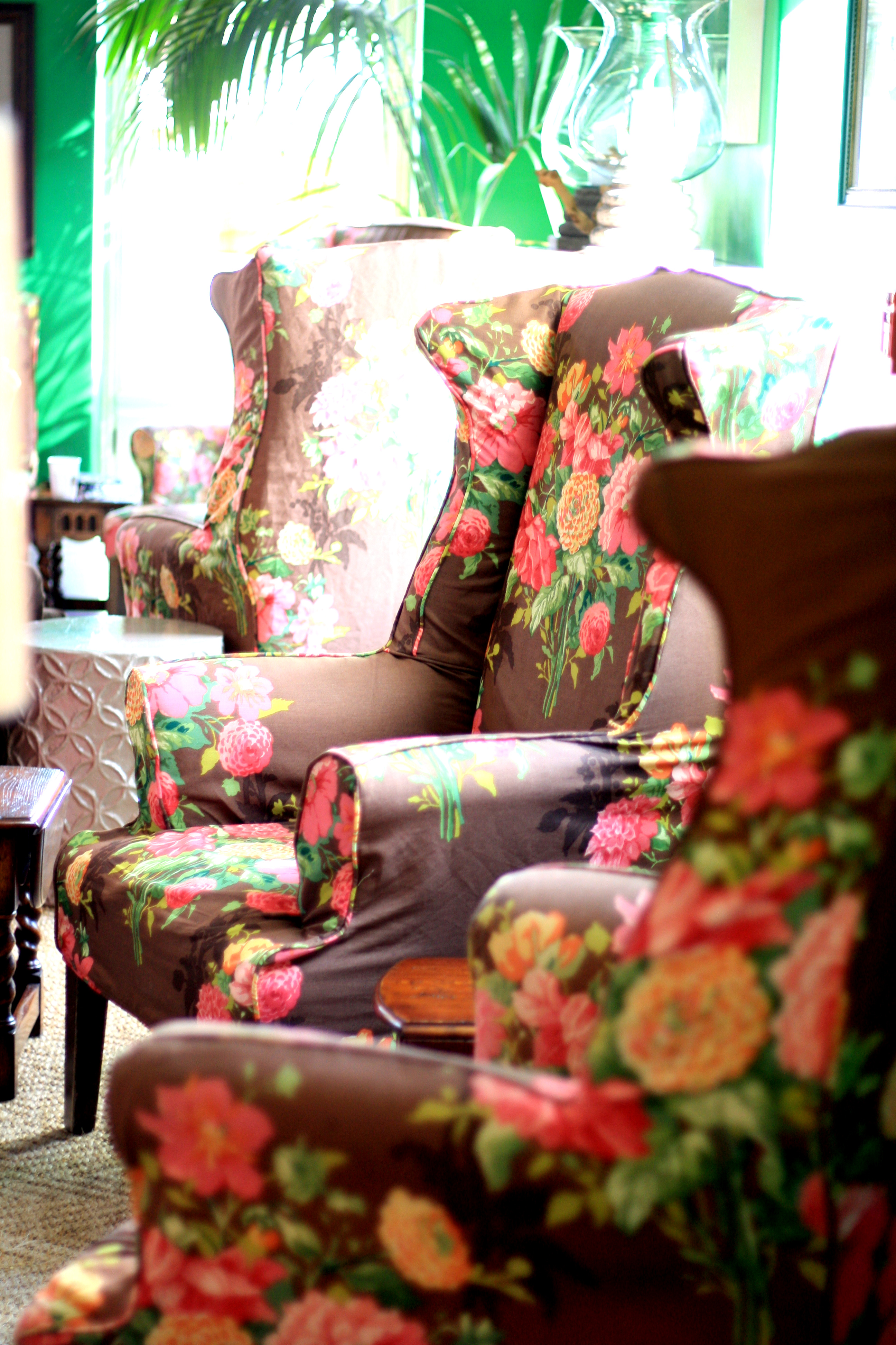
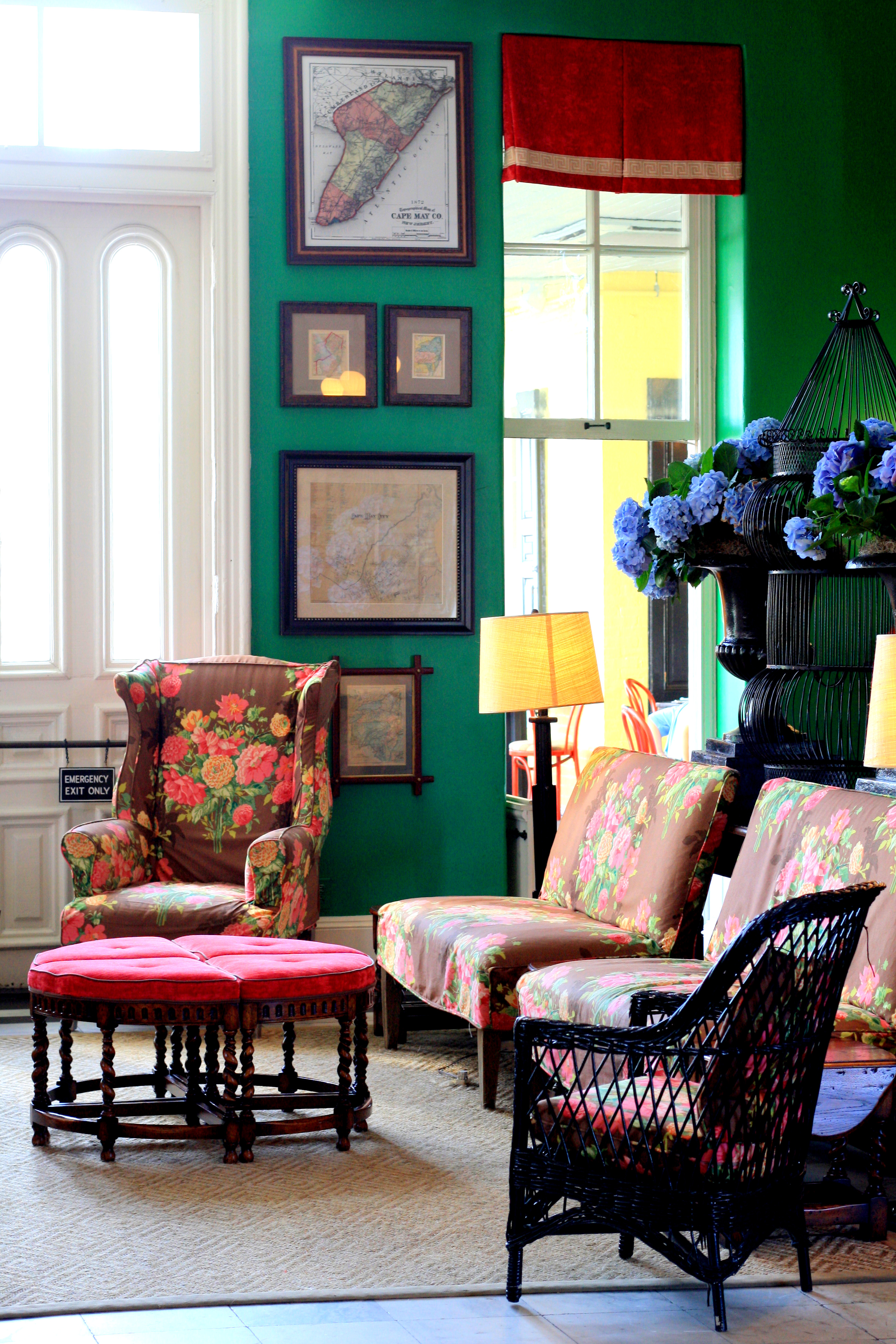
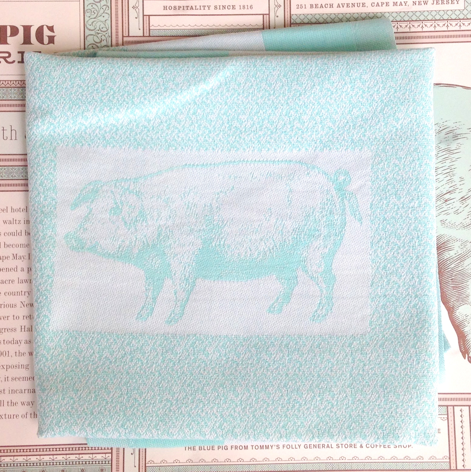
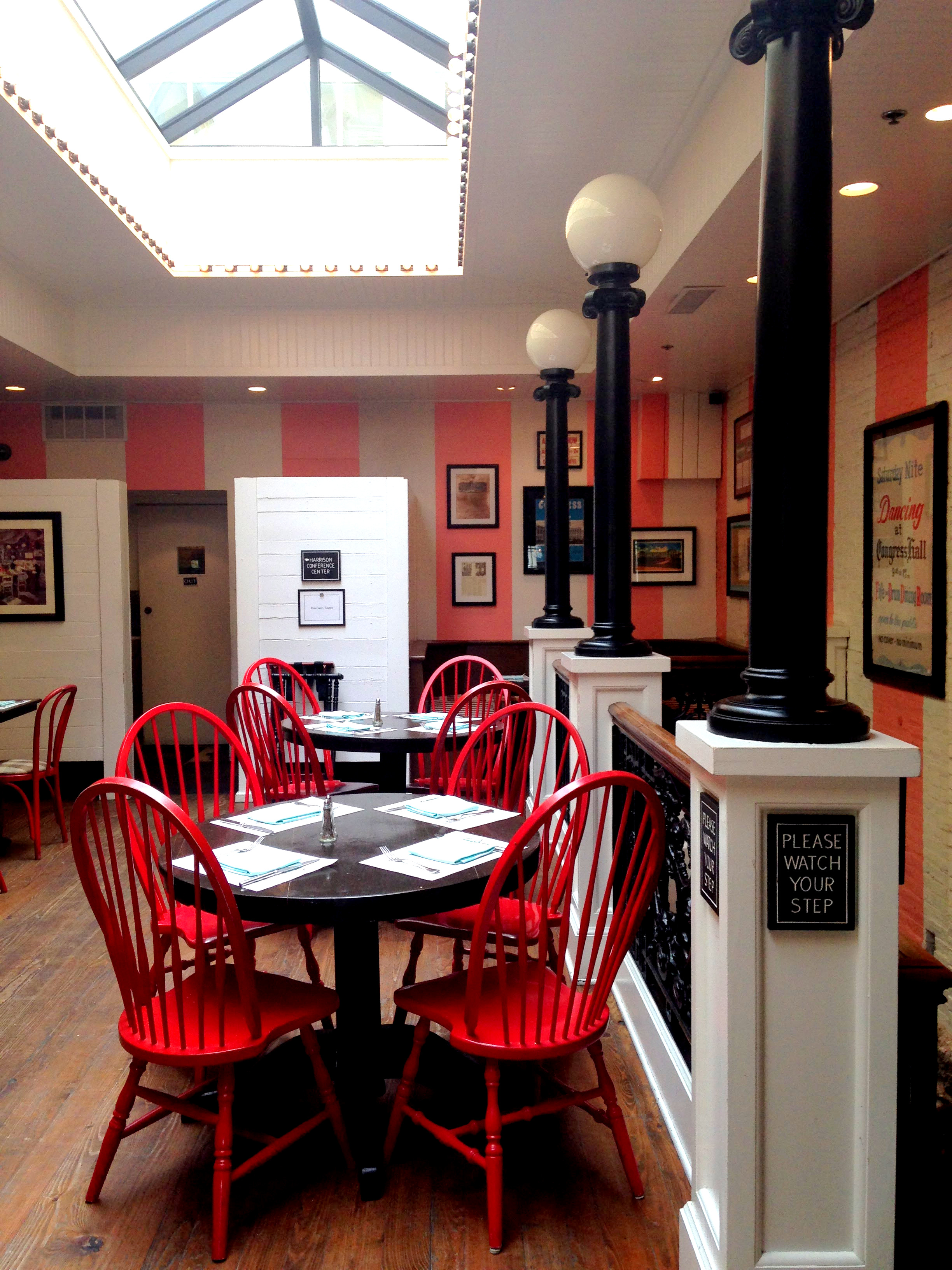
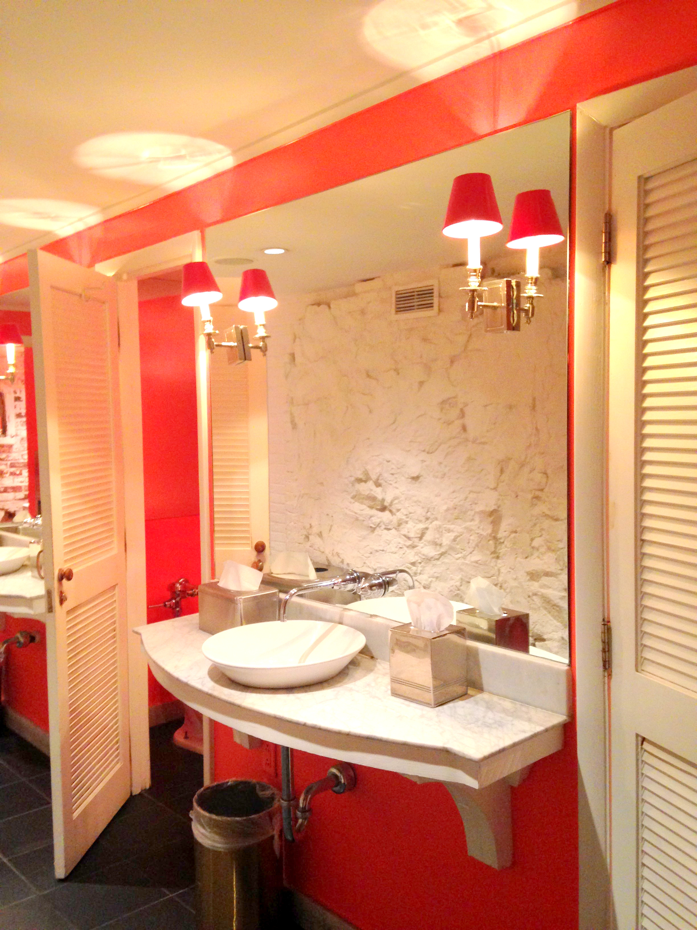
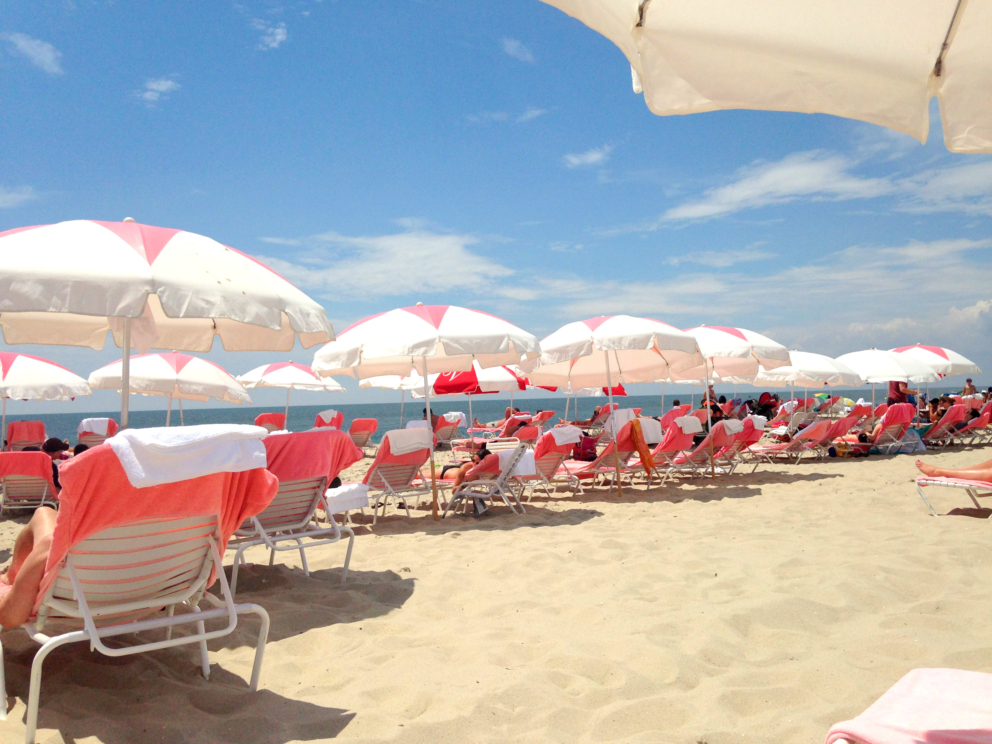
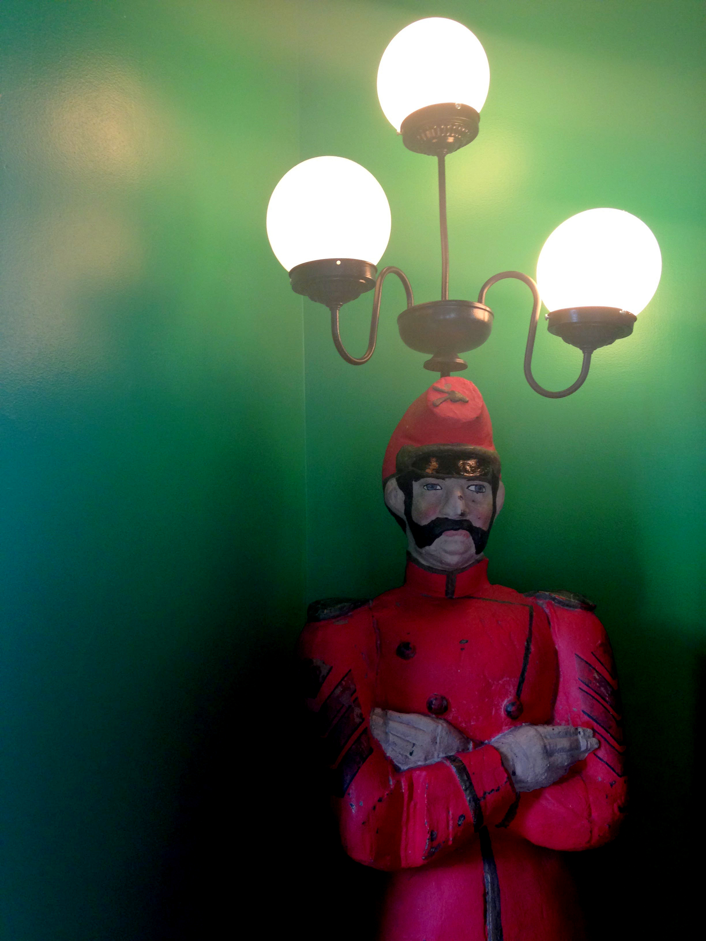
I fell in love – mostly with the colors. The outside of the hotel is the perfect shade of yellow and four enormous American flags greet you upon approach. The lobby is a gorgeous shade of green punctuated by a fantastic floral print. The restaurant, The Blue Pig Tavern, where we had lunch has the cutest napkins in a fabulous shade of light blue. Congress Hall also has it’s own farm, Beach Plum Farm, which harvests the most delicious tomatoes I’ve ever tasted. I highly recommend the BLT – perfect for a post beach snack. On the beach, you have the choice of a gorgeous yellow and white striped tent or chaise lounges and umbrellas with a pink star. The hotel definitely has me rethinking my use of color. Often times I tend to favor neutrals, but I was amazed to see how well a multitude of vastly different colors paired so fabulously together.

35-IMG_217220-IMG_222708-IMG_231912-IMG_237810-IMG_234321-IMG_233814-IMG_242515-IMG_242913-IMG_239711-IMG_236032-IMG_451223-IMG_445029-IMG_449524-IMG_445528-IMG_449330-IMG_449931-IMG_450205-IMG_228607-IMG_231106-IMG_230125-IMG_445917-IMG_247726-IMG_448416-IMG_2458

Entryways: A comparison

One of my favorite things to do is walk around neighborhoods. One of the things I absolutely loved about London was how much fun it was to walk around various different neighborhoods, and it’s part of the reason I fell in love with the city from the get go.

Since being back in the States, I’ve been thinking a lot about what made walking around London so pleasurable, and I’ve decided that Londoner’s think a lot about curb appeal making the streets particularly nice for passersby.

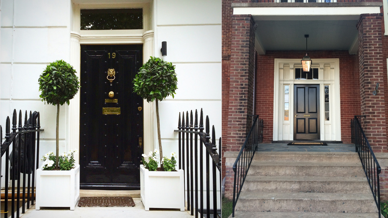
To illustrate my point, I thought I’d do an old-school art history-style slide comparison. On the left, you see a well appointed townhouse in the Chelsea neighboorhood of London. On the right, you see a townhouse from the historic district in the town where I live.

Let’s start with the similarities, first both townhouses have steps with wrought-iron railings that lead up to a dark door with a white, architectural surround. Each surround has faux columns and a transom above the window. Each door is painted and has brass hardware. As you can see, each door is quite similar and both are working with similar bones. However, the Chelsea door is much more inviting.

The first thing that makes the Chelsea door more inviting is the addition of plants. They add a little liveliness to the door that says someone lives here and offers a nice subtle softening to the entrance as well. I like the choice of white planter boxes as it reiterates the white of the walls and the steps. On the right door, there are no plants welcoming you to the front of the house, and as this porch is slightly bigger, it makes the space feel cold and empty.

The second thing to note on the Chelsea entrance is the door itself. First, the high gloss paint serves to catch your attention and give you a focal point as you approach the door. I also like the subtle rivets on the door as they make a traditional door slightly more interesting. Second, the brass hardware is more substantial and more numerous than on the historic home on the left. I think the addition of the doorknocker and the house number are quite important. The door number ensures that guests immediately feel comfortable as their is no confusion that they are in the wrong place. The doorknocker, with it’s lion theme, shows us a little bit about the personality of the owners even before we enter their home. I find the hardware on the Chelsea door to be much more successful, almost like well-chosen jewelry on an outfit. It adds refinement and a subtle sheen that elevates the whole look.

Finally, there is a cohesion to the Chelsea entrance that the historic home just doesn’t have. The Chelsea entrance uses the power of repetition to make the entrance pleasing. The black is repeated on the door, the railings, and the light fixture. The white is repeated on the walls, flowers, planters, and steps. The brass is repeated on the door. On the historic home, there is no sense of repetition and materials seem to be used willy nilly. The steps are different from the landing, which is different from the walls. Another thing that adds to the cohesion of the Chelsea entrance is the use of quality materials across the board. The steps are marble, the railings are thick, the brass is heavy. While you can tell many quality materials were used on the historic home, the cement steps, flimsy railings, and barely-there door hardware take away from the appeal of the beautiful door and surround.

What I ultimately love about the Chelsea entrance is the fact that it seems to welcome you inside. You simultaneously know where you are headed and that you will be taken care of once you get there. There is something that puts you at ease as you approach the London door, whereas there is a slight apprehension as you approach the American home. Are you in the right place? Will you make it up the steps? Are these people friendly? These are not questions you want guests to your home to ask on approach. You want your guests to have a sigh of relief as they have made it to their destination, and they know there is refreshment, relaxation, and friendship waiting for them on the other side of the door.

Have you come across any particularly appealing entryways recently? Is your own entryway more like the one on the left or the right?
The Pink Table

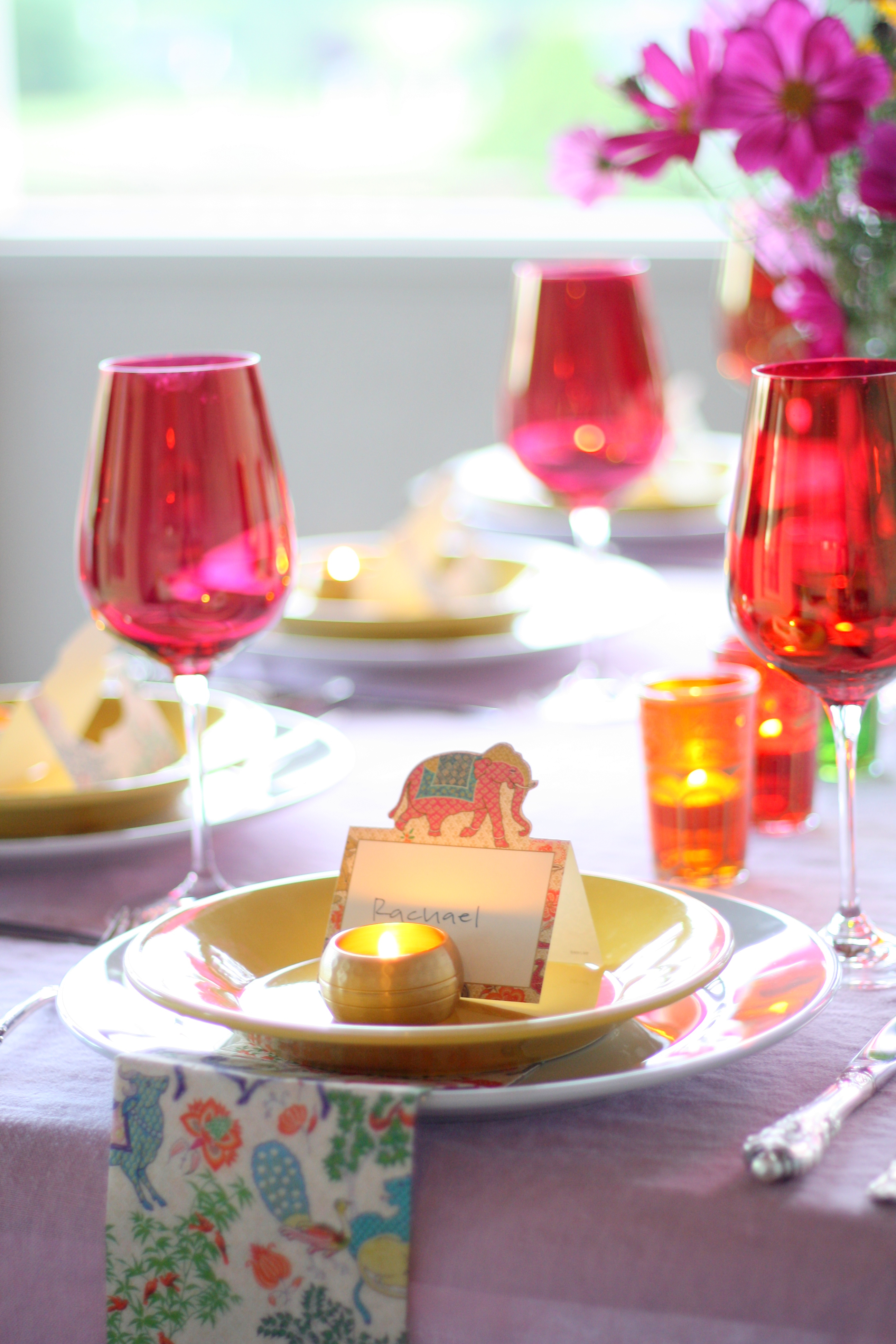
Over the summer, my friend Lindsey sent me a link. It was the kickstarter video for the The Yellow Table Cookbook by Anna Watson Carl. In her video, Anna tells a story about seeing a sign that says, “you can make a wish or you can make it happen,” which prompted her to start working on her dream, a cookbook. After I watched the video, I emailed Lindsey and said, “her video makes me want to have a dinner party.” She replied, “do you want to!?” Me: “Yes!!!” It took us several weeks, okay months, to get it together, but here before your very eyes is our own iteration of The Yellow Table. I was responsible for the decor and Lindsey cooked all the food using recipes from The Yellow Table.

The Menu

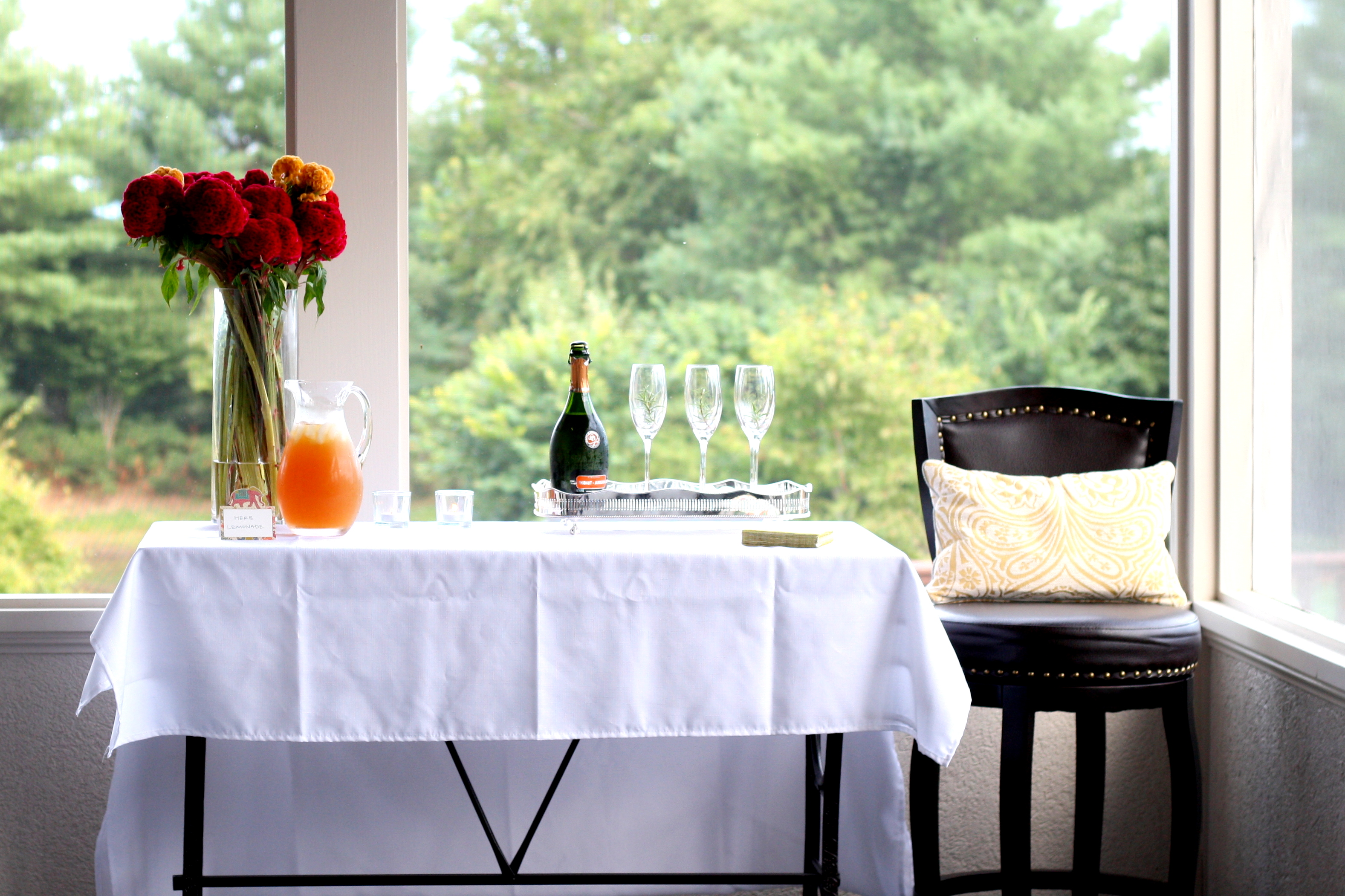
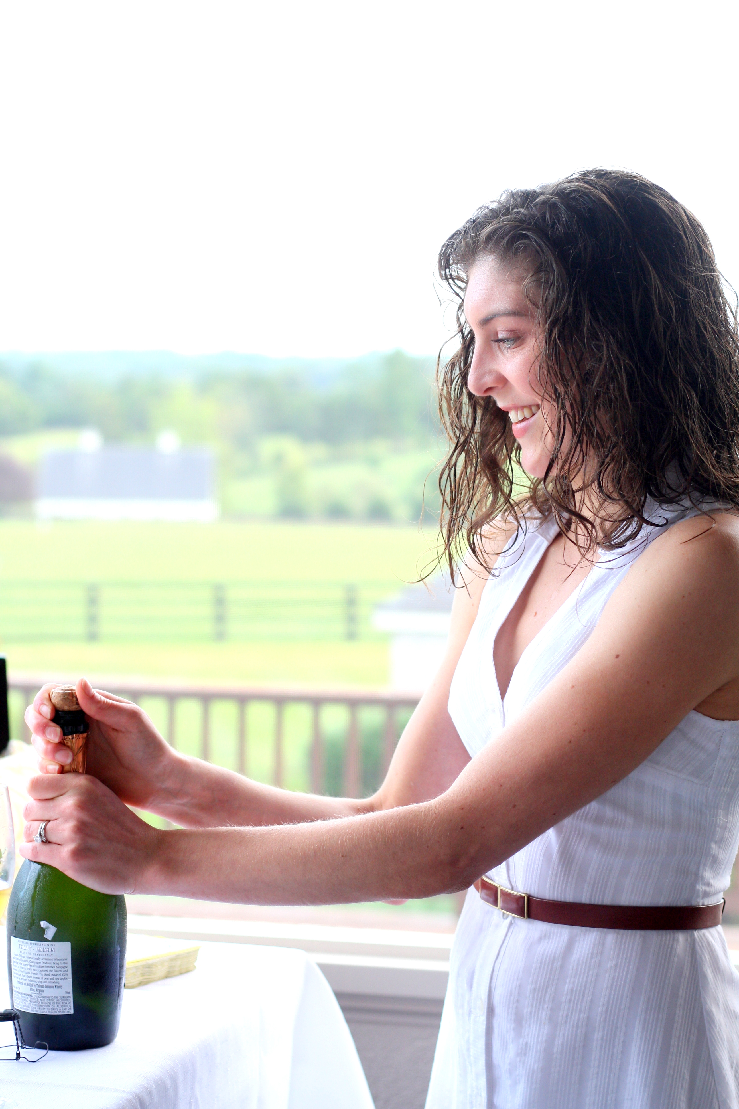
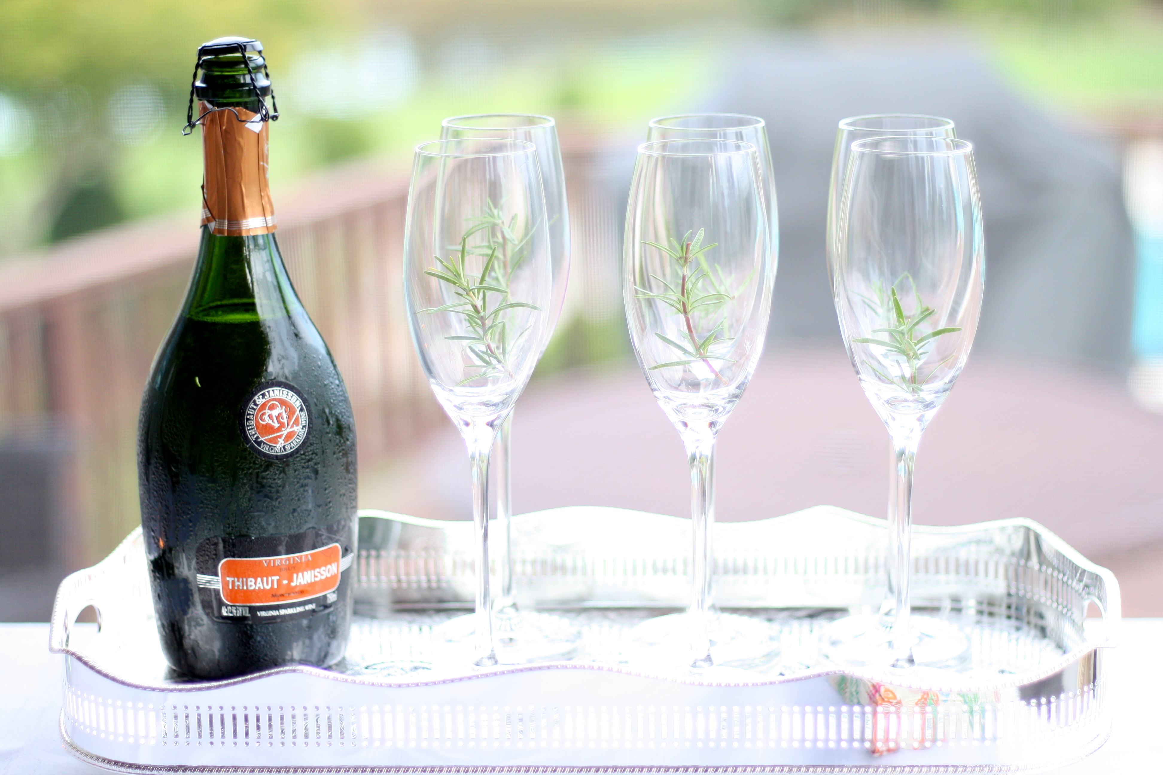
Rosemary Lemonade with  Thibaut-Janisson Blanc de Chardonnay sparkling wine

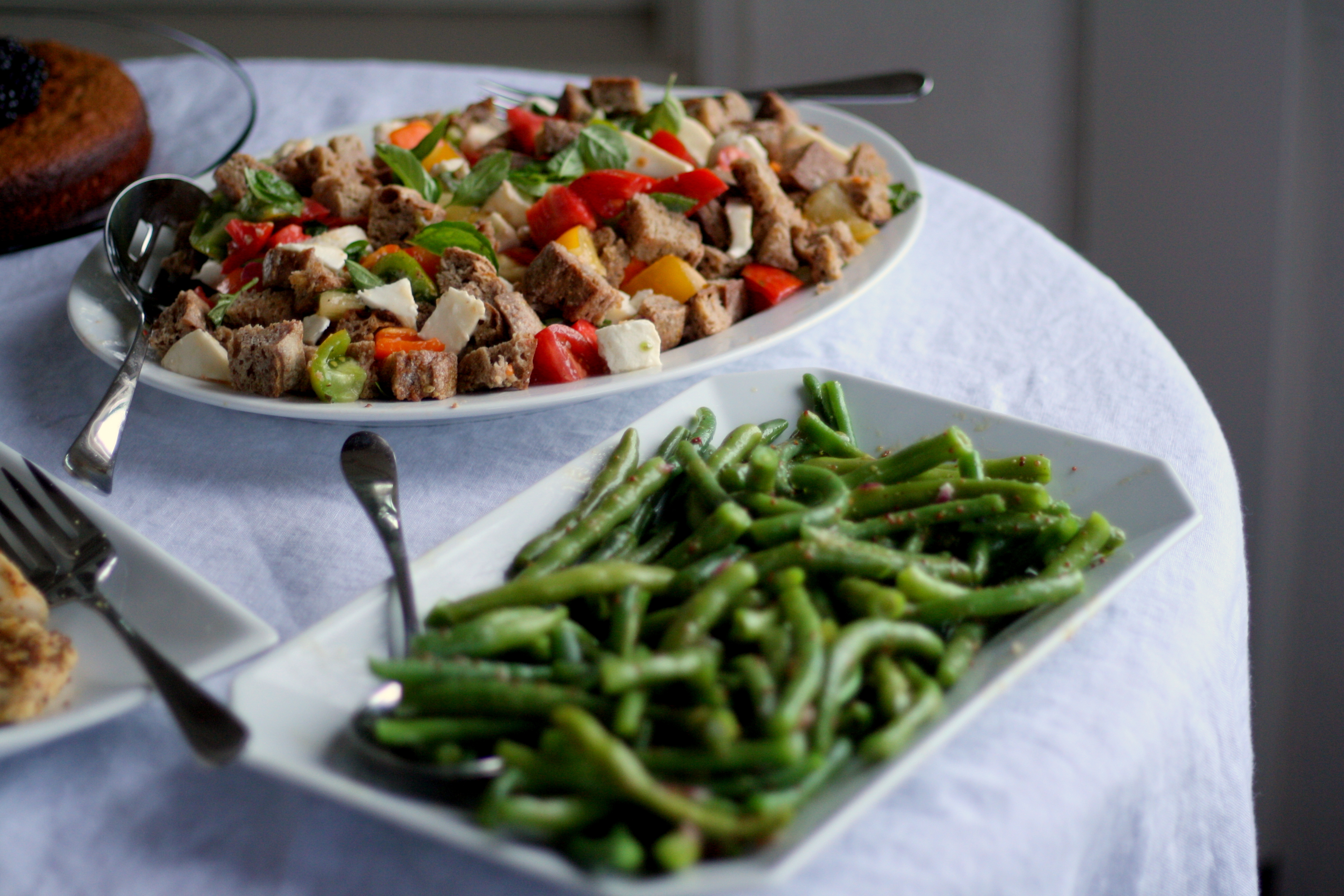
Heirloom Tomato Panzanella

Haricots Verts with Dijon-Shallot Vinaigrette

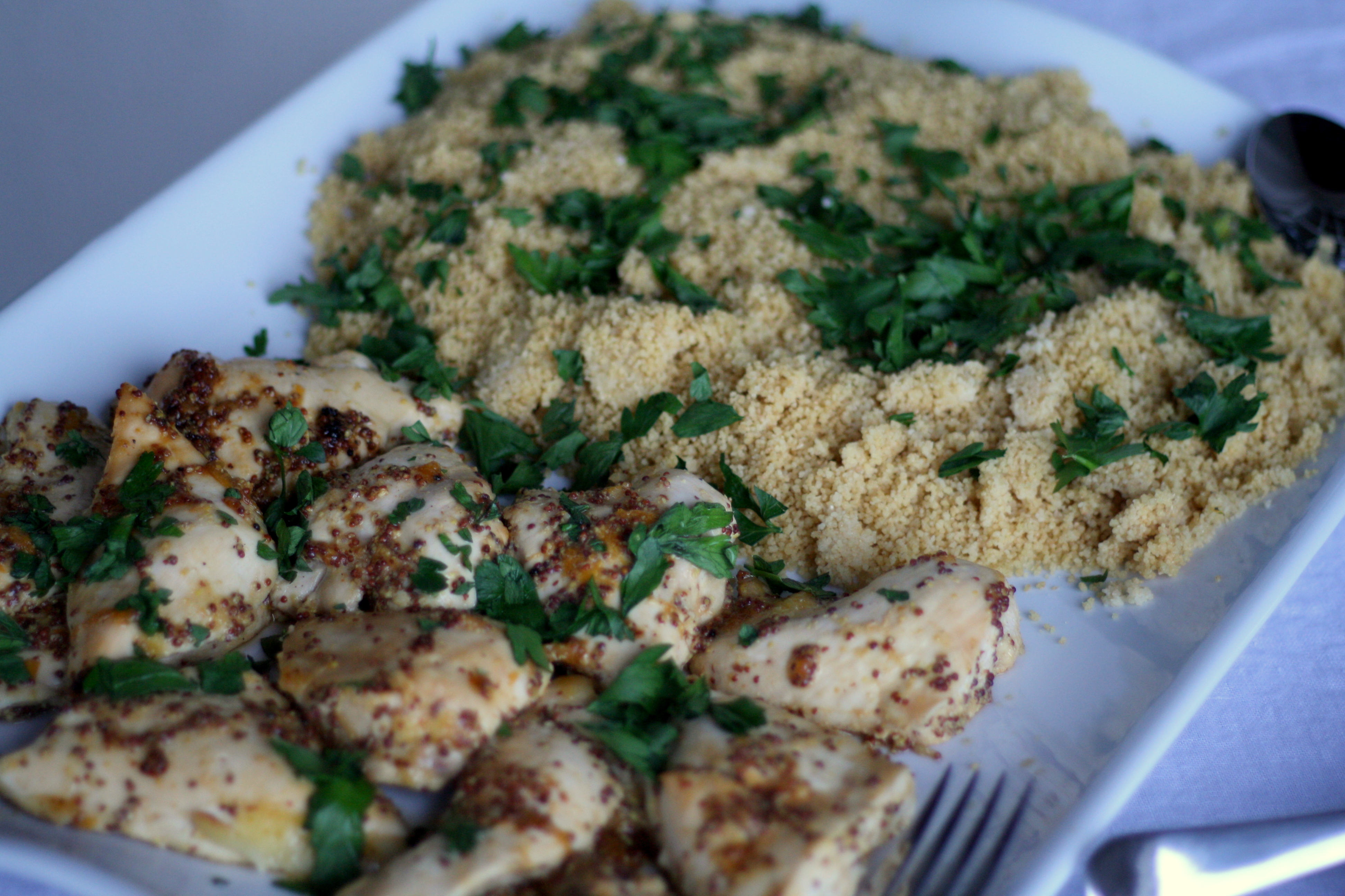
Apricot-Dijon Roasted Chicken with Couscous

Gluten-Free Almond Cake with Lavender Honey

The Decor

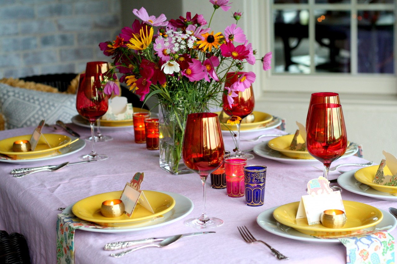
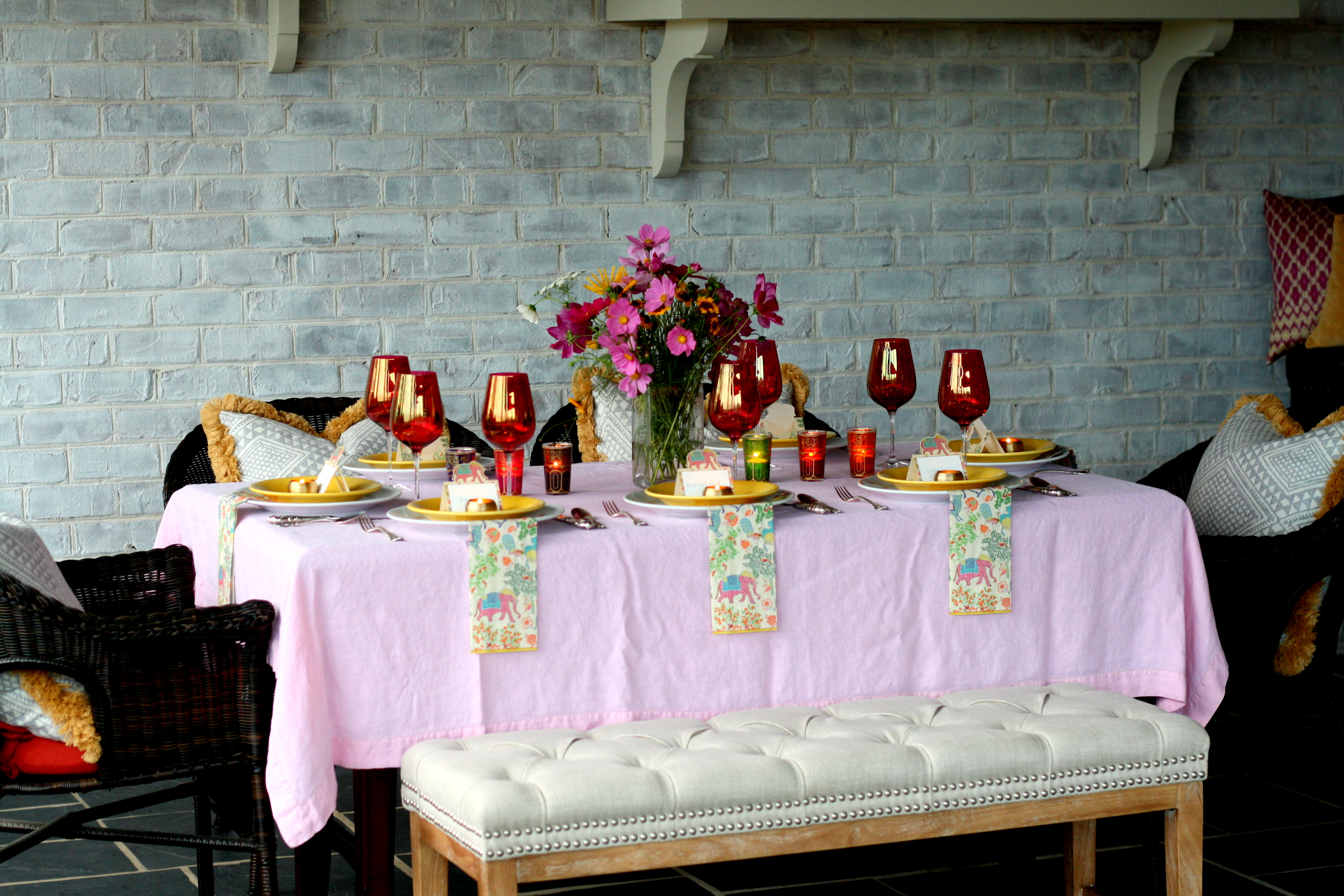
For the table, I wanted something girly with a slight Moroccan theme to match the food. My hope was that our friends would feel special and inspired, and I hoped that the calm setting and good food would spark conversation about what we wanted to make happen in our lives. This was the first time I’d thrown a “proper” dinner party with invites, place cards, a signature drink and more than one course! It was definitely worth the extra effort. I felt so proud, and I’m so glad to have these photos to share with you. My favorite part of the evening was when everyone showed up dressed to the nines. We hadn’t put a dress code on the invite, but everyone felt like dressing up and it really added to the festive vibe of the evening.

Have you ever thrown a proper dinner party? What was it like?
 

IMG_0947IMG_0911IMG_1025IMG_0938IMG_1026IMG_0970IMG_1032IMG_1005


[Pier 1 Pillows // Pink Linen Tablecloth // Moroccan Tea Glasses // Pier 1 Bench // Caspari Le Jardin de Mysore Place Cards // World Market Napkin Rings // Pier 1 Yellow Salad Plates // Apilco Tradition Dinner Plates // Caspari Le Jardin de Mysore Paper Guest Towels // Sir Christopher by Wallace Silverware]