Gifting for the Humble Abode

Gift Guide 2017 - Home

1//2//3//4//5//6//7//8//9//10//11//12//13//14//15//16//17//18//19

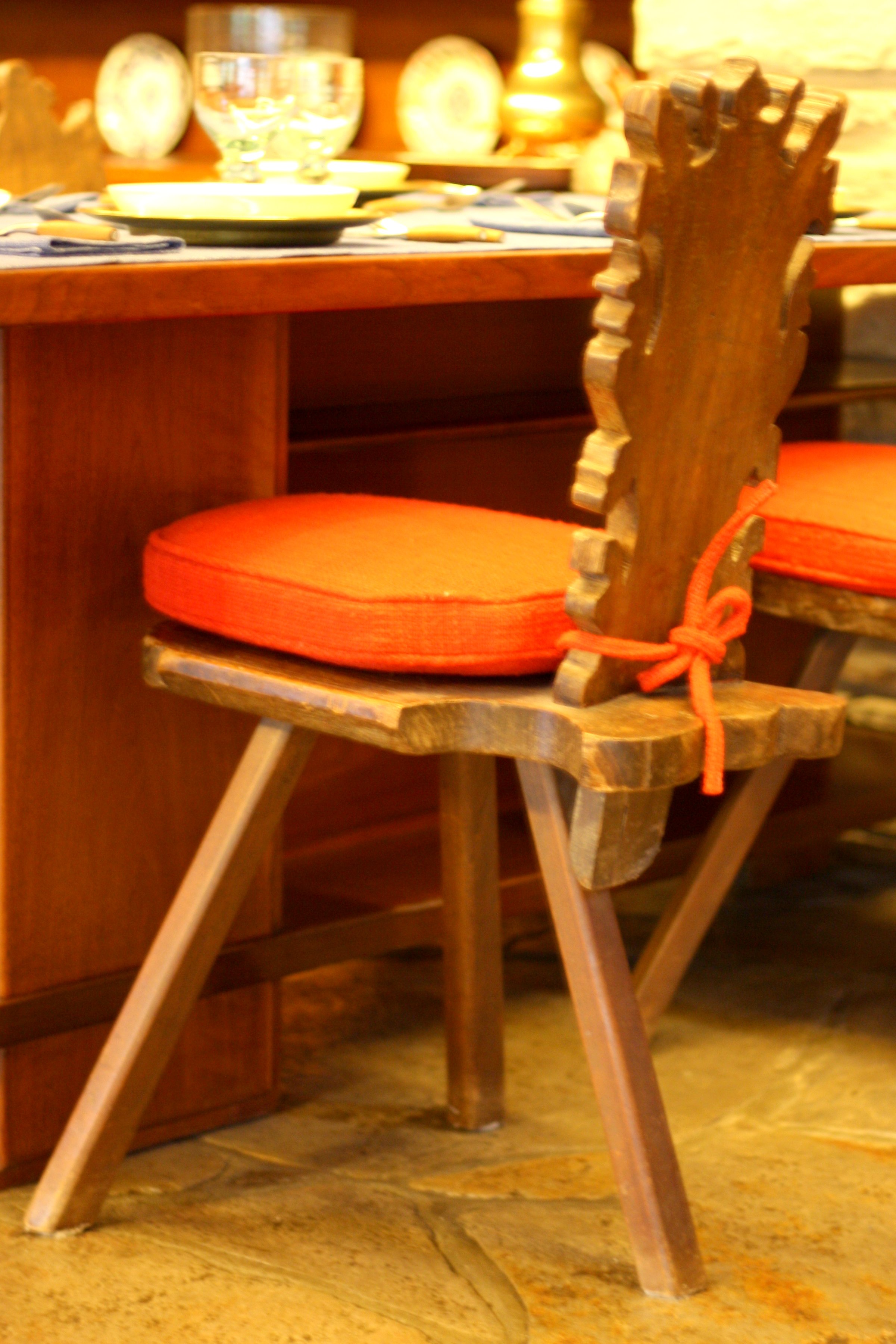
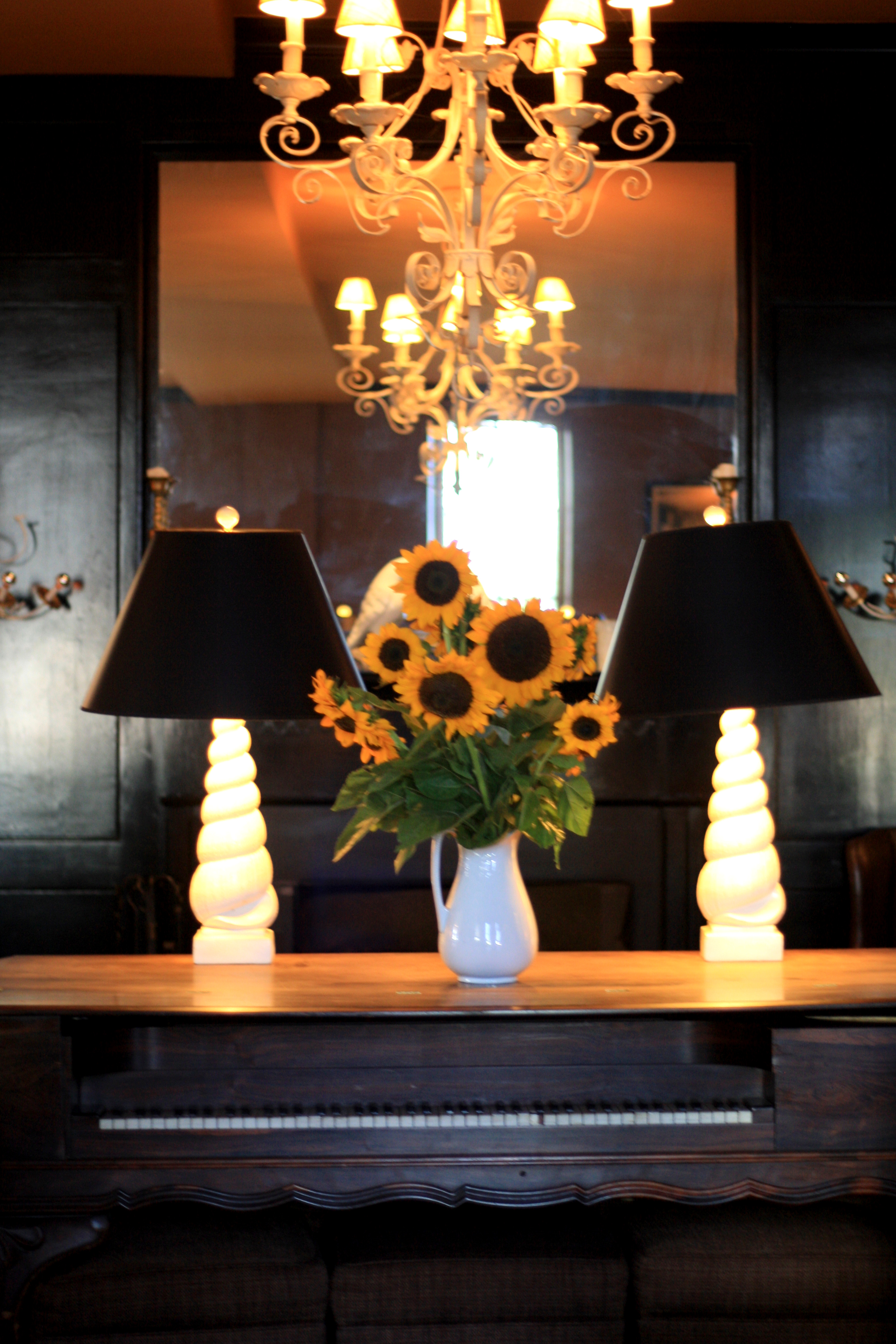
This year, home for the holidays has a special meaning for me because it’s the first time Tom and I will celebrate Christmas in our very own home. One of the first things I did in preparation for the Holidays was to go out and buy the largest tree that would fit in front of our windows. I’ve always loved a tree in front of a window because not only do you get to enjoy it, but those on the outside do, too.

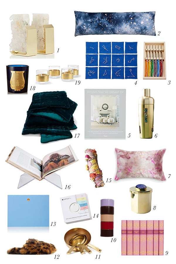
When it came to thinking about gifts for the home, I gravitated towards really unique items that would really make a house a home. Those things that show others a bit more of your personality and make coming home feel special.

I really love the idea of pairing this acrylic book stand with a gorgeous coffee table book. I have lots and lots of coffee table books that I absolutely love and while they look good sitting on a shelf or the table, I’ve hardly ever seen a guest look at one. I like the idea that you could open your favorite book to your favorite page and encourage guests to thumb through it. Continuing with the book theme, I’m feeling like my bookcases could use a little kick. I love the idea of pairing these beautiful bookends with your most tattered and beloved books to create a beautiful contrast on your cases.

I also looked for items that I thought would make a space cozy and bright. I’m completely obsessed with these pillowcases by Elizabeth Few. I saw them first at Roxie Daisy here in Charlottesville and have been completely in love ever since. I also love the idea of using this coverlet during the holiday months. How amazing would an emerald green velvet coverlet look this time of year.

And last, but not least, those emoji notecards. Last year, I got some emoji cocktail napkins that I just love, and I wanted to continue the theme. My husband has been really into writing handwritten letters this year, and I love the fact that these pair the best of technology with a good, old fashioned note.

I hope you find something in here that will bring a special touch to the homes of those you love this year.

Merry Merry!

The Thanksgiving Table of My Dreams

Thanksgiving Table Setting1//2//3//4//5//6//7//8//9//10//11//12//13//14//15//16

For the last couple of years, we’ve celebrated Thanksgiving by taking a trip with family. It’s a surprisingly wonderful time to travel as you don’t encounter many long lines while exploring a city since the bulk of humanity is sitting on their grandmother’s couch watching football. While I absolutely love this new tradition we’ve started, the one thing I miss about Thanksgiving is having the opportunity to design a beautiful Thanksgiving table.

Since I won’t be able to put together a real Thanksgiving table this year, I decided to share with you the Thanksgiving table I’m currently dreaming of. When I started to brainstorm what my ideal Thanksgiving table would look like, two things immediately came to mind dutch tulip vases and Richard Ginori’s Oriente Italiano dinnerware collection. I first fell in love with delftware tulip vases when Tom and I saw the dutch flower pyramid or “Bloempiramide” at the Rijksmuseum in Amsterdam. On a recent trip back, Tom brought me home a kit to build my own flower pyramid. Mine is made of plastic, but it’s still super cool. Ever since, I’ve wanted to design a table with a Bloempiramide as the centerpiece. Now on to those pink plates. I first saw one of Richard Ginori’s Oriente Italiano plates at Forty Five Ten in Dallas. I awkwardly took a picture of the back of the plate in the store because I knew I would want to remember who made it. I think what I love about these plates is that the simultaneously seem traditional and modern at the same time, but in all reality, it was probably just the millennial pink that caught my eye. I built the resulting tablescape around these two pieces and hope it inspires you to make a beautiful Thanksgiving tablescape of your own. Happy Thanksgiving, ya’ll!

It’s All In The Mix

abstract art dresser interiors

I’ve always loved this image from Veranda – I love the choice of art, the colors, the textures, and especially the mix of styles. I think there are two reasons why mixing styles works so well in this image. The first is that pairing the antique dresser with a bright, colorful piece of contemporary art breathes life into the dresser, which could have a tendency to be overly stodgy or too precious. The second is that there is a tension created by placing two contrasting items next to each other that is much more interesting than if you didn’t.

I have a somewhat similar antique dresser that I absolutely love, and I’m dying to get a great abstract painting to go above it. If I did, this is how I would style it.

The gorgeous painting is by Michael Manning on Artsy, which is a great source of contemporary art, and I paired it with a wonderful occasional chair from Jonathan Adler, a unique lamp, and a simple box.

I also found several other options, below, that offer a similar take on the idea:

A Pop of Primary

Shiraleah Clutch//Sachajuan Spray//Rebecca de Ravenel Earrings//Milly Dress//bkr Waterbottle//Sophia Webster Shoes//Katie Kime Elephant//Oliver Peoples Sunglasses

Inside Fallingwater

When I walked inside the main living space at Fallingwater, I immediately felt at ease. I felt sometimes like I do in a wonderfully designed hotel room. Where you can tell someone has thought about exactly what you need to feel comfortable. You felt like you had everything you needed, and nothing you didn’t. There were plenty of areas to lounge and read a book or come together with others and socialize. While it functioned perfectly, it was also quite stylish. Yet not over the top where you felt uncomfortable, just enough to feel special without feeling precious. It was what we can only hope to achieve in an interior space.

02-IMG_1461 03-IMG_1467 04-IMG_1452 05-IMG_1460 06-IMG_1456 07-IMG_1514 08-IMG_1459 09-IMG_1468 10-IMG_1484 11-IMG_1478 12-IMG_1444 13-IMG_1490 14-IMG_1431

White Space

As an art history major, I theoretically understand the importance of white space. Almost every work of art has it, and it’s almost always essential to making a beautiful piece. Yet understanding it theoretically is very different from understanding it practically. Practicality is really the realm of the artist. It is the artist that is skilled at saying this painting would be better if I didn’t put something in that space.

The problem with my theoretical understanding is that on some level I’m also an artist. I, like you, have many blank canvases in my life to paint. These include my time, my home, and my wardrobe among other things. I often find that these areas of my life are filled with too many things that I don’t love. One of my favorite authors, Leo Babauta, touched on how to remedy this problem in his article, “Too Much to Do, Not Enough Time.” He writes: “You have too many things to fit into your container, and you’ve decided to only put the important and beautiful things into the container. That means a bunch of things you think you “should” do are not going to fit.” What Leo is essentially instructing each of us to do is to become the artists of our own lives. When you boil it down, essentially the work of an artist is to choose – to choose to only depict what is most relevant and beautiful to the subject matter. And in order to emphasize the subject matter, the artist left out a lot of things he might have felt he “should” incorporate. For instance, think about the painting Les Demoiselles d’Avignon by Picasso. What makes this painting truly beautiful and meaningful is really what Picasso chose to leave out. Rather than depicting the women as they actually were (as he probably “should” have done as a highly trained visual artist), he chose to depict only their most basic forms, and it is what he left out that makes this painting a modern masterpiece.

As you think about those blank canvases in your life today, and your hope that they be a little more beautiful and meaningful, I invite you to ask yourself, “what can I leave out?” You might just find that this white space is just the thing your life needs to truly come alive.

Miami Art Deco District

I went to Miami Beach recently for the first time in fifteen years, and one of the highlights of the trip was the Art Deco Walking Tour. One of the most interesting things that we learned is that there are only two places in the world with a high concentration of Art Deco architecture. One is Miami Beach and the other is Napier, New Zealand. Both were devastated by natural disasters around the same time causing them to have to rebuild in the 1930s when the Art Deco style was prominent. Art Deco became popular around the world after the 1925 Exposition Internationale des Arts Decoratifs et Industriels Modernes in Paris. Miami Beach’s Art Deco District was the first 20th century neighborhood to be recognized by the National Register of Historic Places and is the largest collection of Art Deco architecture in the world. Much of the preservation is the work of one woman, Barbara Baer Capitman, who had the realization in the late ’70s that these buildings were worth saving and devoted her life to the cause.

A few details to note on the buildings themselves. The buildings that are completely white are actually more historically correct. When the architects designed these structures they were after a streamlined aesthetic and loved the use of white. They were particularly interested in the play of light on the buildings and the shadows created by the “eyebrows” or overhangs over windows and other sculptural elements such as the ziggurat or stepped rooflines and decorative sculptural panels seen on many of the buildings. Other common themes include symmetry, repeated elements in groups of three, curved edges and corners, and the use of neon lighting.


3-IMG_32312-IMG_3253 4-IMG_3245 5-IMG_3159 6-IMG_3170 7-IMG_3199 8-IMG_3207 9-IMG_3098

Meet Me at Congress Hall

I had the unexpected opportunity to go to Cape May last weekend. If you had asked me two weeks ago about Cape May, I could have told you absolutely nothing. However it is absolutely charming and historic to boot. Cape May is one of the country’s oldest vacation resort destinations. The whole town is a a National Historic Landmark because of the concentration of Victorian buildings.

While we stayed in the historic Bradford Cottage on Franklin Street, I spent a day at Congress Hall. Congress Hall is America’s Oldest Seaside Resort. Four different presidents have vacationed there and it was the official Summer White House for President Benjamin Harrison.

I fell in love – mostly with the colors. The outside of the hotel is the perfect shade of yellow and four enormous American flags greet you upon approach. The lobby is a gorgeous shade of green punctuated by a fantastic floral print. The restaurant, The Blue Pig Tavern, where we had lunch has the cutest napkins in a fabulous shade of light blue. Congress Hall also has it’s own farm, Beach Plum Farm, which harvests the most delicious tomatoes I’ve ever tasted. I highly recommend the BLT – perfect for a post beach snack. On the beach, you have the choice of a gorgeous yellow and white striped tent or chaise lounges and umbrellas with a pink star. The hotel definitely has me rethinking my use of color. Often times I tend to favor neutrals, but I was amazed to see how well a multitude of vastly different colors paired so fabulously together.

35-IMG_217220-IMG_222708-IMG_231912-IMG_237810-IMG_234321-IMG_233814-IMG_242515-IMG_242913-IMG_239711-IMG_236032-IMG_451223-IMG_445029-IMG_449524-IMG_445528-IMG_449330-IMG_449931-IMG_450205-IMG_228607-IMG_231106-IMG_230125-IMG_445917-IMG_247726-IMG_448416-IMG_2458