Inside Fallingwater

When I walked inside the main living space at Fallingwater, I immediately felt at ease. I felt sometimes like I do in a wonderfully designed hotel room. Where you can tell someone has thought about exactly what you need to feel comfortable. You felt like you had everything you needed, and nothing you didn’t. There were plenty of areas to lounge and read a book or come together with others and socialize. While it functioned perfectly, it was also quite stylish. Yet not over the top where you felt uncomfortable, just enough to feel special without feeling precious. It was what we can only hope to achieve in an interior space.

02-IMG_1461 03-IMG_1467 04-IMG_1452 05-IMG_1460 06-IMG_1456 07-IMG_1514 08-IMG_1459 09-IMG_1468 10-IMG_1484 11-IMG_1478 12-IMG_1444 13-IMG_1490 14-IMG_1431

Victorian Architecture

Having grown up in Texas, I wasn’t exposed to much Victorian Architecture as a child. For that reason, I was entranced by the Victorian Architecture in Cape May when we visited this summer. I roamed the streets for hours one morning trying to capture the best of what Cape May had to offer. Cape May is designated the Cape May Historic District, a National Historic Landmark, for it’s high concentration of Victorian buildings so there was plenty to capture.

What architecture did you grow up around? How did that influence what you like now?

02-IMG_2269 03-IMG_1915 04-IMG_2537 05-IMG_2590 06-IMG_1866 07-IMG_1963 08-IMG_2519 09-IMG_2038 10-IMG_2155 11-IMG_2021 12-IMG_1890 13-IMG_1938 14-IMG_1950 15-IMG_2041 16-IMG_2141 17-IMG_2260 18-IMG_2257 19-IMG_1924 20-IMG_1966 21-IMG_1902 22-IMG_2126 23-IMG_2011 24-IMG_1942 25-IMG_2512 26-IMG_2147 27-IMG_2488

Miami Art Deco District

I went to Miami Beach recently for the first time in fifteen years, and one of the highlights of the trip was the Art Deco Walking Tour. One of the most interesting things that we learned is that there are only two places in the world with a high concentration of Art Deco architecture. One is Miami Beach and the other is Napier, New Zealand. Both were devastated by natural disasters around the same time causing them to have to rebuild in the 1930s when the Art Deco style was prominent. Art Deco became popular around the world after the 1925 Exposition Internationale des Arts Decoratifs et Industriels Modernes in Paris. Miami Beach’s Art Deco District was the first 20th century neighborhood to be recognized by the National Register of Historic Places and is the largest collection of Art Deco architecture in the world. Much of the preservation is the work of one woman, Barbara Baer Capitman, who had the realization in the late ’70s that these buildings were worth saving and devoted her life to the cause.

A few details to note on the buildings themselves. The buildings that are completely white are actually more historically correct. When the architects designed these structures they were after a streamlined aesthetic and loved the use of white. They were particularly interested in the play of light on the buildings and the shadows created by the “eyebrows” or overhangs over windows and other sculptural elements such as the ziggurat or stepped rooflines and decorative sculptural panels seen on many of the buildings. Other common themes include symmetry, repeated elements in groups of three, curved edges and corners, and the use of neon lighting.


3-IMG_32312-IMG_3253 4-IMG_3245 5-IMG_3159 6-IMG_3170 7-IMG_3199 8-IMG_3207 9-IMG_3098

Meet Me at Congress Hall

I had the unexpected opportunity to go to Cape May last weekend. If you had asked me two weeks ago about Cape May, I could have told you absolutely nothing. However it is absolutely charming and historic to boot. Cape May is one of the country’s oldest vacation resort destinations. The whole town is a a National Historic Landmark because of the concentration of Victorian buildings.

While we stayed in the historic Bradford Cottage on Franklin Street, I spent a day at Congress Hall. Congress Hall is America’s Oldest Seaside Resort. Four different presidents have vacationed there and it was the official Summer White House for President Benjamin Harrison.

I fell in love – mostly with the colors. The outside of the hotel is the perfect shade of yellow and four enormous American flags greet you upon approach. The lobby is a gorgeous shade of green punctuated by a fantastic floral print. The restaurant, The Blue Pig Tavern, where we had lunch has the cutest napkins in a fabulous shade of light blue. Congress Hall also has it’s own farm, Beach Plum Farm, which harvests the most delicious tomatoes I’ve ever tasted. I highly recommend the BLT – perfect for a post beach snack. On the beach, you have the choice of a gorgeous yellow and white striped tent or chaise lounges and umbrellas with a pink star. The hotel definitely has me rethinking my use of color. Often times I tend to favor neutrals, but I was amazed to see how well a multitude of vastly different colors paired so fabulously together.

35-IMG_217220-IMG_222708-IMG_231912-IMG_237810-IMG_234321-IMG_233814-IMG_242515-IMG_242913-IMG_239711-IMG_236032-IMG_451223-IMG_445029-IMG_449524-IMG_445528-IMG_449330-IMG_449931-IMG_450205-IMG_228607-IMG_231106-IMG_230125-IMG_445917-IMG_247726-IMG_448416-IMG_2458

Entryways: A comparison

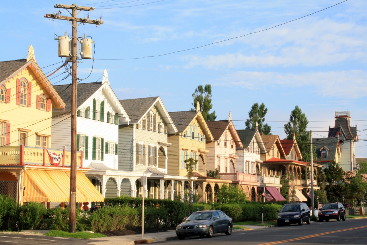
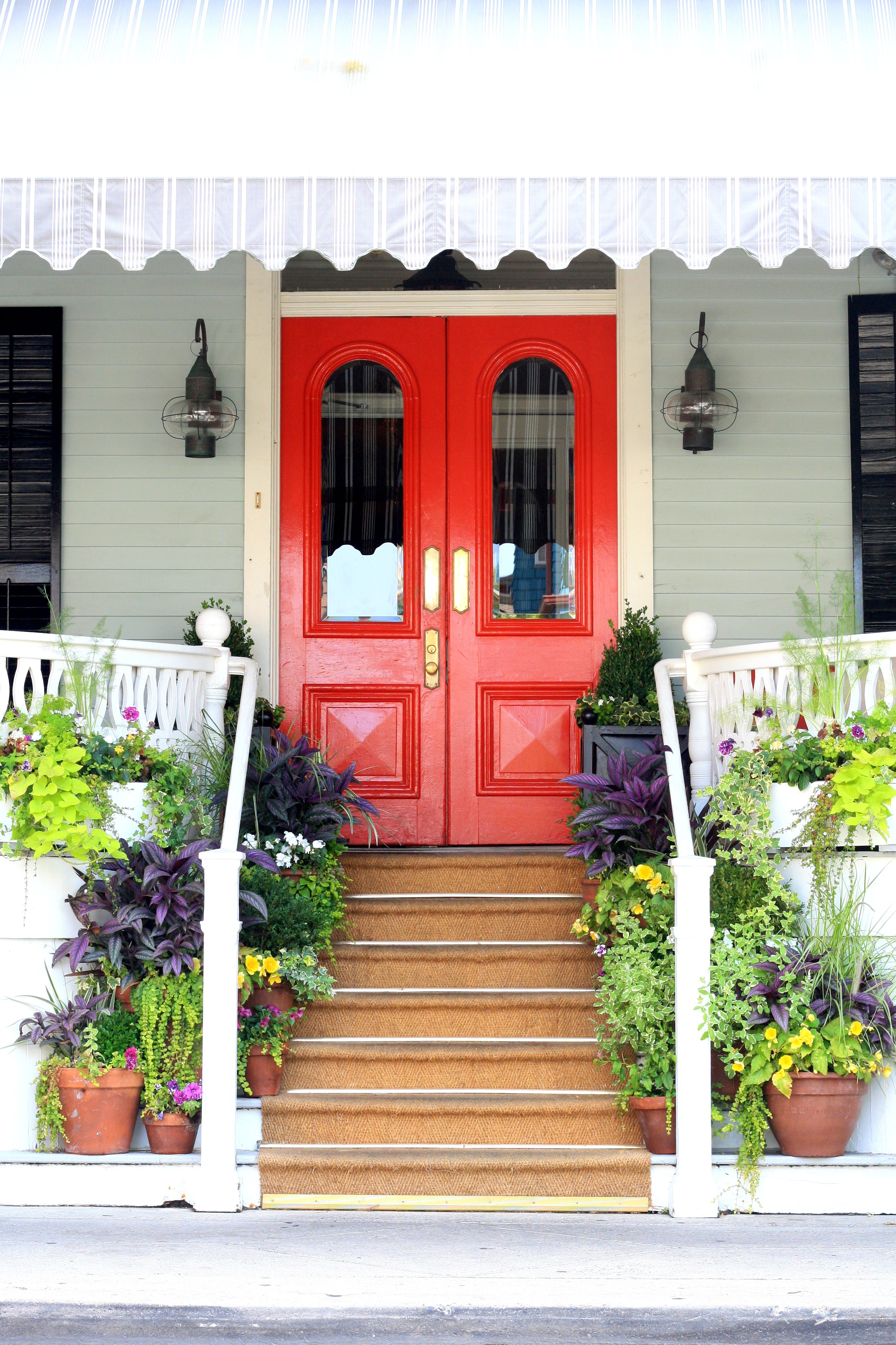
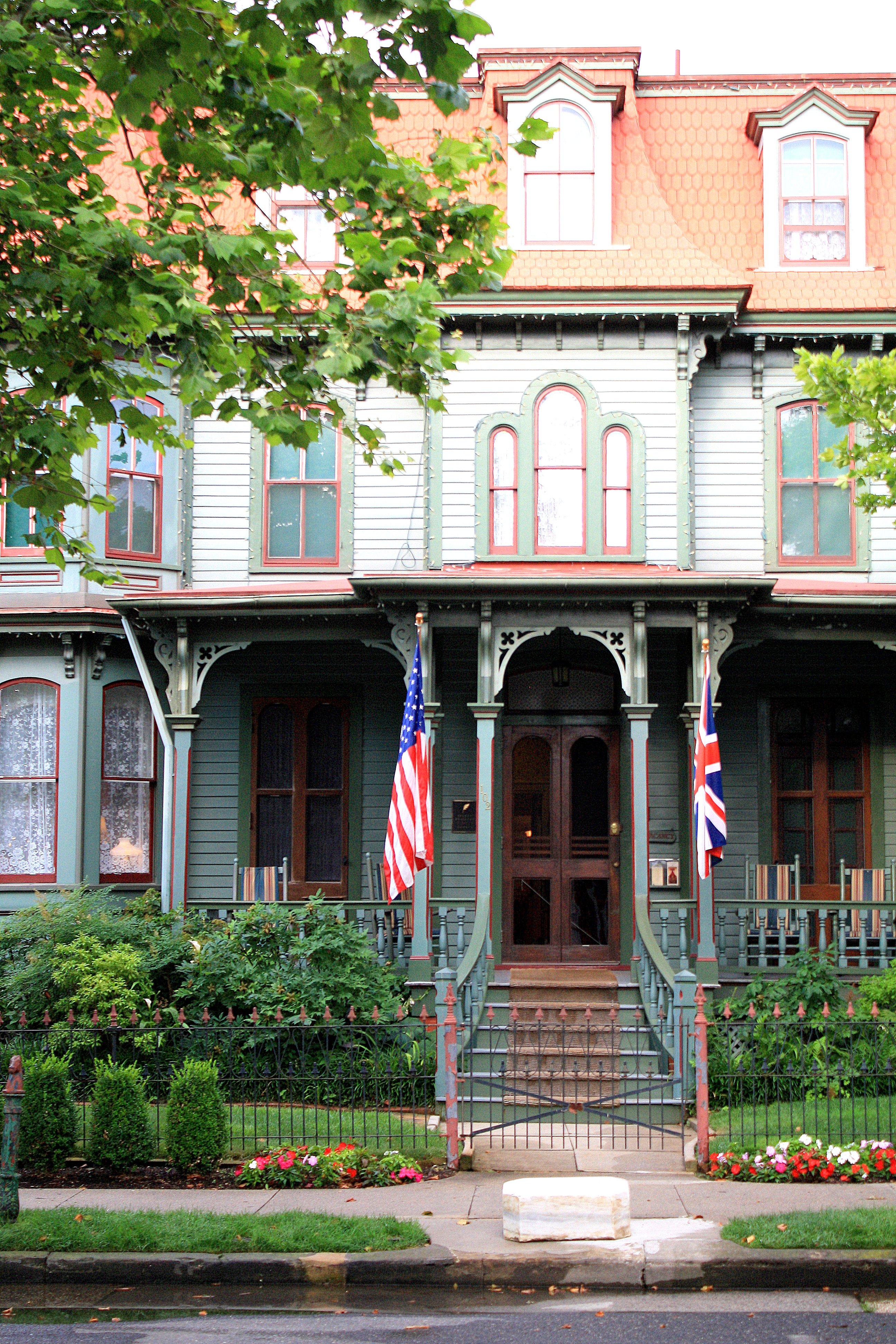
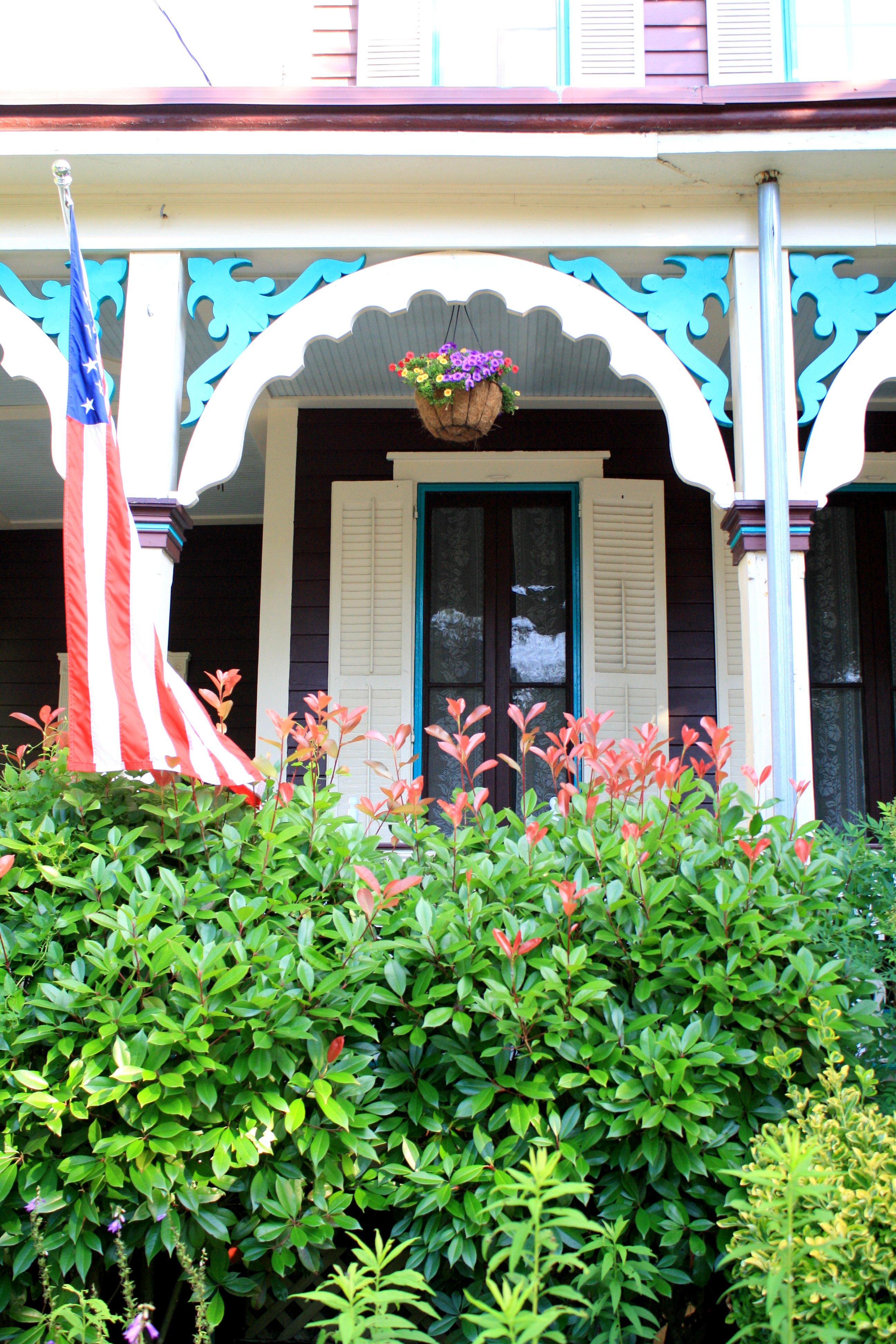
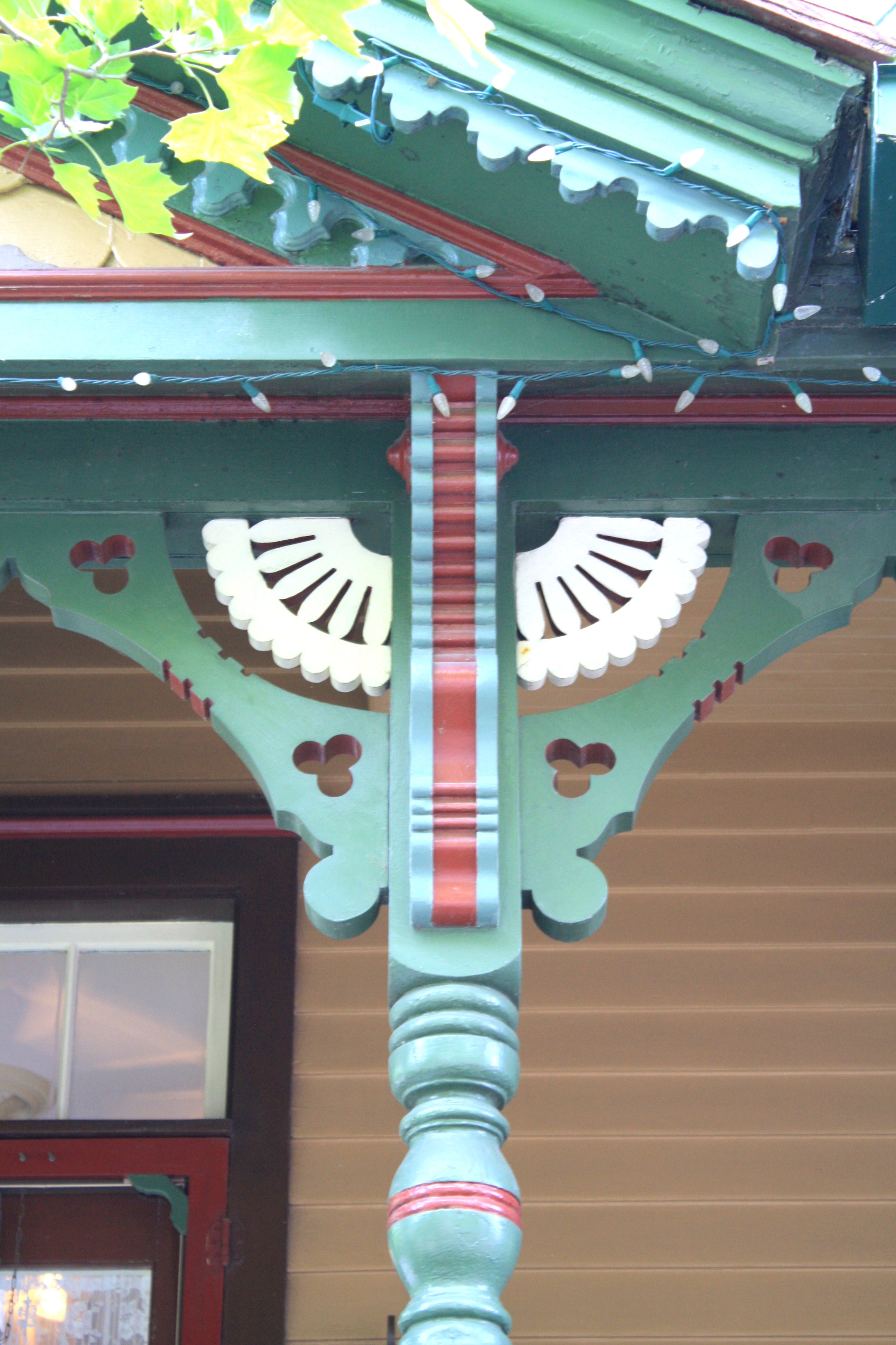
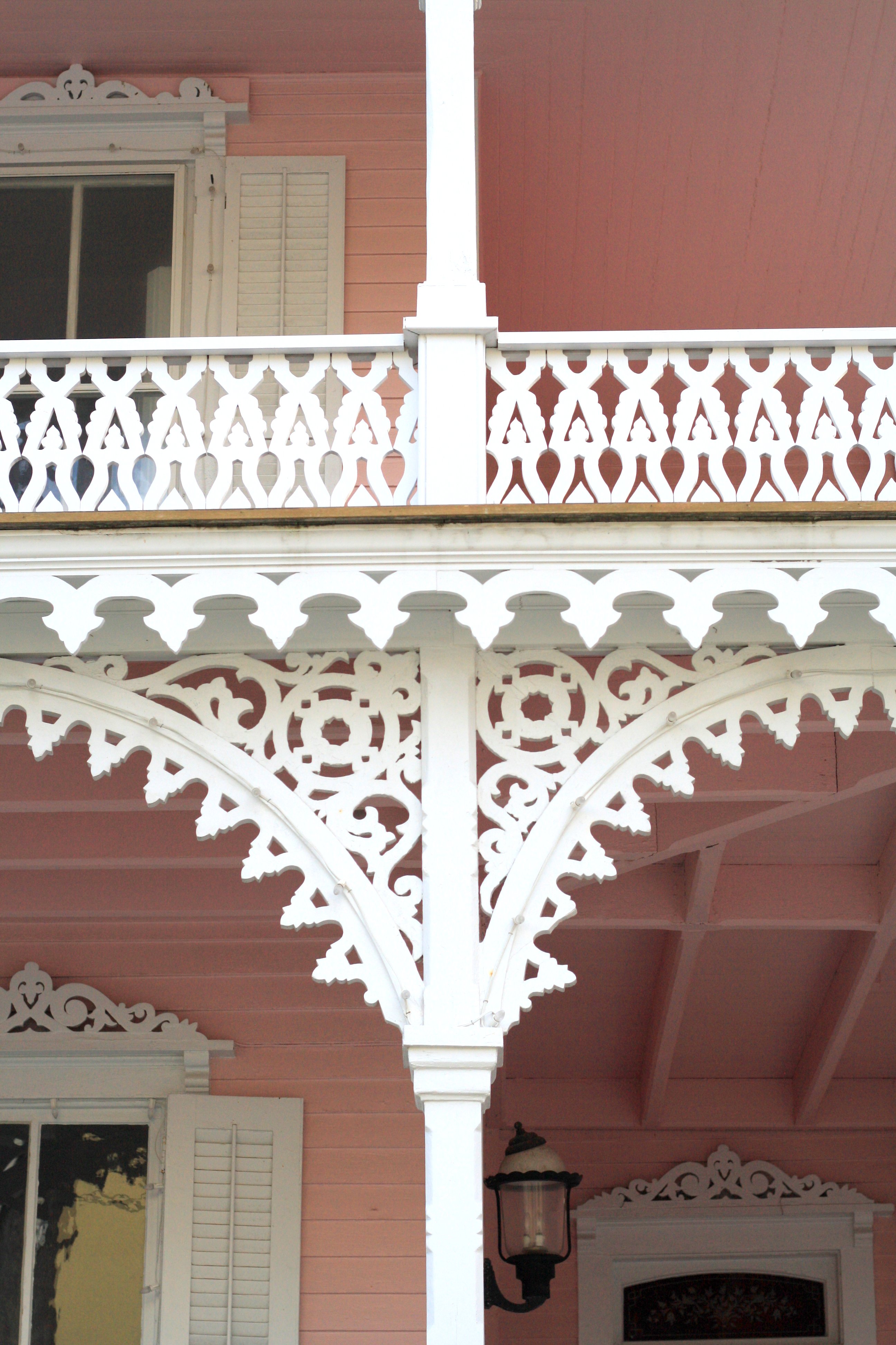
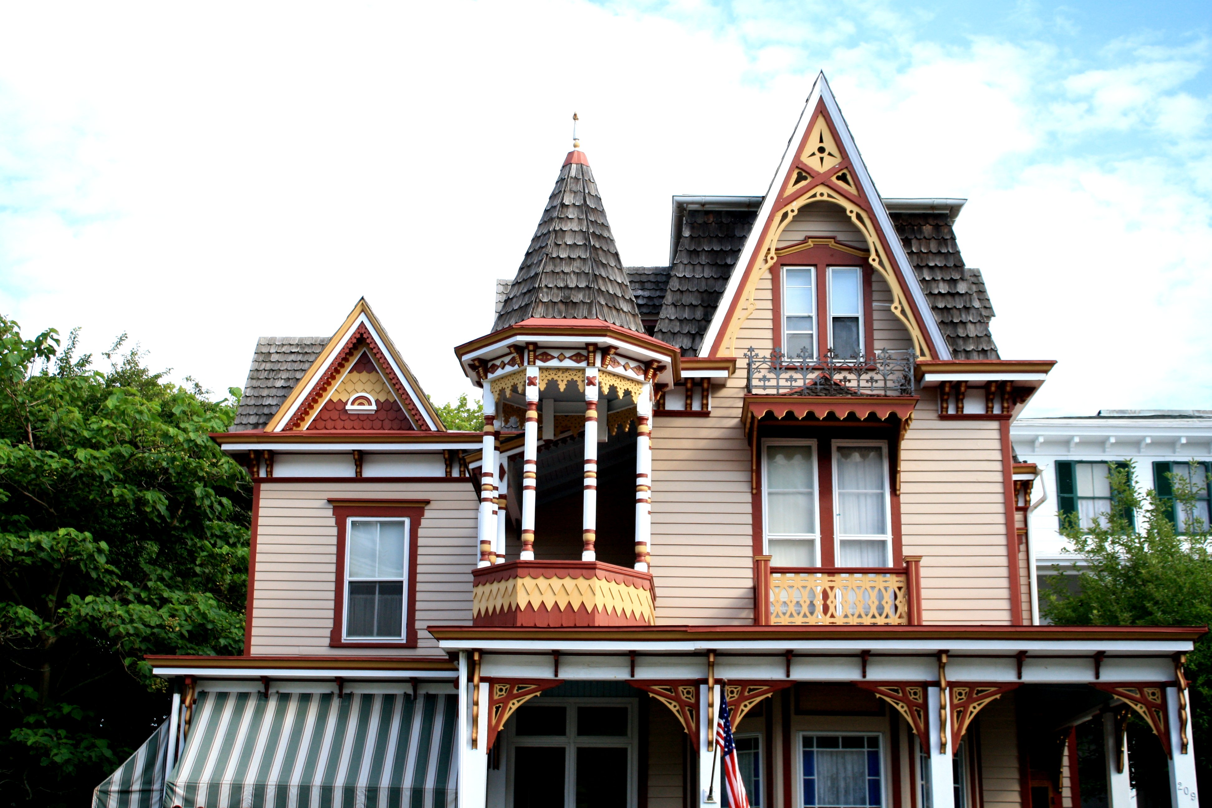
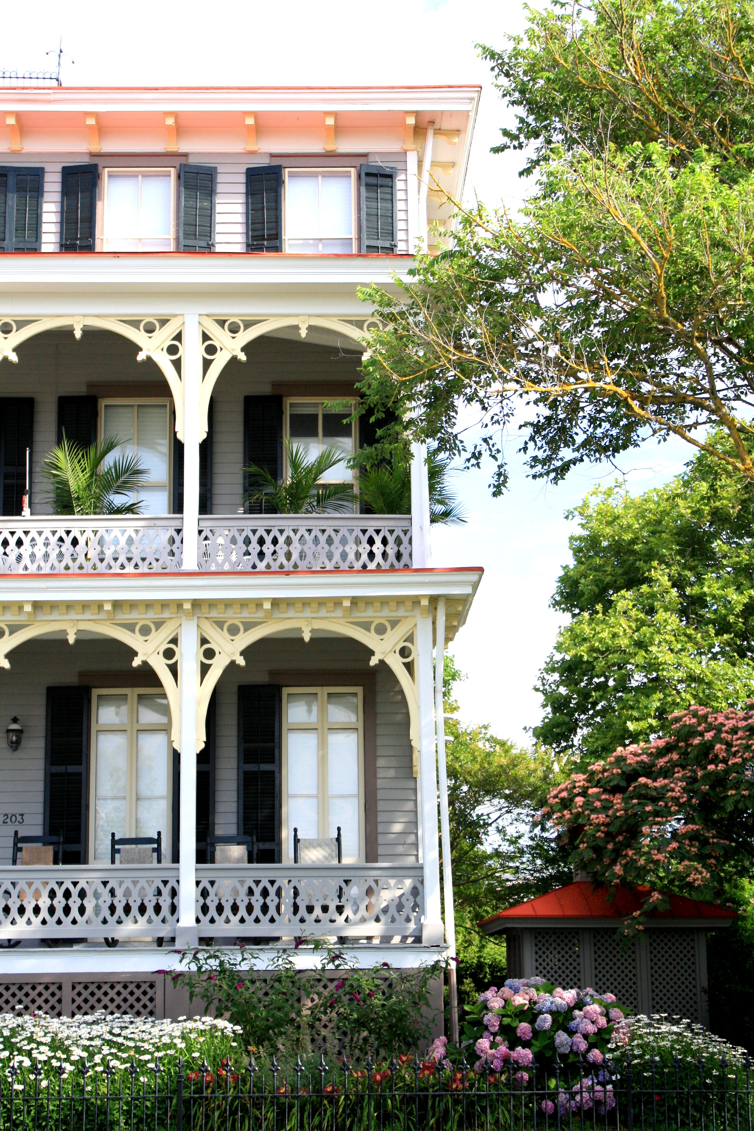
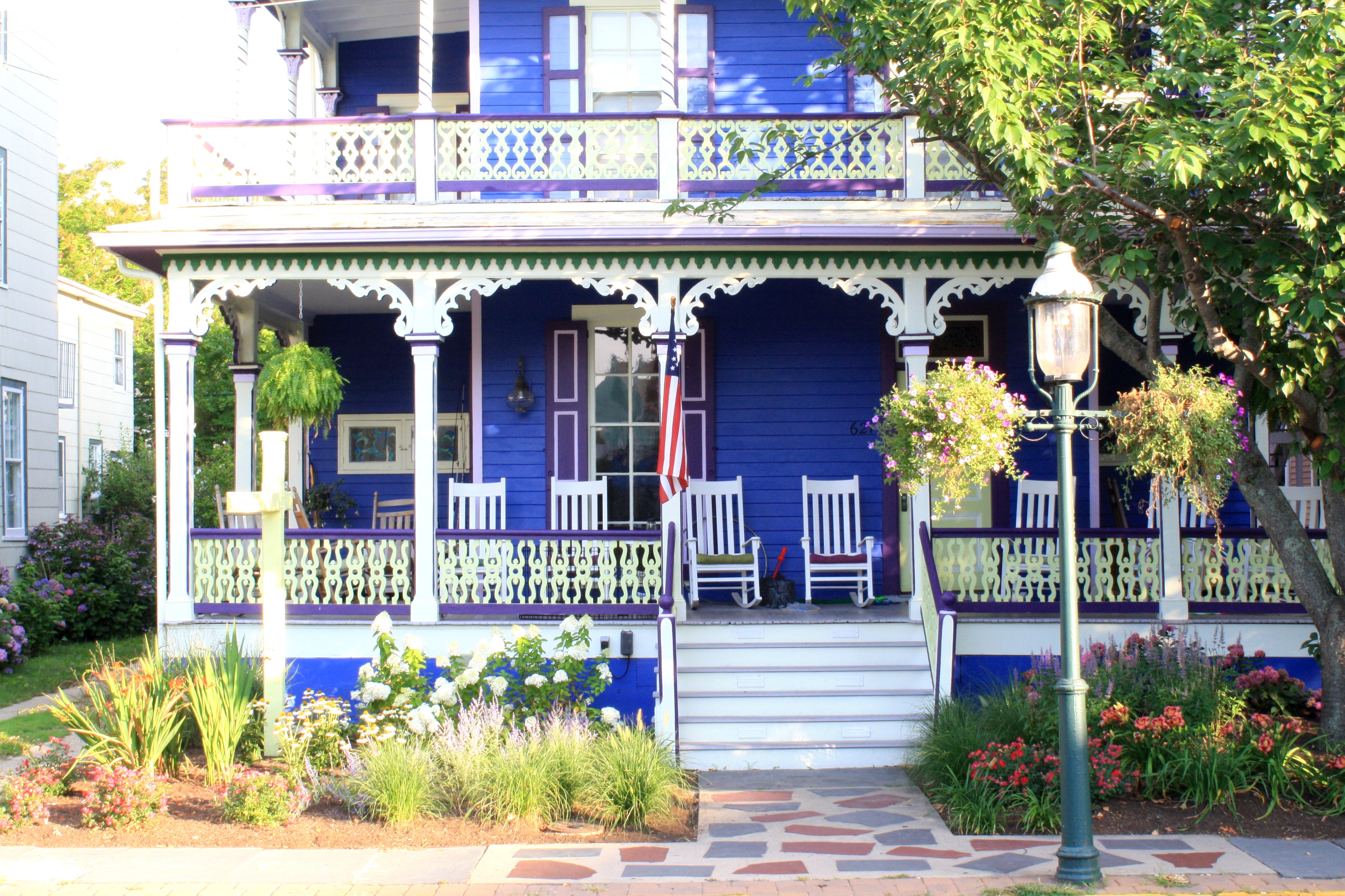
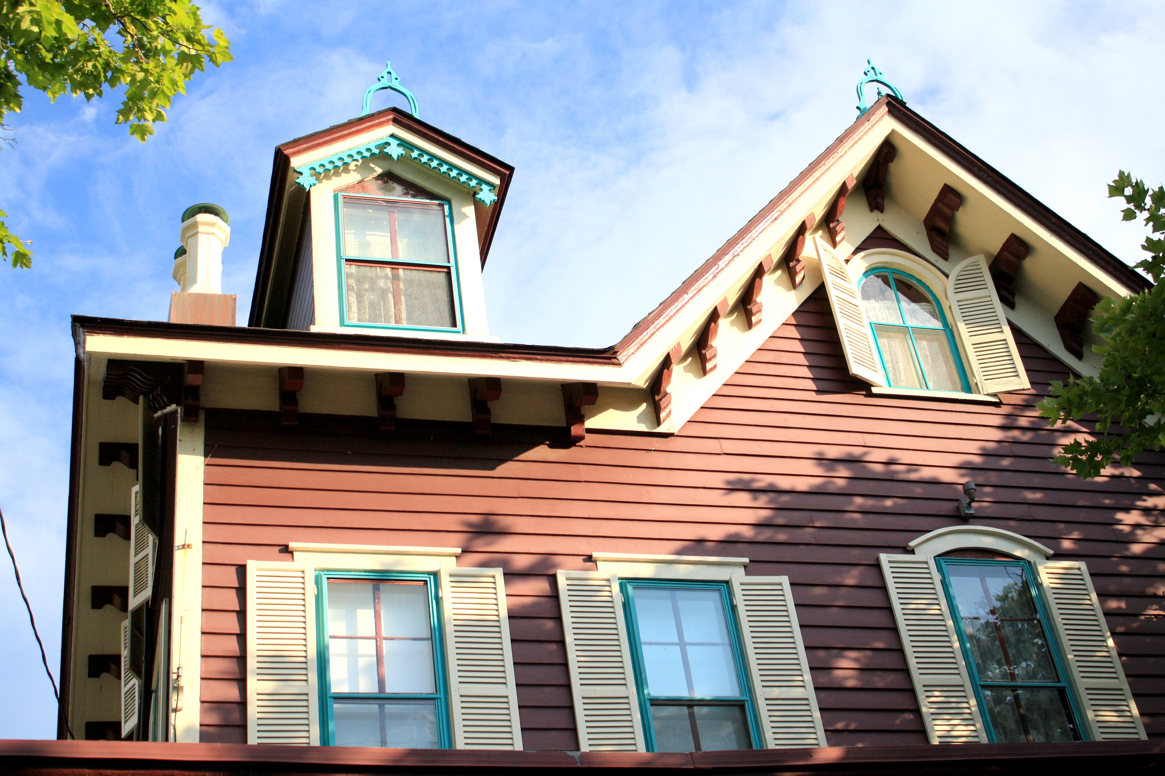
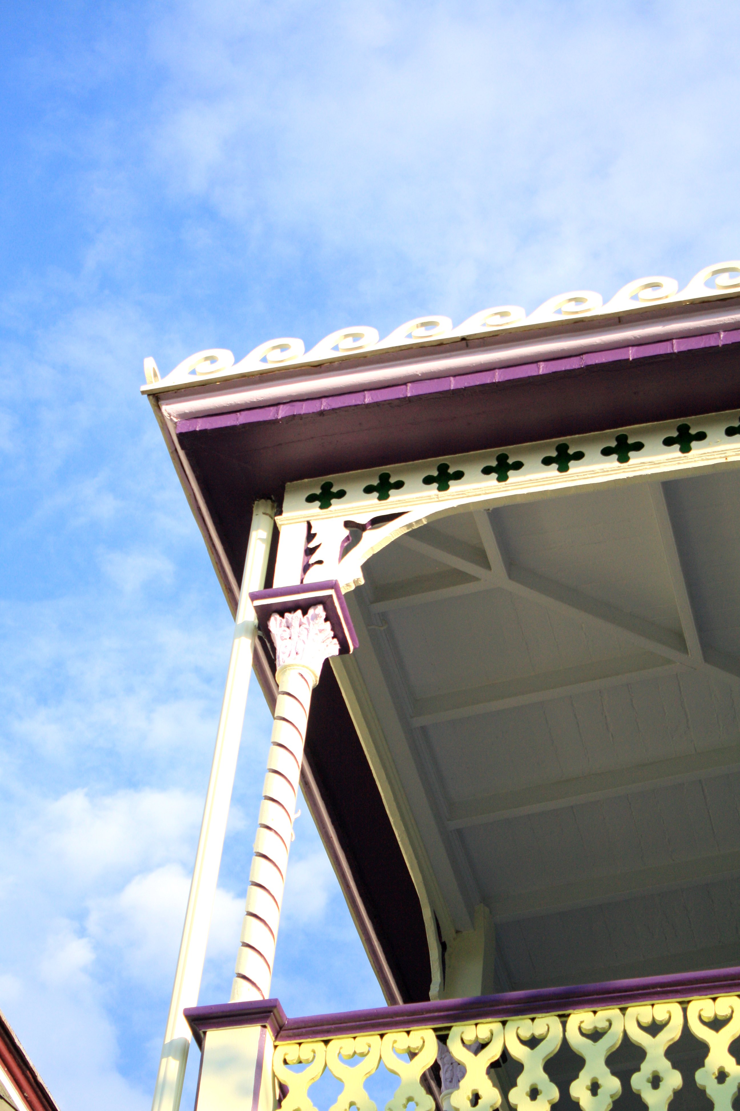
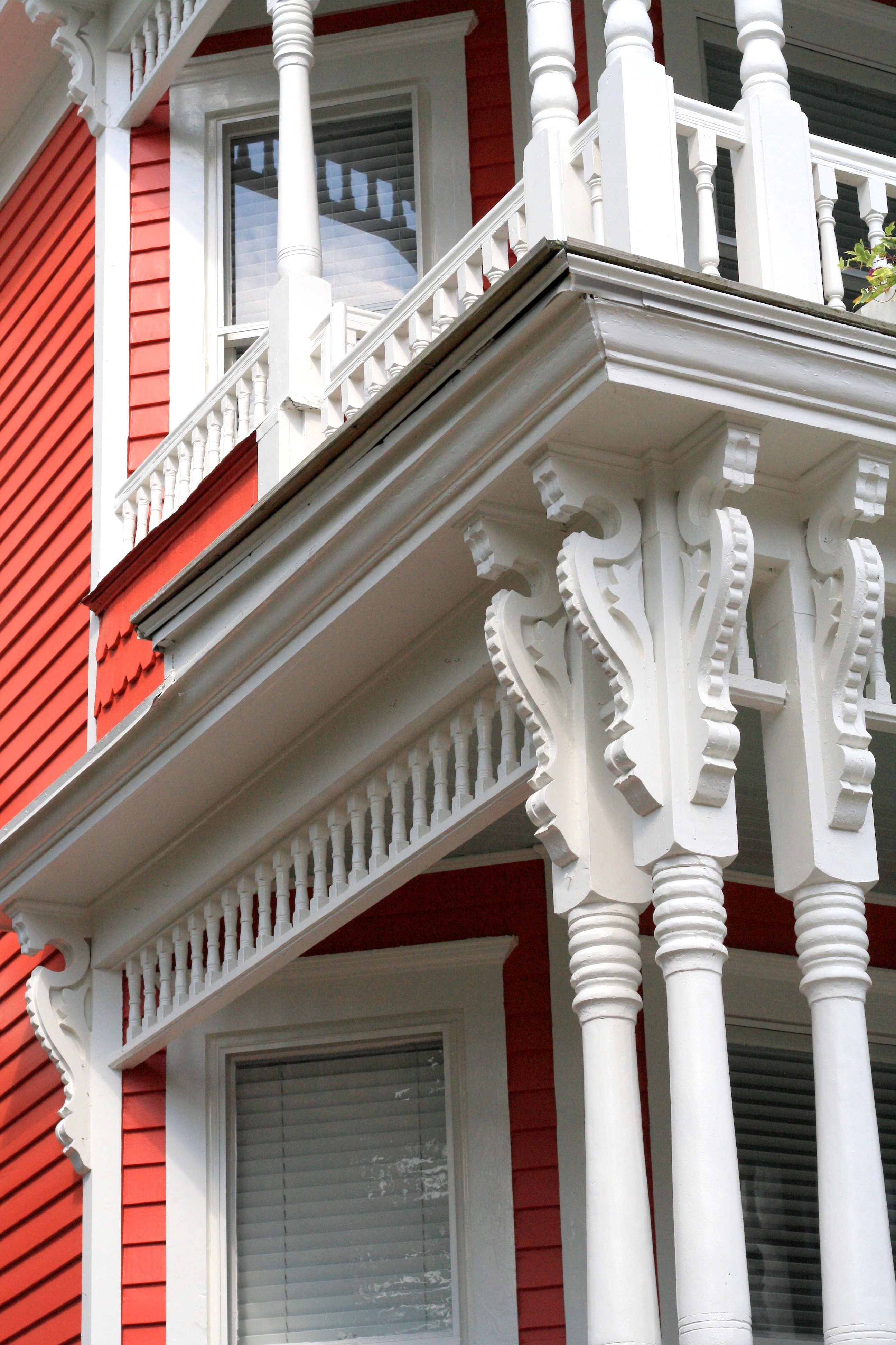
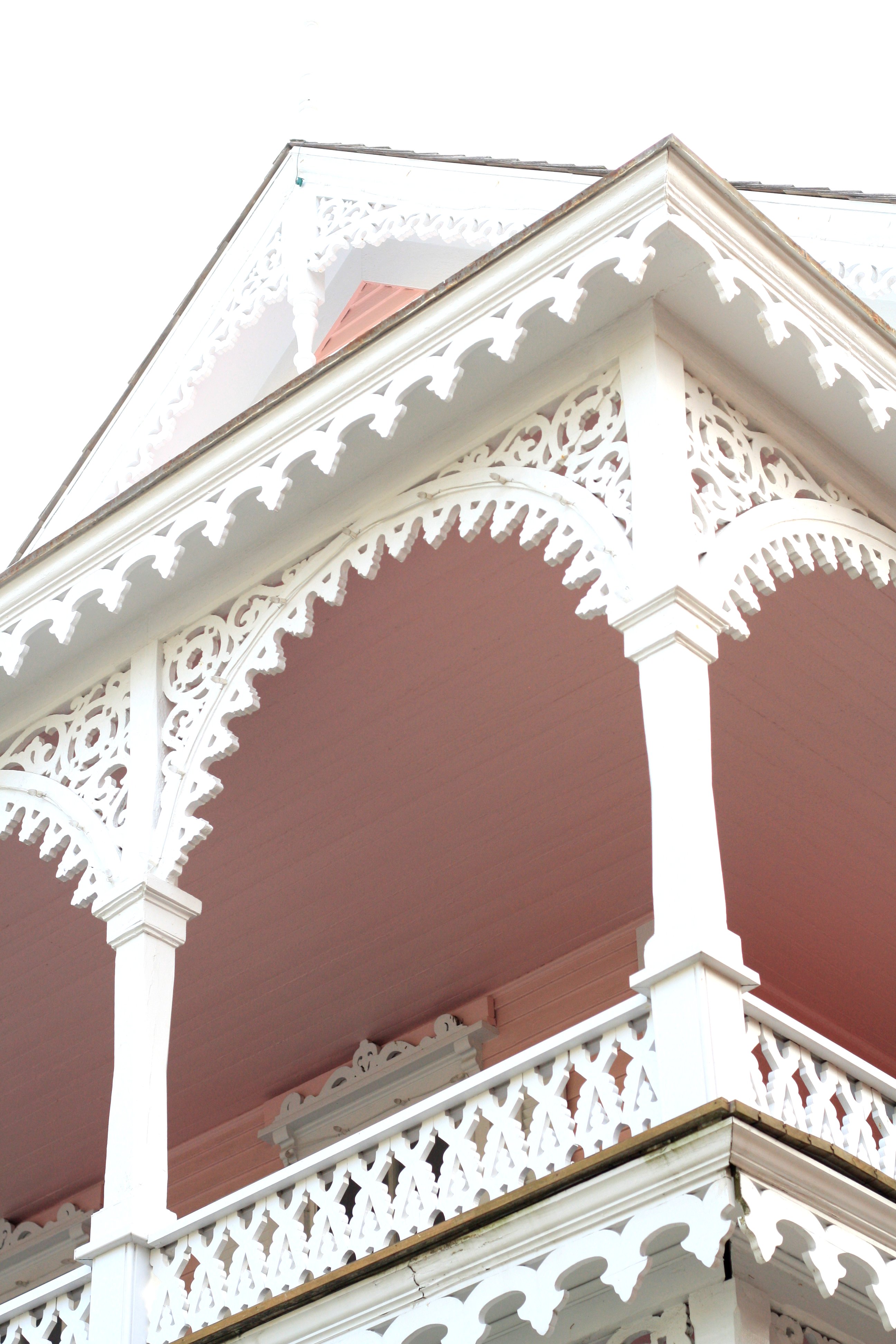
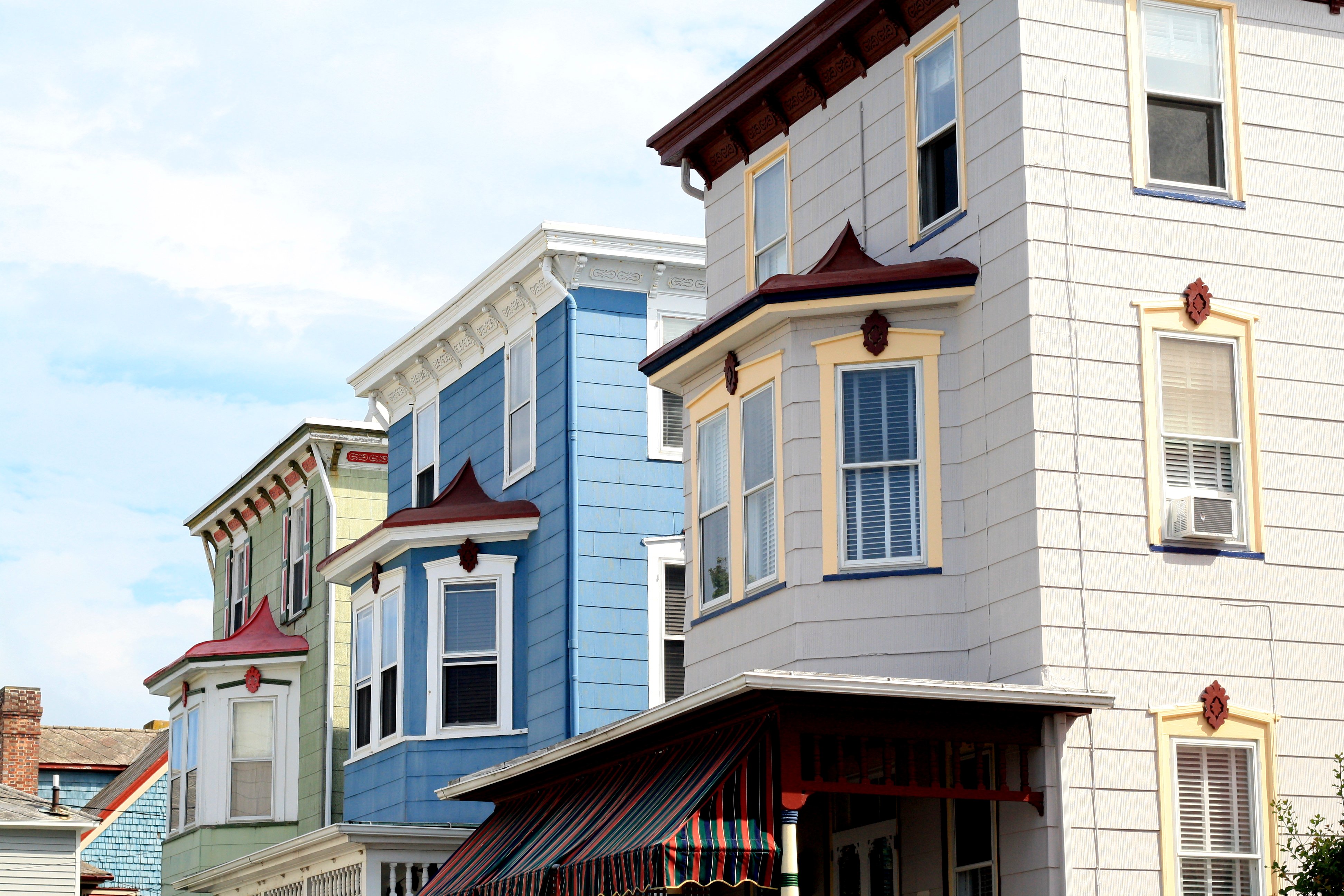
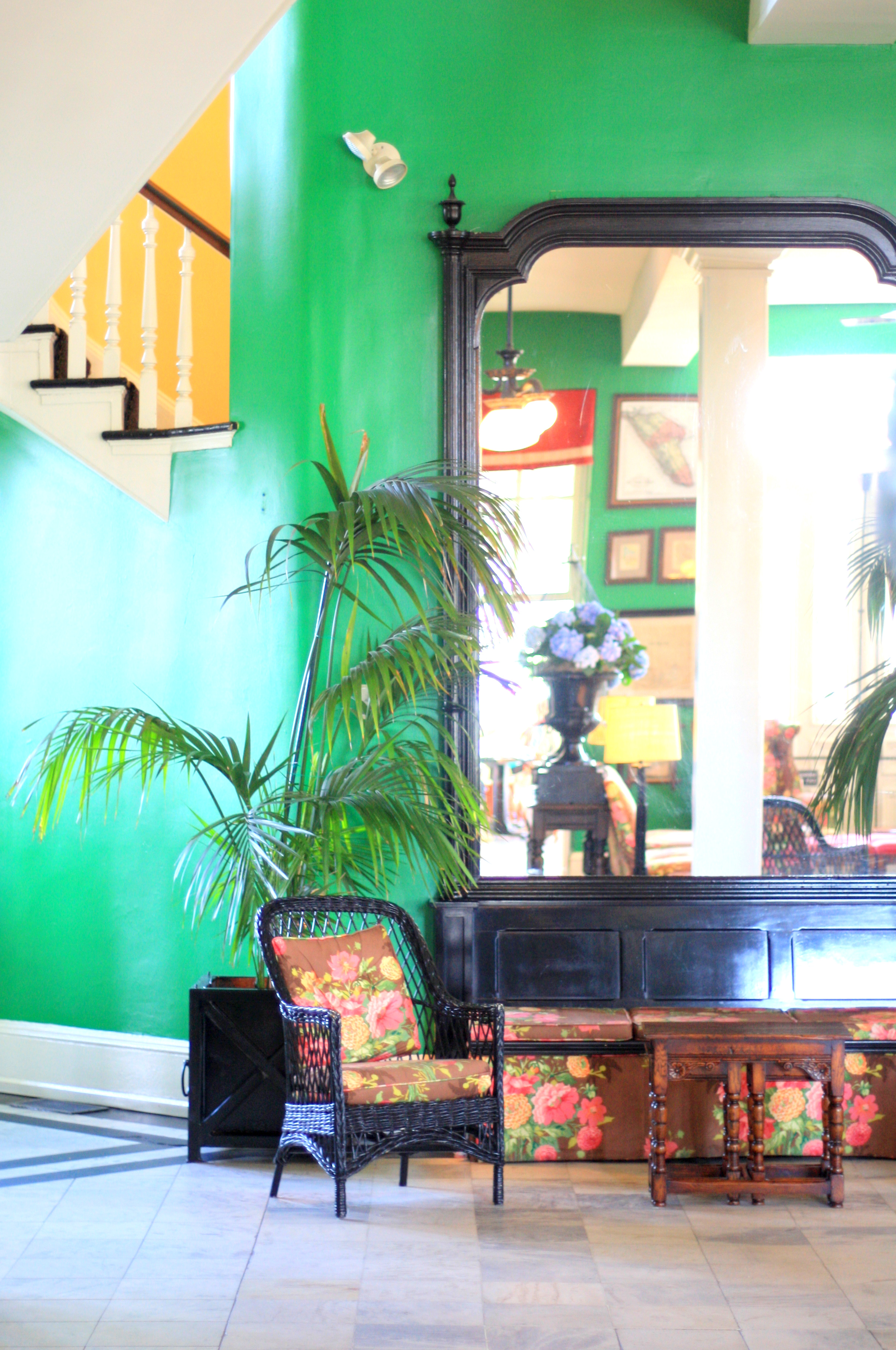
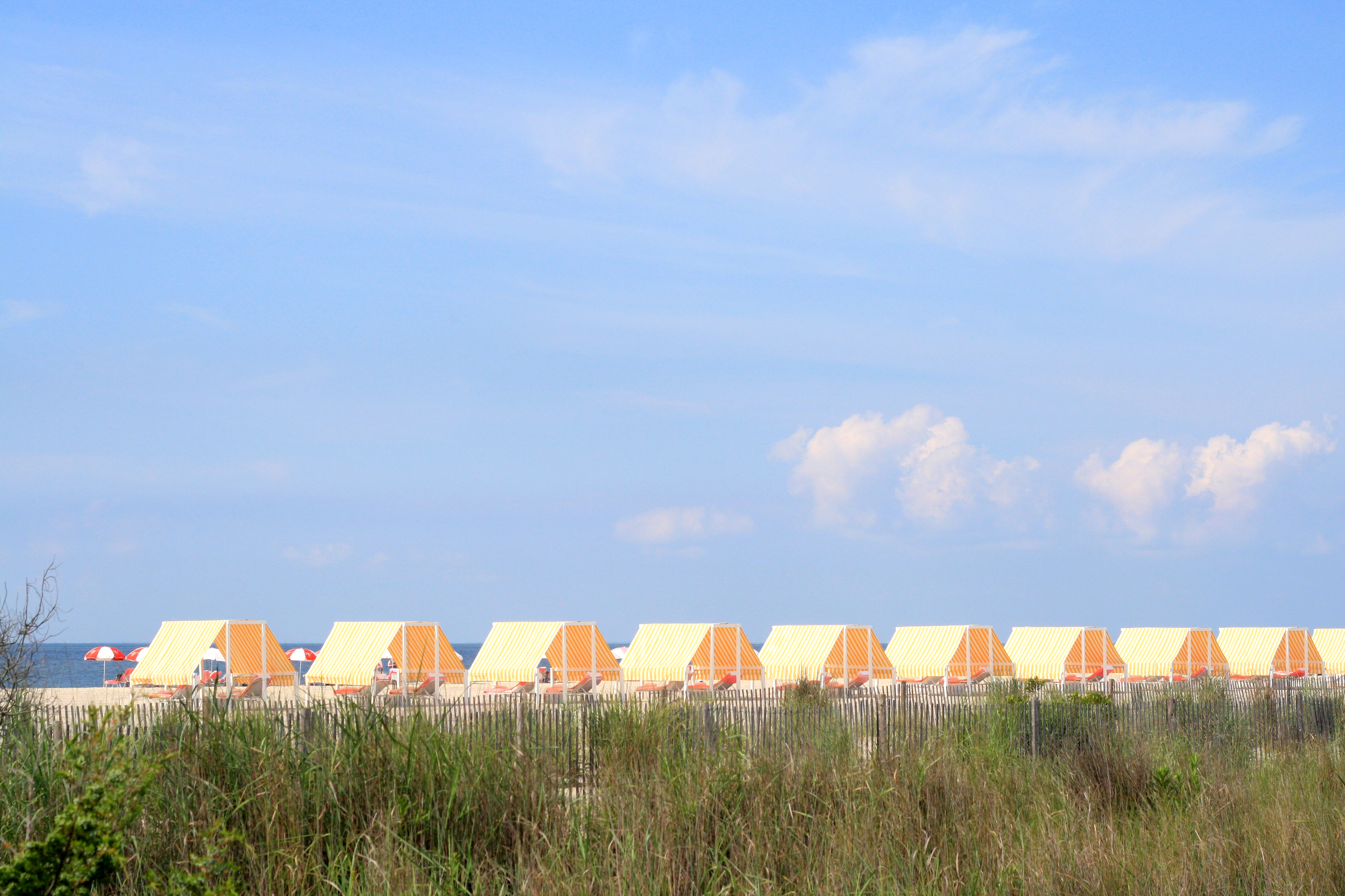
One of my favorite things to do is walk around neighborhoods. One of the things I absolutely loved about London was how much fun it was to walk around various different neighborhoods, and it’s part of the reason I fell in love with the city from the get go.

Since being back in the States, I’ve been thinking a lot about what made walking around London so pleasurable, and I’ve decided that Londoner’s think a lot about curb appeal making the streets particularly nice for passersby.

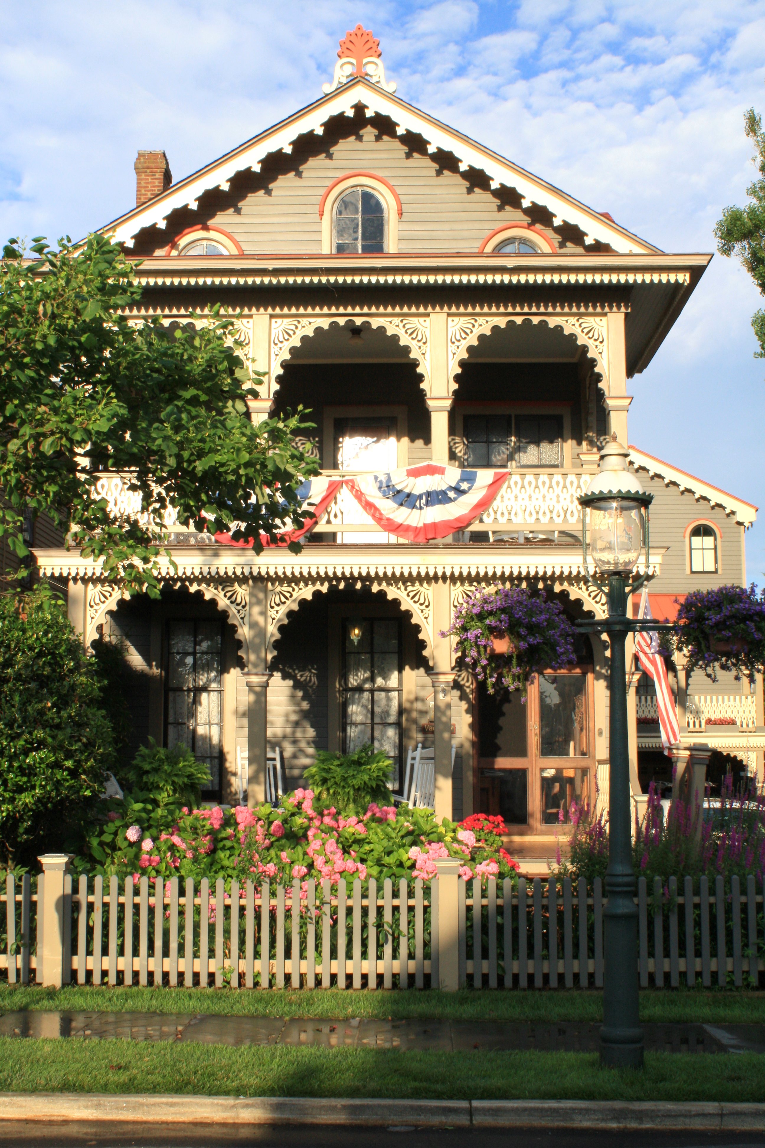
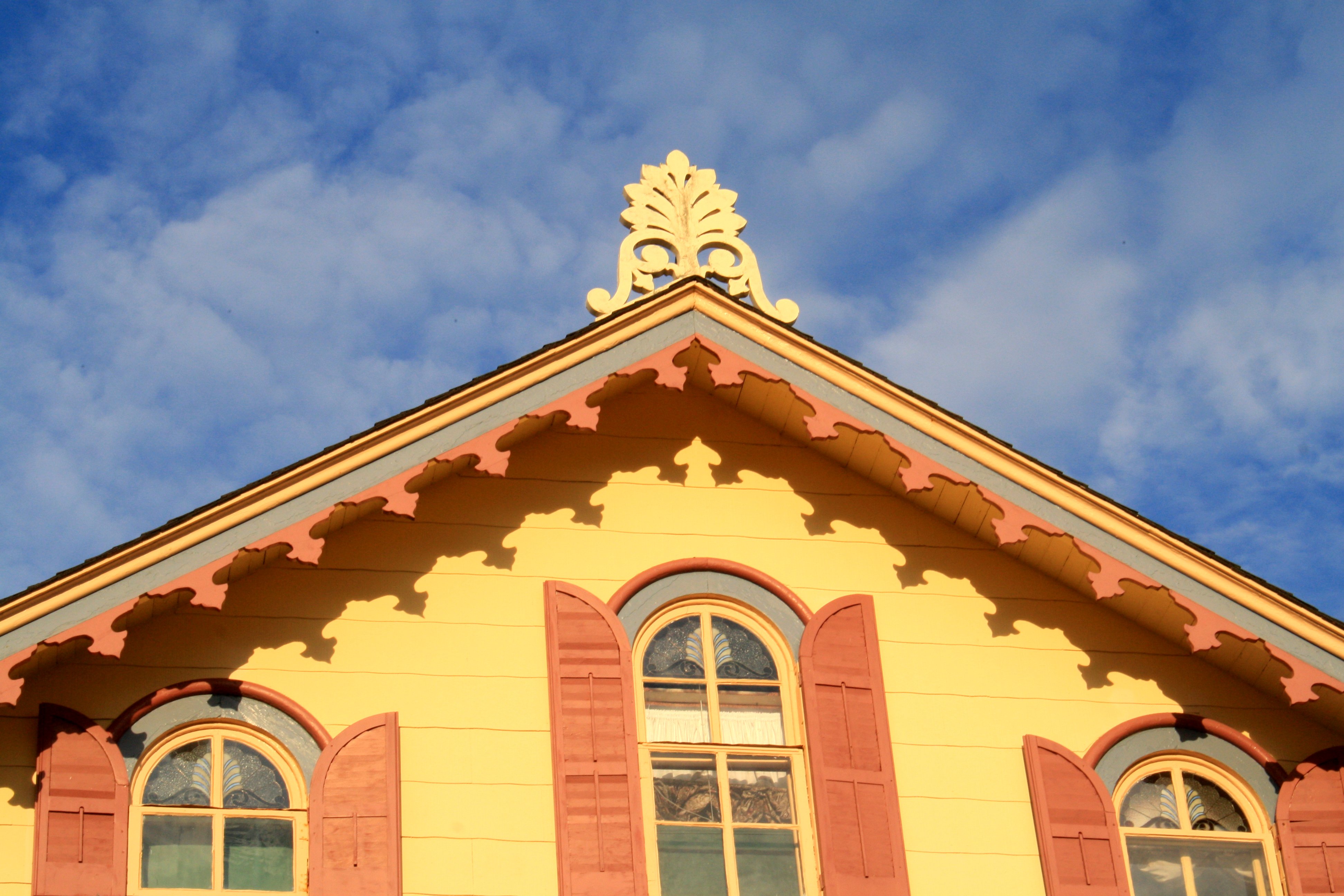
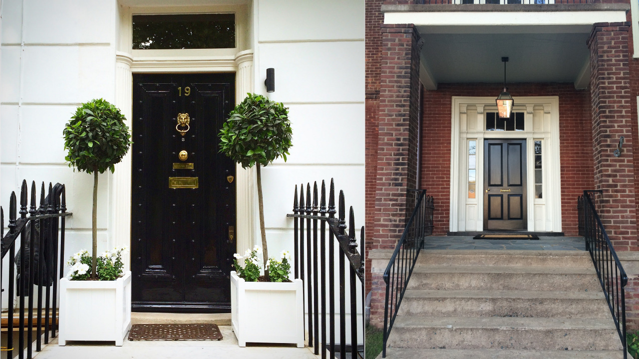
To illustrate my point, I thought I’d do an old-school art history-style slide comparison. On the left, you see a well appointed townhouse in the Chelsea neighboorhood of London. On the right, you see a townhouse from the historic district in the town where I live.

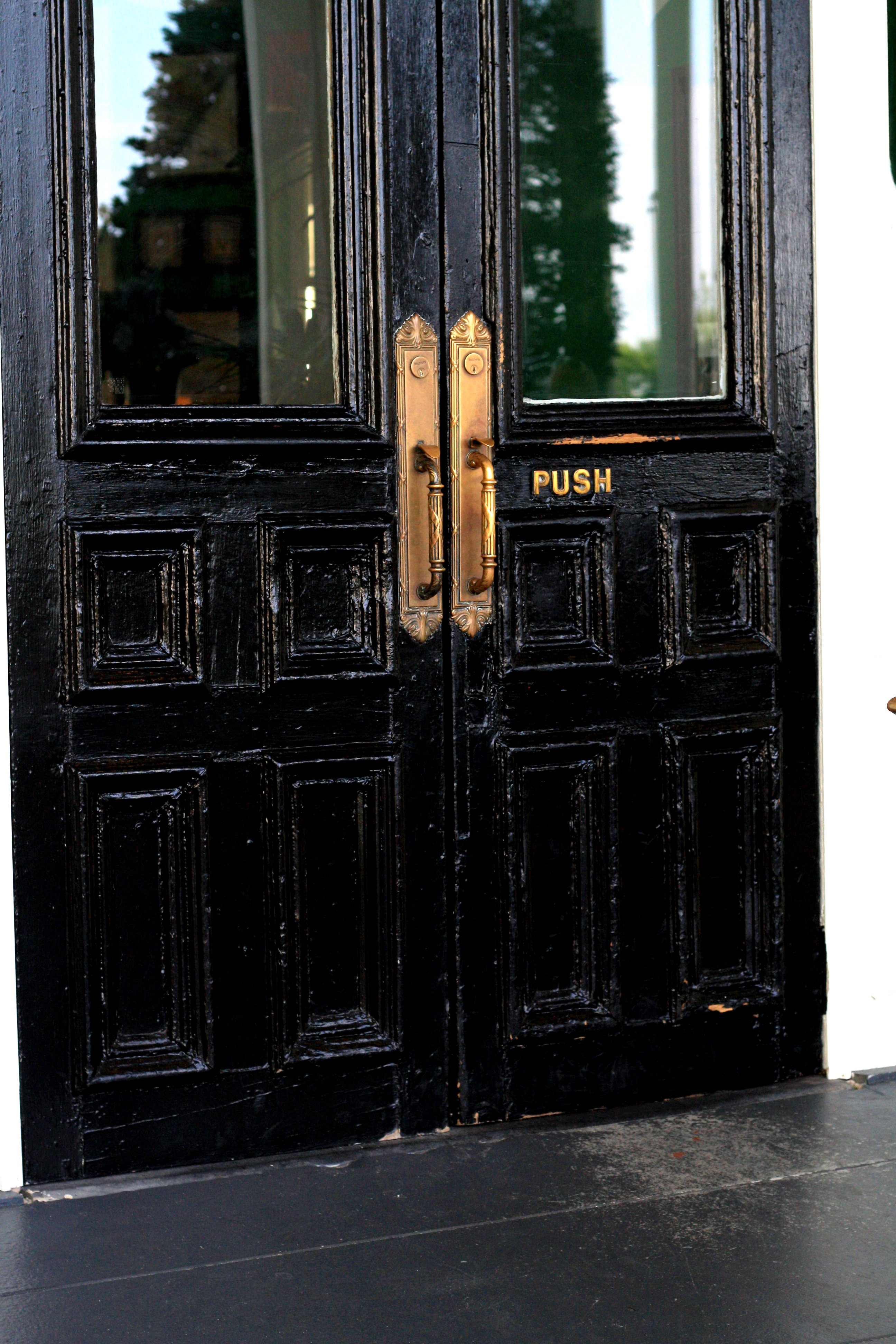
Let’s start with the similarities, first both townhouses have steps with wrought-iron railings that lead up to a dark door with a white, architectural surround. Each surround has faux columns and a transom above the window. Each door is painted and has brass hardware. As you can see, each door is quite similar and both are working with similar bones. However, the Chelsea door is much more inviting.

The first thing that makes the Chelsea door more inviting is the addition of plants. They add a little liveliness to the door that says someone lives here and offers a nice subtle softening to the entrance as well. I like the choice of white planter boxes as it reiterates the white of the walls and the steps. On the right door, there are no plants welcoming you to the front of the house, and as this porch is slightly bigger, it makes the space feel cold and empty.

The second thing to note on the Chelsea entrance is the door itself. First, the high gloss paint serves to catch your attention and give you a focal point as you approach the door. I also like the subtle rivets on the door as they make a traditional door slightly more interesting. Second, the brass hardware is more substantial and more numerous than on the historic home on the left. I think the addition of the doorknocker and the house number are quite important. The door number ensures that guests immediately feel comfortable as their is no confusion that they are in the wrong place. The doorknocker, with it’s lion theme, shows us a little bit about the personality of the owners even before we enter their home. I find the hardware on the Chelsea door to be much more successful, almost like well-chosen jewelry on an outfit. It adds refinement and a subtle sheen that elevates the whole look.

Finally, there is a cohesion to the Chelsea entrance that the historic home just doesn’t have. The Chelsea entrance uses the power of repetition to make the entrance pleasing. The black is repeated on the door, the railings, and the light fixture. The white is repeated on the walls, flowers, planters, and steps. The brass is repeated on the door. On the historic home, there is no sense of repetition and materials seem to be used willy nilly. The steps are different from the landing, which is different from the walls. Another thing that adds to the cohesion of the Chelsea entrance is the use of quality materials across the board. The steps are marble, the railings are thick, the brass is heavy. While you can tell many quality materials were used on the historic home, the cement steps, flimsy railings, and barely-there door hardware take away from the appeal of the beautiful door and surround.

What I ultimately love about the Chelsea entrance is the fact that it seems to welcome you inside. You simultaneously know where you are headed and that you will be taken care of once you get there. There is something that puts you at ease as you approach the London door, whereas there is a slight apprehension as you approach the American home. Are you in the right place? Will you make it up the steps? Are these people friendly? These are not questions you want guests to your home to ask on approach. You want your guests to have a sigh of relief as they have made it to their destination, and they know there is refreshment, relaxation, and friendship waiting for them on the other side of the door.

Have you come across any particularly appealing entryways recently? Is your own entryway more like the one on the left or the right?

How-to Dress for a Music Festival

Last weekend, I went to Austin City Limits (ACL) Music Festival. When I went to ACL for the first time in 2004, it wasn’t a huge deal. Now, I feel like it’s blown up and there’s more of an expectation to dress the part. It’s almost as if there is a music festival dress code these days, which can leave a lot of us wondering what to wear.

Have no fear! Here’s the five things you need to know about how to dress for a music festival. Whether you’re headed to weekend two of ACL or Festy in the Old Dominion, you’re sure to look the part.

1) Rule Numero Uno.

  • Embrace the bohemian vibe, yet don’t take it too far. While part of going to a music festival is letting your freak flag fly a little bit, you don’t want to end up with a closet full of clothes you’ll never wear again.

2) Keep your base neutral.

  • The base layer is your blank canvas where you can paint your festival masterpiece, so to speak. While I went with pants paired with tanks and tees for all these looks, you could easily do dresses, shorts, or button-downs depending on where you are headed.

3) Layer fun accessories.

  • I was able to create three distinct looks by using different accessories. The first look has more of an urban rocker thing going  on. The second gets it’s interest from the layers of colorful necklaces. And the third is slightly more polished, but the scarf, which I wore as a turban, keeps it from looking too stiff.

4) Plan your outfits ahead of time.

  • You don’t want to miss the music because you’re fretting about what to wear. For the first time in a long time, I planned out every outfit down to the lipstick I was going to wear before I left for the weekend. This ensured that I could forget about what I was wearing and just dance to Jimmy Cliff. Highly recommended.

5) Rock your own style.

  • At the festival, I got so tired of seeing girls wearing the exact same thing. It almost seemed like a uniform. I highly recommend wearing a few pieces that are uniquely you so you don’t get swallowed in the sea of cut-off shorts. While the outfits I put together have a great bohemian vibe, they aren’t too far outside my wheelhouse because they all contain things I wear on a normal basis.

pankBa2-IMG_1130

[Outfit 1: J.Crew Bag (similar)//Calvin Klein Fedora (similar)//Target Scarf (similar)//Ray-Ban Aviators//Leather Bracelet//Vintage Silver Cuff (similar)//Moroccanoil Treatment//Melissa Joy Manning Hoops//Lucchese Cowboy Boots//Tom Ford Vampire Kiss Lip Color//Arquiste for J. Crew Perfume//Coach Wallet//Citizens of Humanity Jeans (similar)//Motif 56 Belt//Altuzarra for Target Tee//J. Crew Jacket]

[Outfit 2: J Brand Jeans (similar)//CeraVe Sunscreen//Melissa Joy Manning Hoops//Vintage Necklaces//Sanctuary Clothing Tank (similar)//Straw Cowboy Hat//Dooney & Bourke Purse (similar)//Mossimo Supply Co. Sandals]

[Outfit 3: Vintage Belt//Madewell Necklace (similar)//Tom Ford Sahara Pink Ultra Shine Lipgloss//Vintage Adrienne Vittadini Scarf//Dooney & Bourke Purse (similar)//Ray-Ban Aviators//Melissa Joy Manning Hoops//Everlane Tank//Citizens of Humanity Jeans (similar)//Mossimo Co. Sandals]

Snapshot of a City – Portland

Portland

I spent literally 36 hours in Portland for Labor Day but crammed an incredible amount of exploration into those mere hours. While I would have loved to spend a few more days there, it was a great snapshot of the city. Here’s what I recommend doing if you have less than two days in Portland:

1. Attend a wedding on an organic farm that starts fashionably late and comes complete with smoked salmon caught on premises.

2. Wear your sequin dress with your cowboy boots and complete the outfit with a Texas-sized belt buckle, prana vintage textile clutch, and bold red lips — because anything goes in Portland.

3. Eat Tasty n Sons brunch – go for the breakfast board and the grapefruit juice.

4. See 10,000 roses at the International Rose Test Garden.

5. Get lost at Powell’s Books – you might find yourself tearing up a little because this place is so beautiful.

6. Walk over to Stumptown Coffee and read your new book in the lobby of the adjacent Ace Hotel, both Portland institutions.

7. Catch the latest flick at Living Room Theaters where you can also charge your phone and have a snack.

8. Sip hibiscus tea, eat fresh guacamole and carnitas tacos at Por Que No?

9. Take a quick jaunt out to Mt. Hood to see Timberline Lodge built during the WPA era. Rustic cool at it’s best with a great upstairs bar over looking the lobby.